
British Lacrosse — Brand Identity
A modern British identity for a new national governing body
Challenge
British Lacrosse is the new governing body for elite lacrosse in Britain, uniting players from England, Scotland and Wales to compete internationally. The body exists to boost the profile of the sport, get the nation’s best players on the British squad, and advance the future of lacrosse – with their sights set on the World and Olympic Games. To match those bold ambitions, they needed an inspiring, instantly recognisable brand. And they wanted everyone to play a part in the action.
Idea
Seeing as the governing body is new, the brand would have to be clear and recognisable: something indisputably British Lacrosse. It should get buy-in from each nation, so couldn’t be too edgy or polarising. But it still had to feel fresh and exciting to get players and supporters on board. That meant finding a balance between boldly British cues and energising modernity – something that could represent the elite national team both at home and abroad.
Outcome
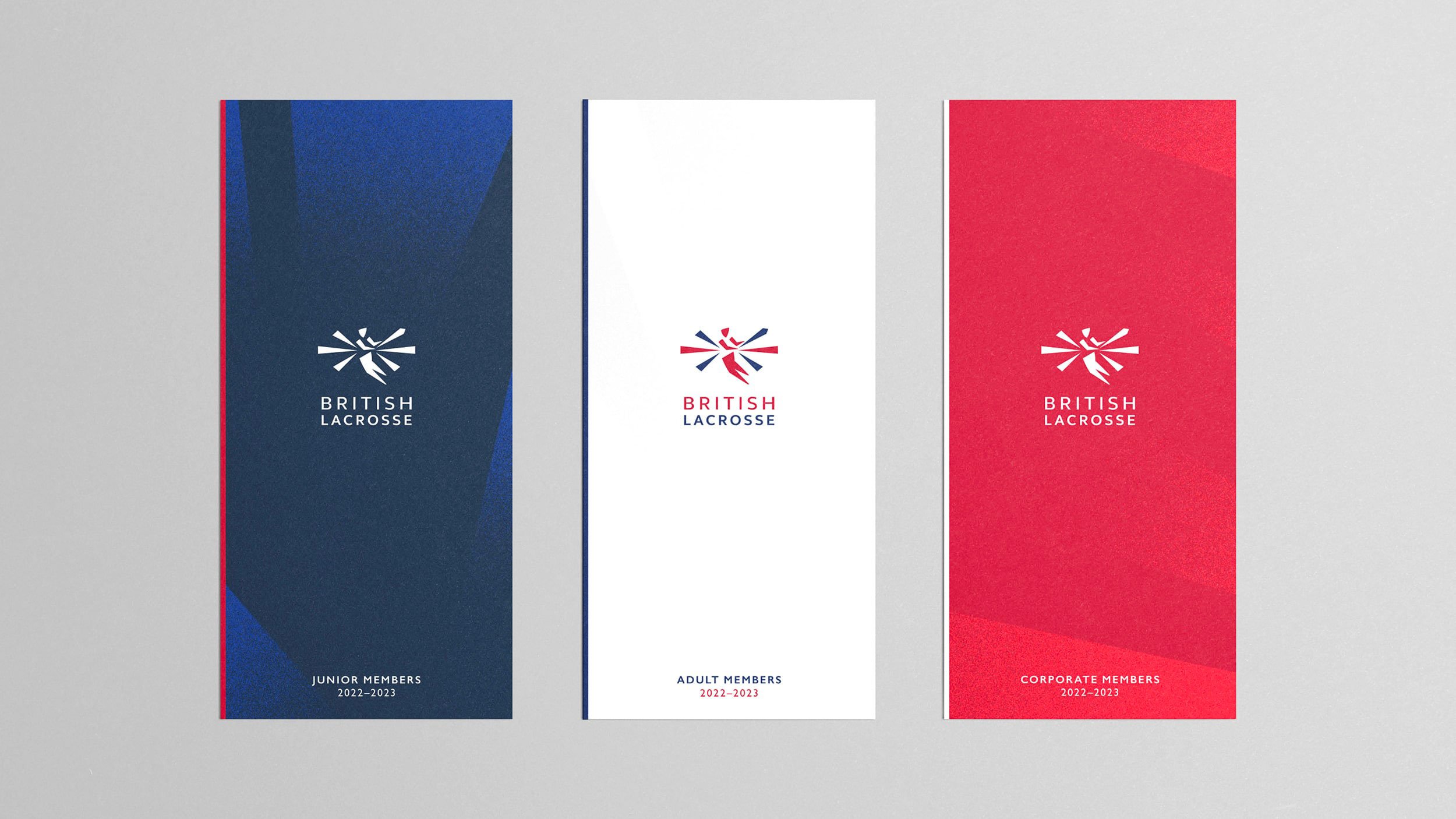
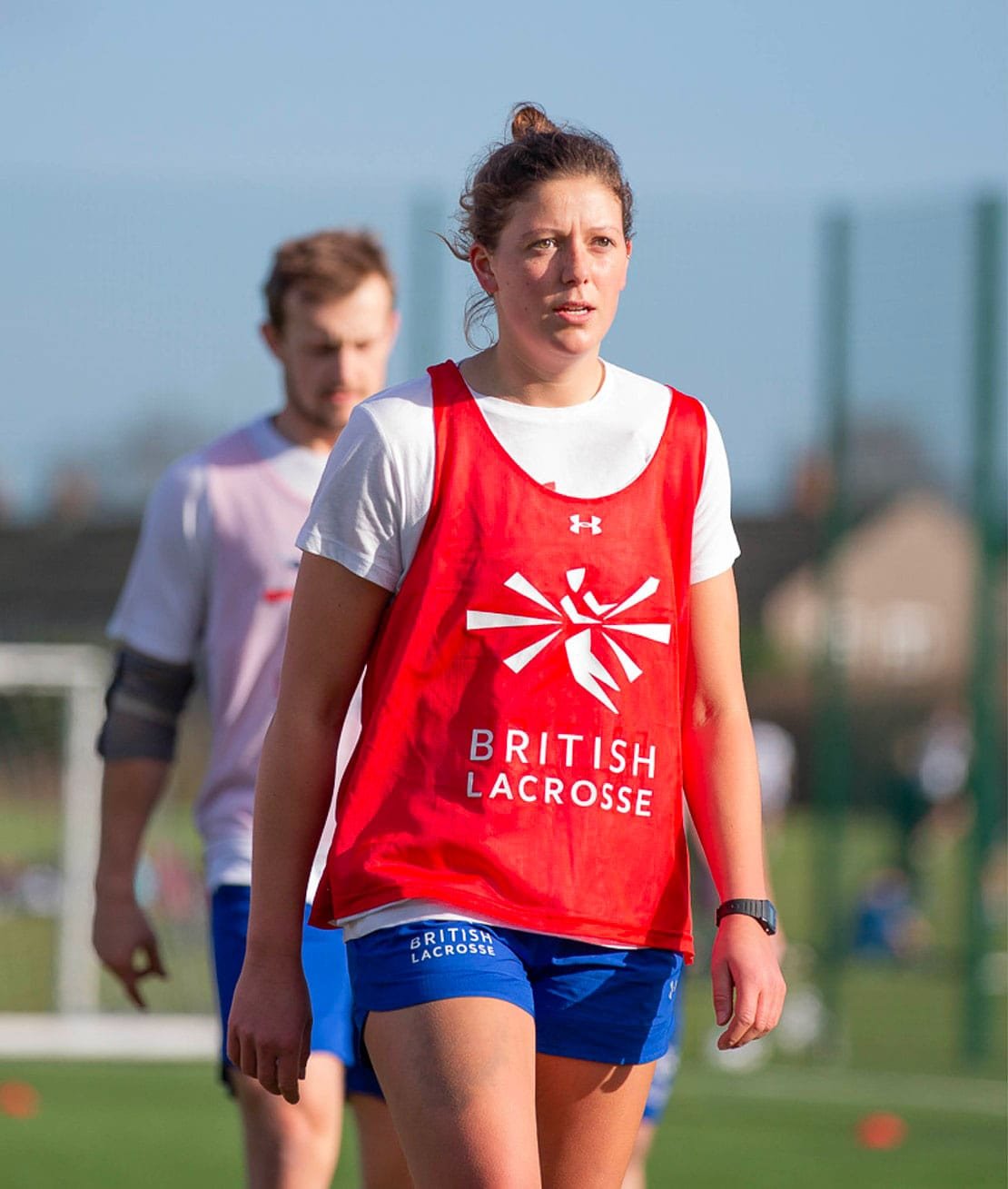
That theme of classic-meets-modern runs throughout the brand. We brought illustrator Anthony Millard on board to refine our logo concept, which sleekly sets a racing lacrosse player at the heart of the Union Jack. The colour palette is classic red, white and blue for immediate international recognition, while shards from the logo become dynamic brand assets. And we chose two fonts: traditionally British Gill Sans for body text, but a high impact, modern typeface for attention-grabbing headers.
We rolled the resulting brand across everything from social graphics to cap badges, then packaged up the details in a bold set of guidelines. It’s all the kit British Lacrosse needs to step onto the international stage.
Sector
Sport
Services
Brand Identity
Positioning
Visual Guidelines
Jersey Design
Launch Collateral
Collaborators
Logo development: Anthony Millard
Photography: Rafaella Macintosh & James Fowles


“By engaging with our board, coaches and players to get under the skin of why we exist, who we are and what we want to achieve, Lark developed a uniquely British visual identity that reflects the movement, dynamism, passion and joy for the game of lacrosse. Mindful of our start-up mode, Lark’s approach was thoughtful, creative, flexible and practical. We now have a fabulous foundation from which to build the British Lacrosse brand, inspiring our men’s and women’s teams in their pursuit of success on the world stage and the Olympics.”
Rosie Halfhead
British Lacrosse


Hatching plans?
If you’re launching something new or refreshing an existing brand, we’d love to hear about it.
Similar projects
