Homesite — Brand Identity
A premium brand identity for a Notting Hill estate agent

Challenge
Homesite had just moved into a new, high-end location on Westbourne Grove and needed a visual identity that matched the postcode. Their existing brand didn’t reflect the luxury, warmth, or deep local expertise they were known for. With more premium foot traffic now passing their door, they needed a brand that felt both sophisticated and personal.
Idea
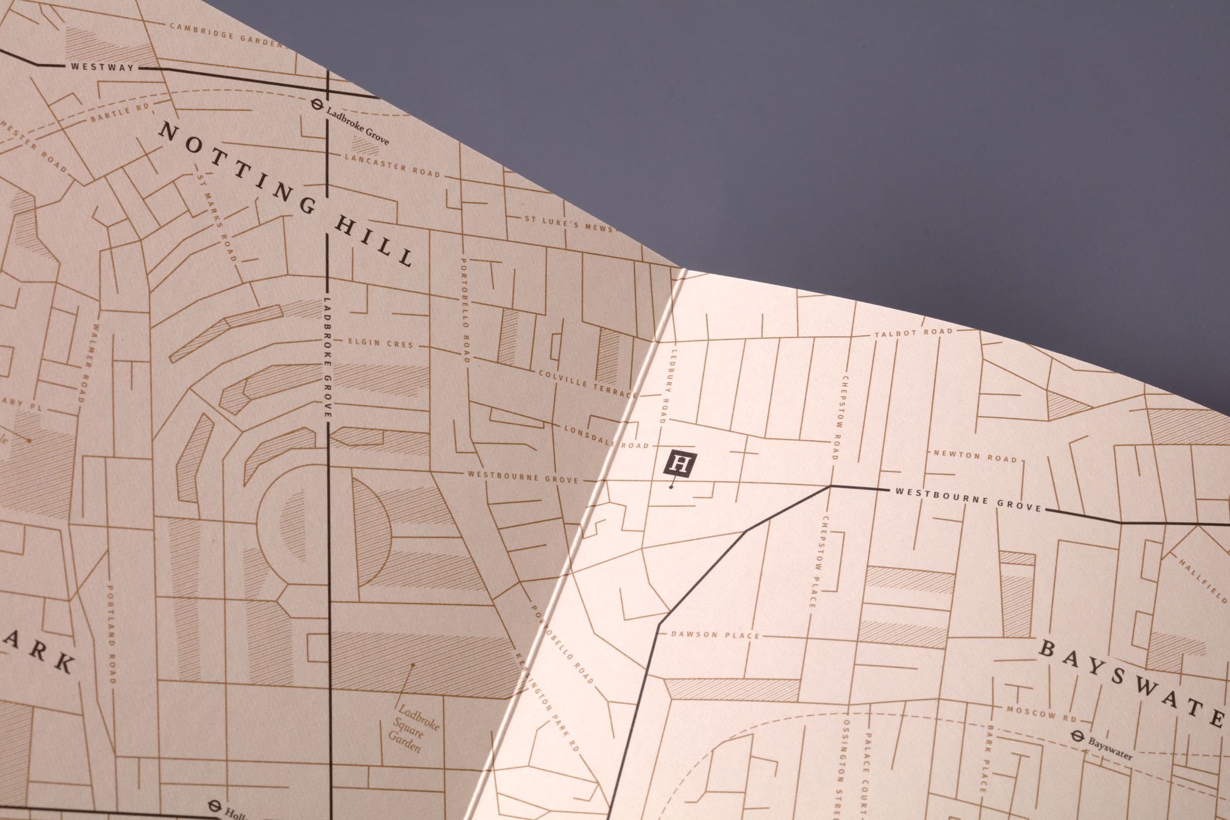
We positioned Homesite as “Notting Hill’s inside source” – a premium brand built on local know-how, boutique service, and genuine charm. A blend of high-end aesthetics with a layer of storytelling and warmth: a sleek, modern identity with hidden nods to local secrets (including a subtle home in the ‘H’ of the logo).
Outcome
The new identity feels elegant and intelligent. From a minimal black-gold-ivory palette to bespoke map illustrations and angle-matched icons, every detail was designed with care and intent. We carried the brand across stationery, a warm and friendly brochure, and seasonal illustrated shopfronts – helping Homesite not only settle into their affluent new location but stand out within it.
The final result is a brand that’s as sharp as a boutique hotel and as welcoming as a local host. It did exactly what it set out to, positioning Homesite to attract premium clients and, ultimately, helping pave the way for its acquisition by leading estate agent Marsh & Parsons.
Sector
Property
Services
Brand Identity
Print Design
Tone of Voice
Shopfront
Collaborators
Copywriting: Yarn
Printing: Taylor Brothers


“Working with Lark was a great experience and not only did they understand what we were looking to achieve, the brand created far exceeded our expectations. Easy to work with, very diligent, professional, creative and – just as importantly – practical which from previous experience is not that common in the design industry.”
Nigel Hargreaves
Owner, Homesite

Hatching plans?
If you’re launching something new or refreshing an existing brand, we’d love to hear about it.
Similar projects