Yarn — Brand Identity
A characterful aesthetic for a fresh-thinking copy agency
Challenge
Copy brands can be – well, a bit bland. At least that’s what Sophie, Yarn’s founder, says. And to transform her freelance business into a fully fledged agency, she needed a creative identity that cut through the stuffy stock imagery and corporate clichés to celebrate, and elevate, copy.
Idea
Whilst we could have riffed off the name and done something cool with knitting needles, so could anyone. Instead, we went back to the threads of the brand to weave something really unique. Copy is everything at Yarn. And it should be everything to the new brand, too.
Outcome
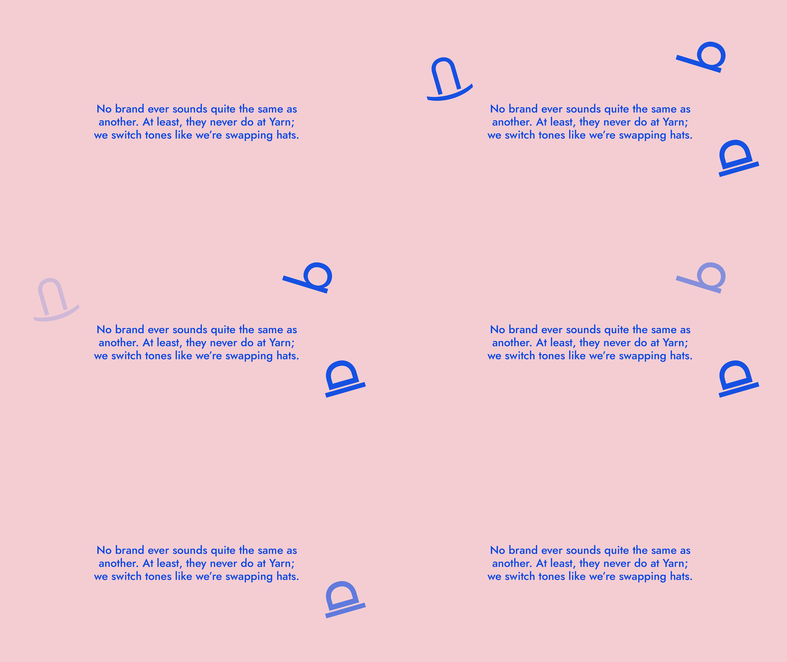
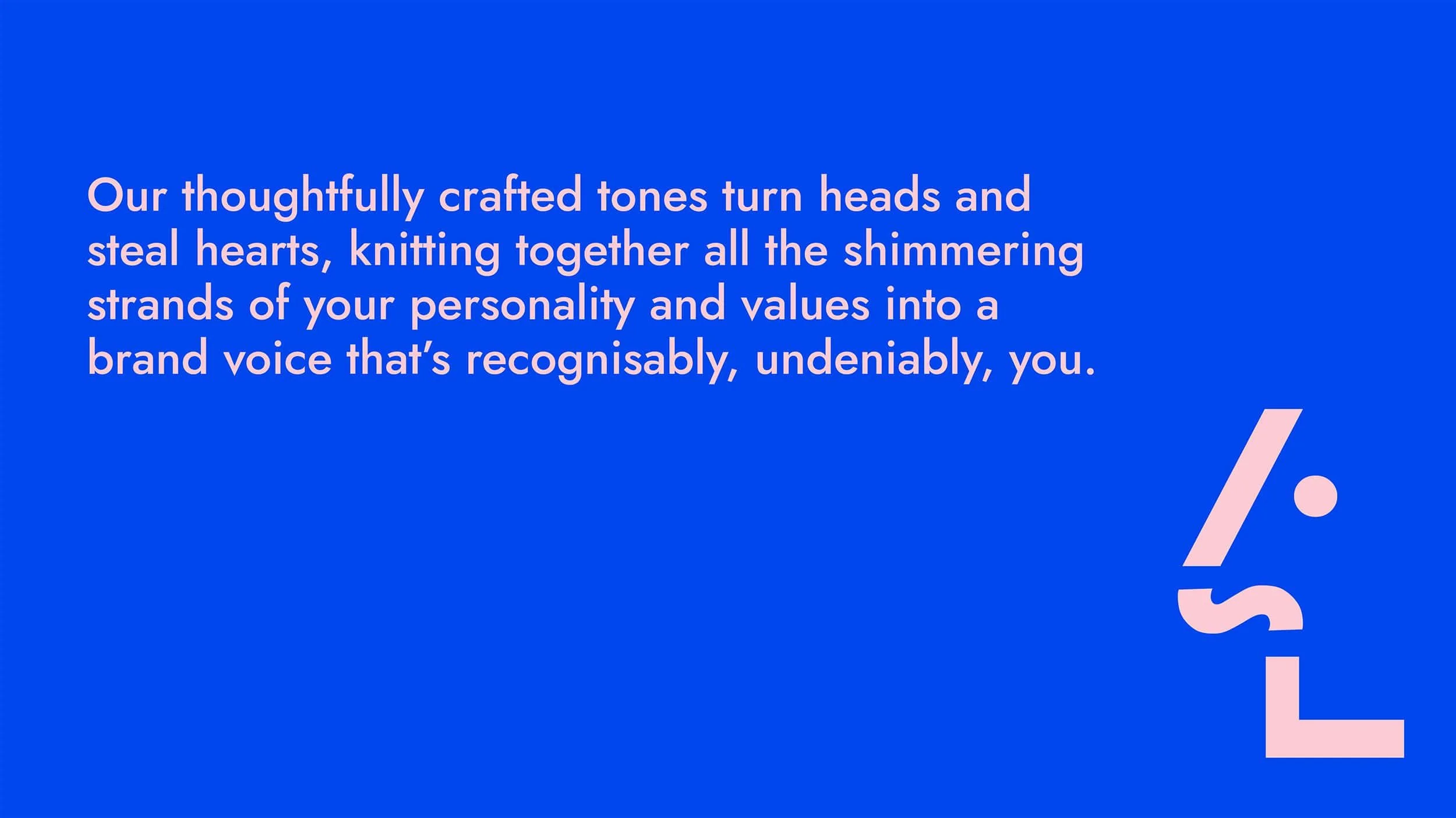
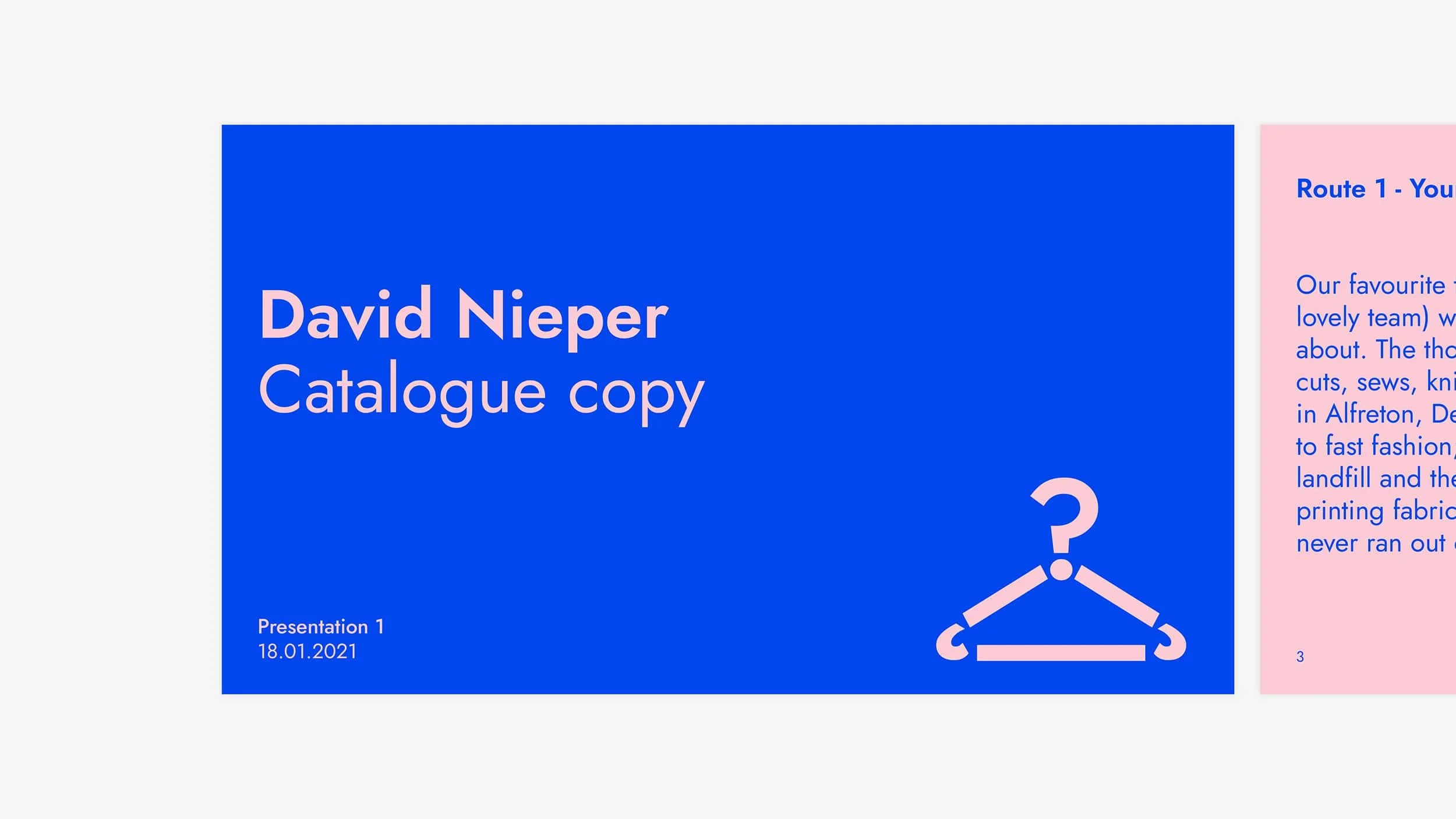
For Yarn, copy’s now the indisputable hero – even in the design. Except for the odd snap for the blog, there aren’t any images. Instead, we created a full suite of icons using letters, symbols, and punctuation. Even the lines are built from dashes, every writer’s best friend.
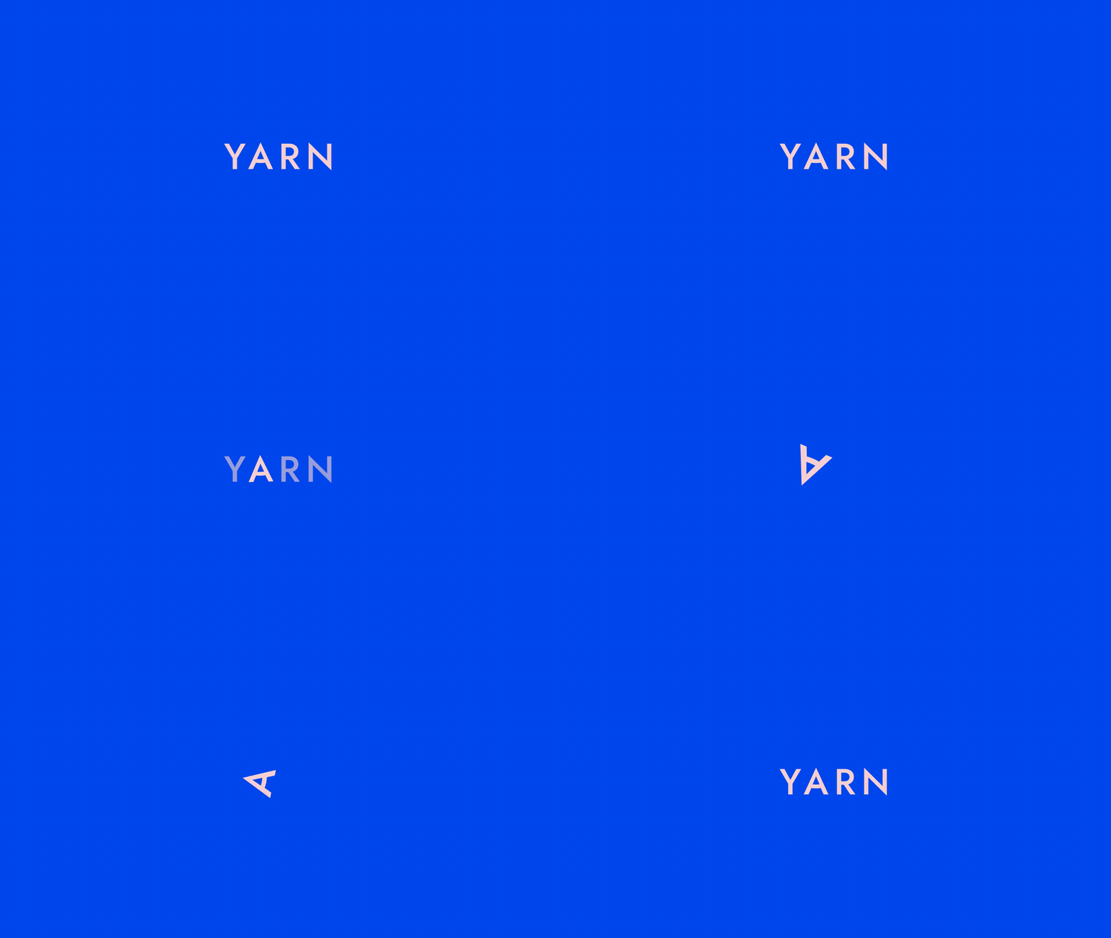
But the clever(est) bit’s the logo. Look again – the ‘A’ is the nib of a pen, which turns on its side to write when the agency needs a smaller format. Add to that a quirky palette of powder pink and electric blue, and you’ve got a fresh and energetic brand that perfectly captures Yarn’s values: courage, compassion, and creativity.
With the visual brand sorted, we moved onto the website. It’s bold and minimal, giving copy plenty of breathing space, but the kooky colours and icons pack every pixel with character. And you know what? Not a ball of yarn in sight.
Sector
Professional services
Services
Visual Identity
Branded Materials
Website Design
Website Build
Collaborators
Copywriting: Yarn

“Working on our brand with Lark was an awesome experience. Left to my own devices our logo would have been a ball of yarn and... well, that’s pretty much where I ran out of ideas. Instead, they channelled our values and how we’d like to be perceived into something super clever and, frankly, totally adorable. I can’t imagine ever getting bored of it.”
Sophie Titcomb
Founder and lead copywriter, Yarn


