The blue bag and four other finds
Five Finds is a monthly collection of five inspiring things we deemed worthy of sharing. If you’d like inspiration in your inbox each month sign up here.
Bags, birds, beats and a The Bear
Hello and welcome to the nine new subscribers who’ve signed up since my last edition. If that’s you, thanks for following along! There’s an archive of past editions here and if you like what you read please pass it on to someone you think will like it too.
September’s newsletter has a big blue bag, tasty paint, some wooden friends and a Bear omelette finished off with some late summer tunes to keep you in the mood until spooky season. From the studio we’ve put together a little article on the humble icon and considerations for their use when creating a brand’s visual identity. Hope you like it!
Keith / Founder
The blue bag
IKEA is set to open a store in London’s Oxford Street. As they continue the construction, the building wrap has been designed to look like a giant Frakta blue bag. The simplest ideas are the best but often the hardest to implement. This could easily have been just other boring hoarding with some marketing shots and a ‘coming soon’ message. Hat tip to both Mother and the brave IKEA marketing team.
Happy swinging birds
On a recent trip to London I picked up one of these rocking birds designed by Kutulu. They’re a team of four designers and friends from Czechia and Slovakia who create a range of hand-made wooden toys that are all bright, bold and brilliant.
Tasty paint
Anyone with kids may well have had the issue of their kitchen walls being redecorated with tomato sauce. Now you can get the same effect (but with more intention) with sustainable paint brand Lick. They’ve collaborated with Heinz to mix the perfect shade of red for those ketchup connoisseurs.
Bear omelette
If you’re missing The Bear as much as I am (if you haven’t seen it I really do envy you) this recipe helped sate my appetite for one of the best tv shows I’ve seen in years. In Season 2, Episode 9 chef Sydney makes an omelette and it looks and sounds delicious. I’ve since found the recipe and can confirm it really is.
Keep summer going
My album of the summer has been Volcano, the 4th album from electronic band Jungle. Think 70s breakbeats and old school soul remixed for the 21st century.
Studio news
Icon article
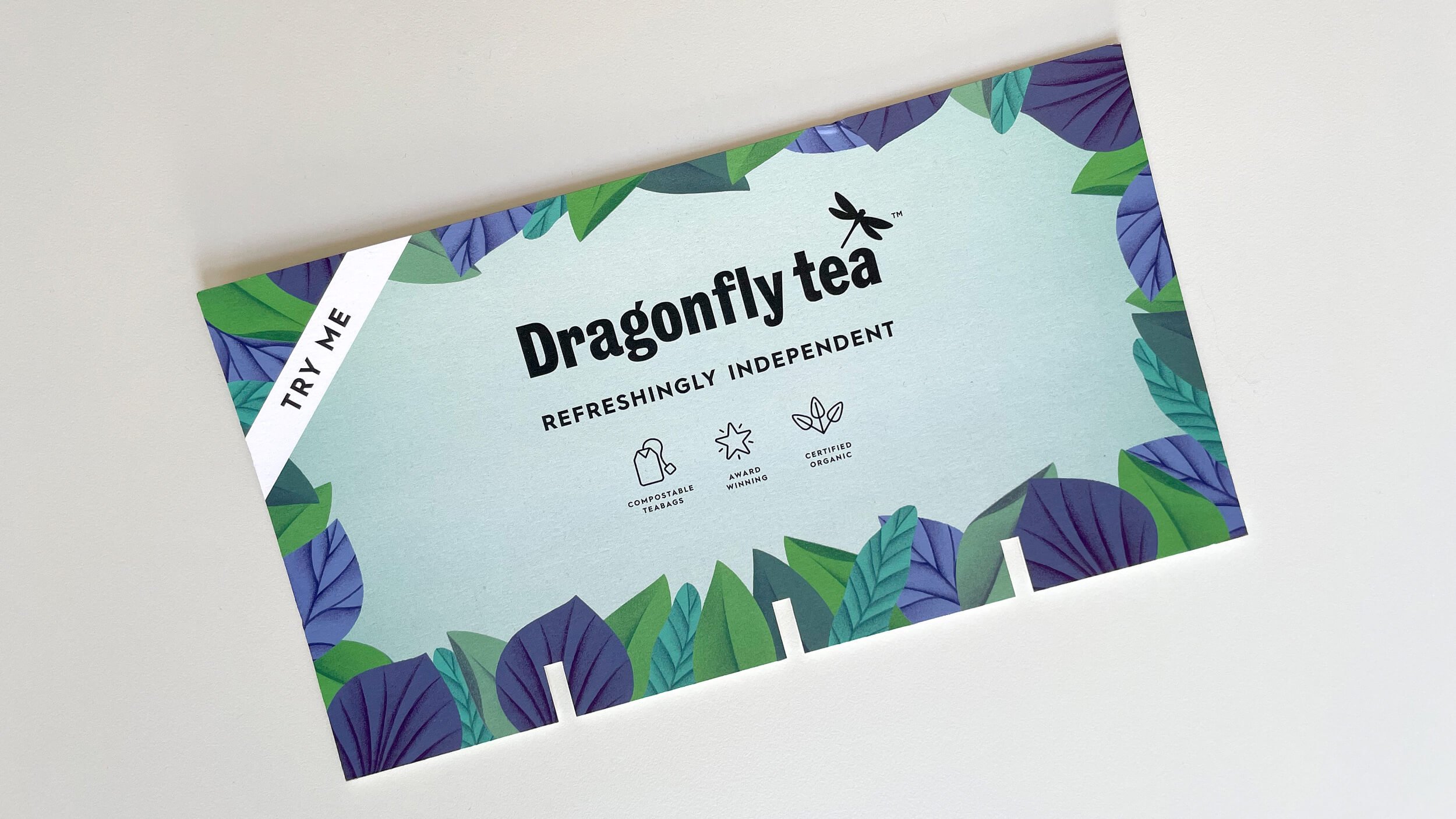
An ode to icons
We’ve found a few times as we’ve worked through the branding or rebranding process that clients don’t see iconography as an important asset even if they’re already using them. So, we thought it would be useful to put together a little ‘ode to the icon’.


