Luii — Brand Identity
A startup brand identity for when you’ve really gotta go
Challenge
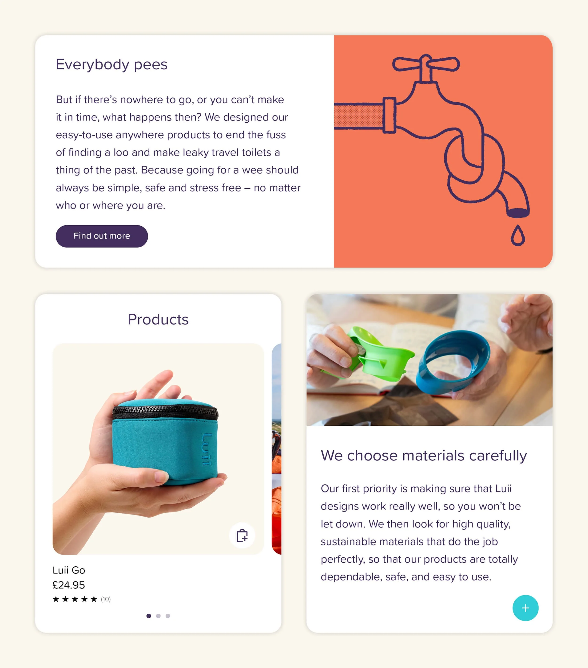
Luii know and appreciate good design. They created their unique portable toilets with the team behind Joseph Joseph. So when pitching to investors and planning ahead to launch, they knew they would need more than a logo to communicate their USPs. They asked us for a full visual and verbal identity that would position Luii as a consumer brand and speak to a wide audience. Because Luii’s toilets aren’t healthcare devices. They’re lifestyle products. Everybody pees, after all.
Idea
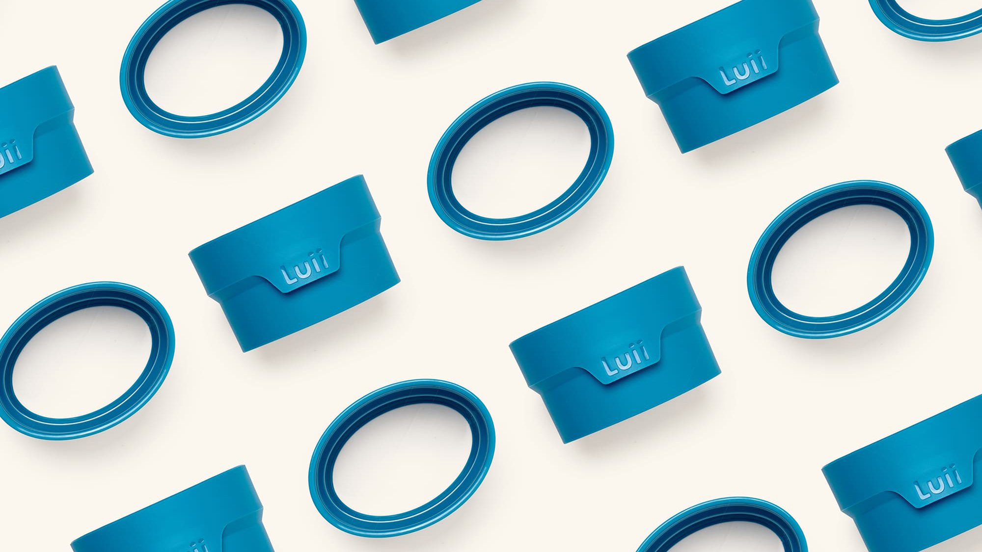
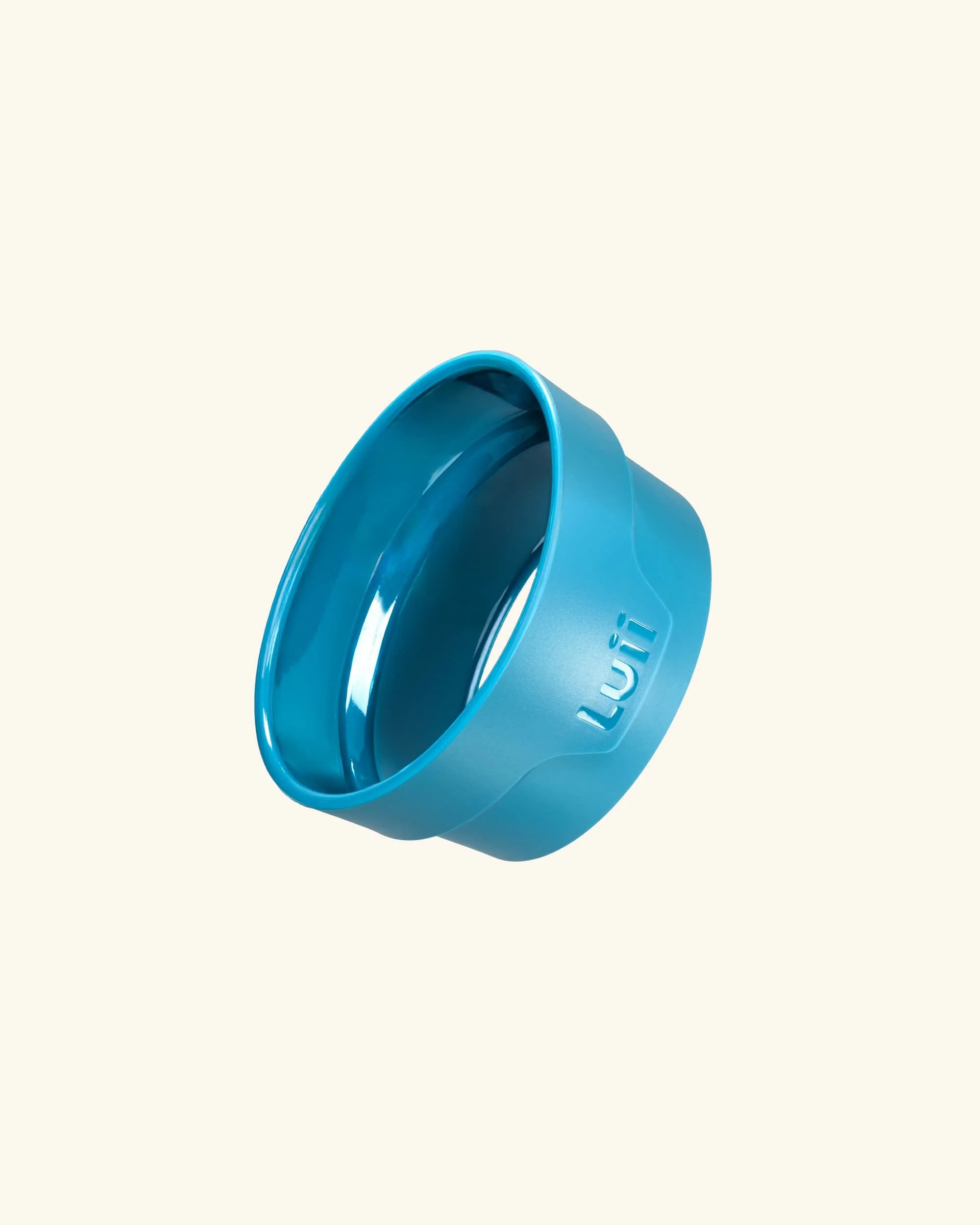
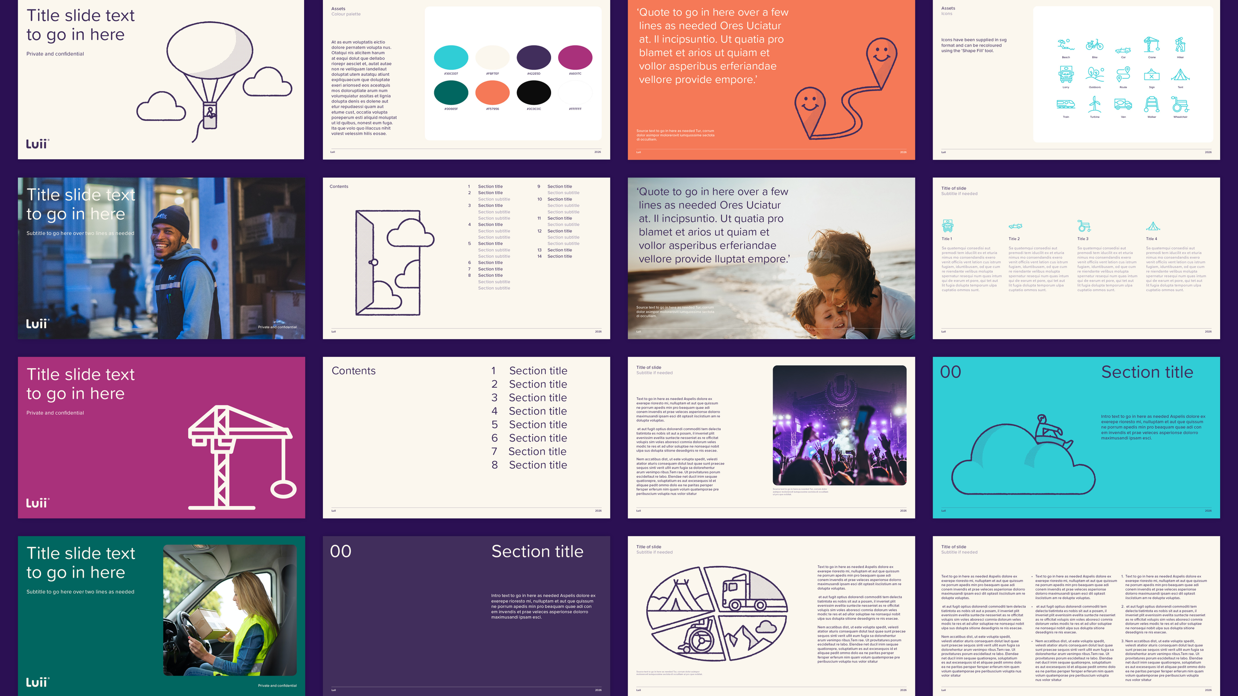
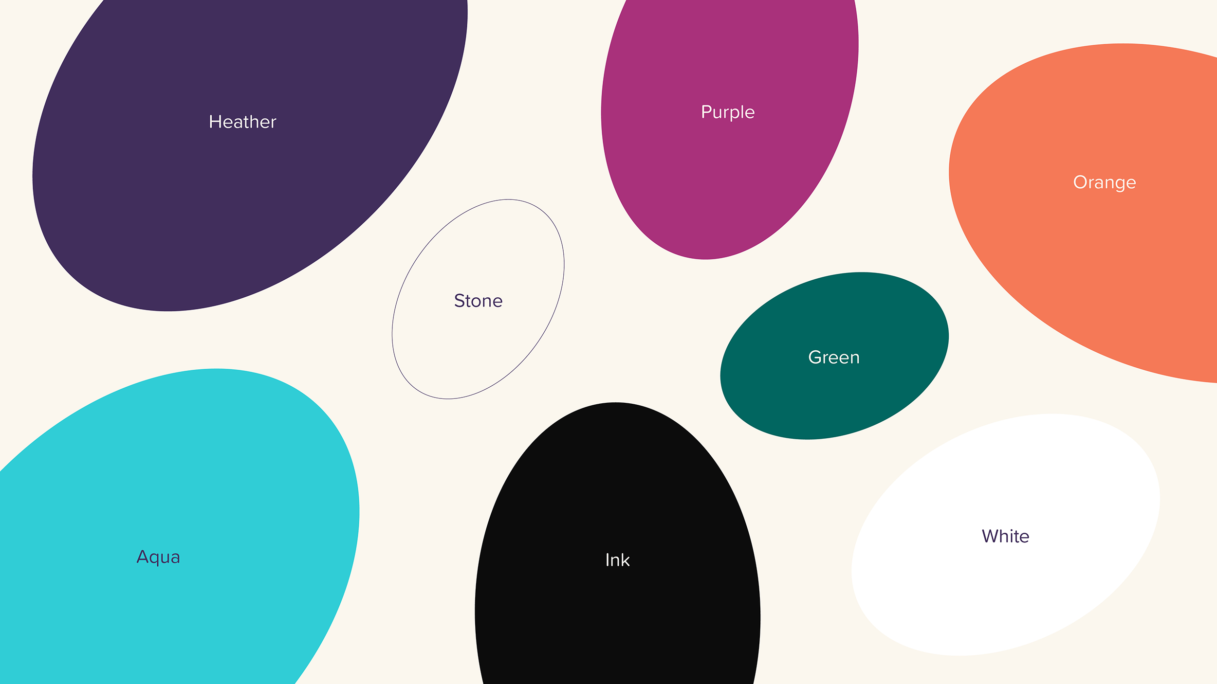
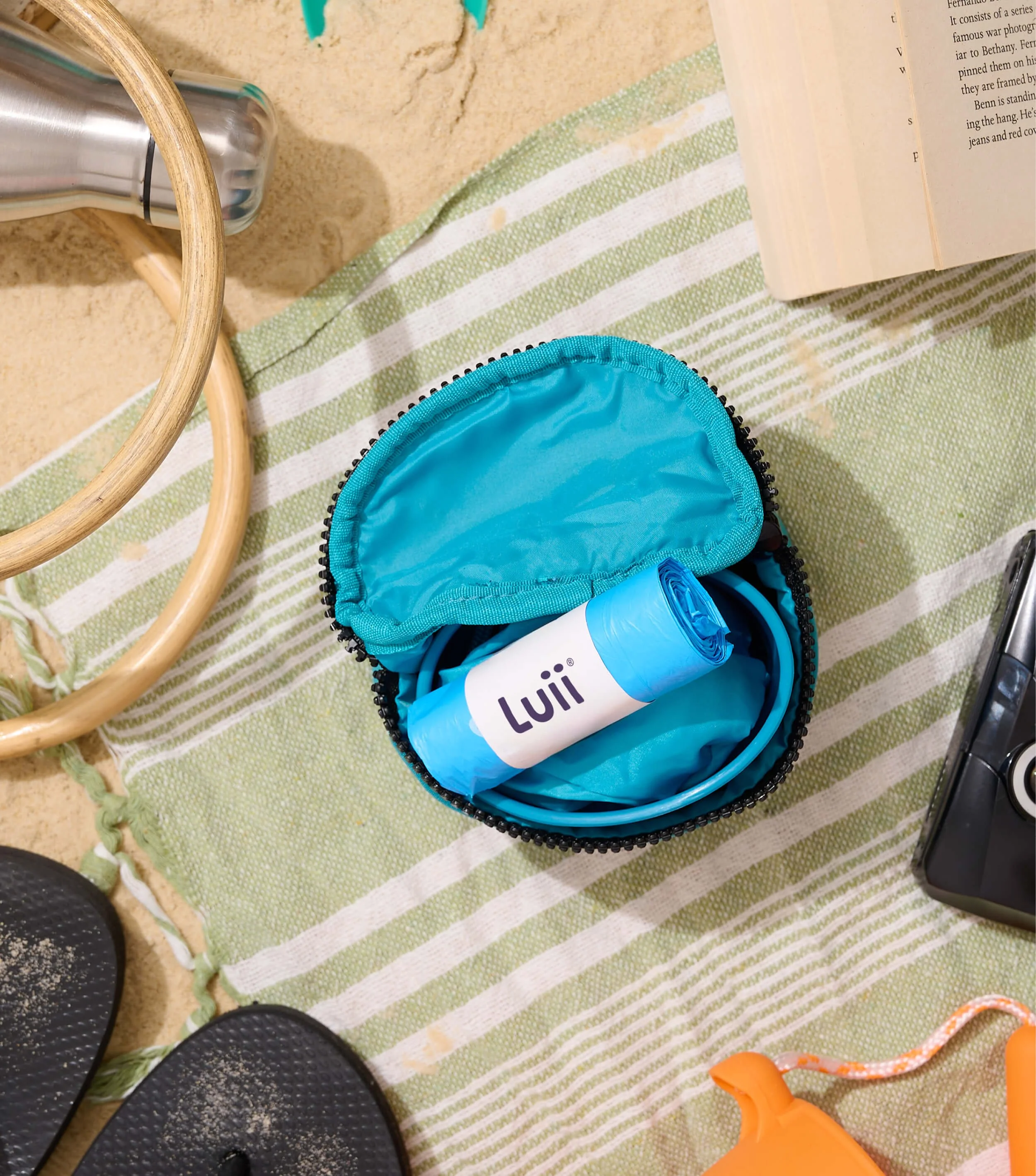
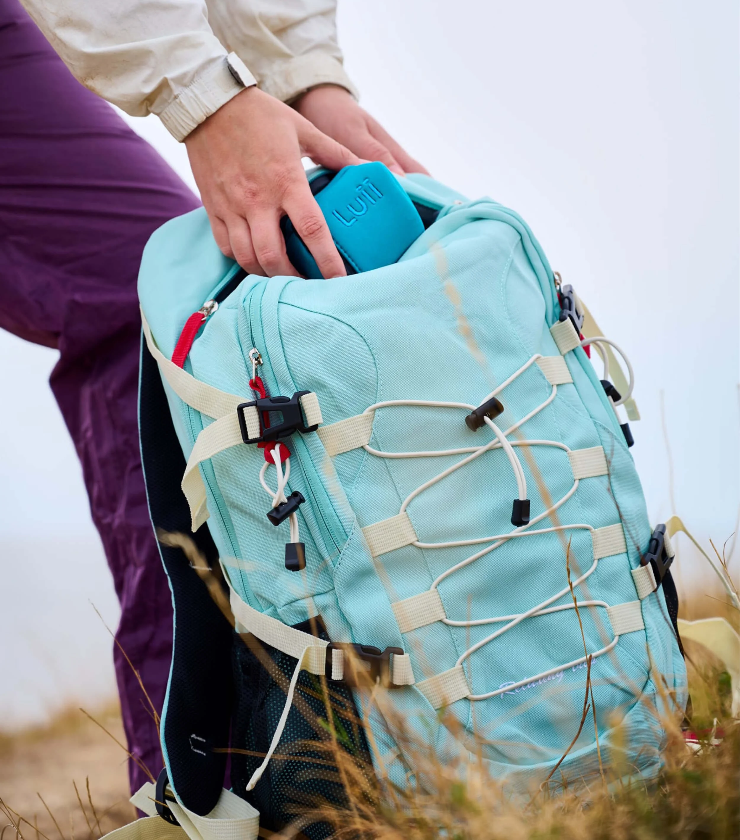
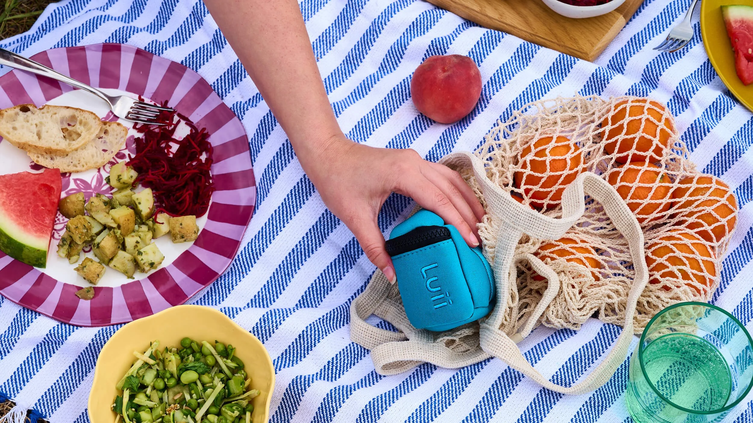
The shape of Luii is unique. So we turned it into an instantly recognisable anchor for the visual identity. The distinctive elliptical aperture runs through every element: icons, illustrations and patterns. So that every glimpse of the brand is a reminder of the products’ innovative design. Paired with sector-defying colours and warm, witty assets, we swap clinical connotations for consumer cues.
Outcome
Bright colours, with muted options for flex, break the healthcare mould. And we sail Luii away from the medical sea of blue with vibrant pops of purple, orange and green.
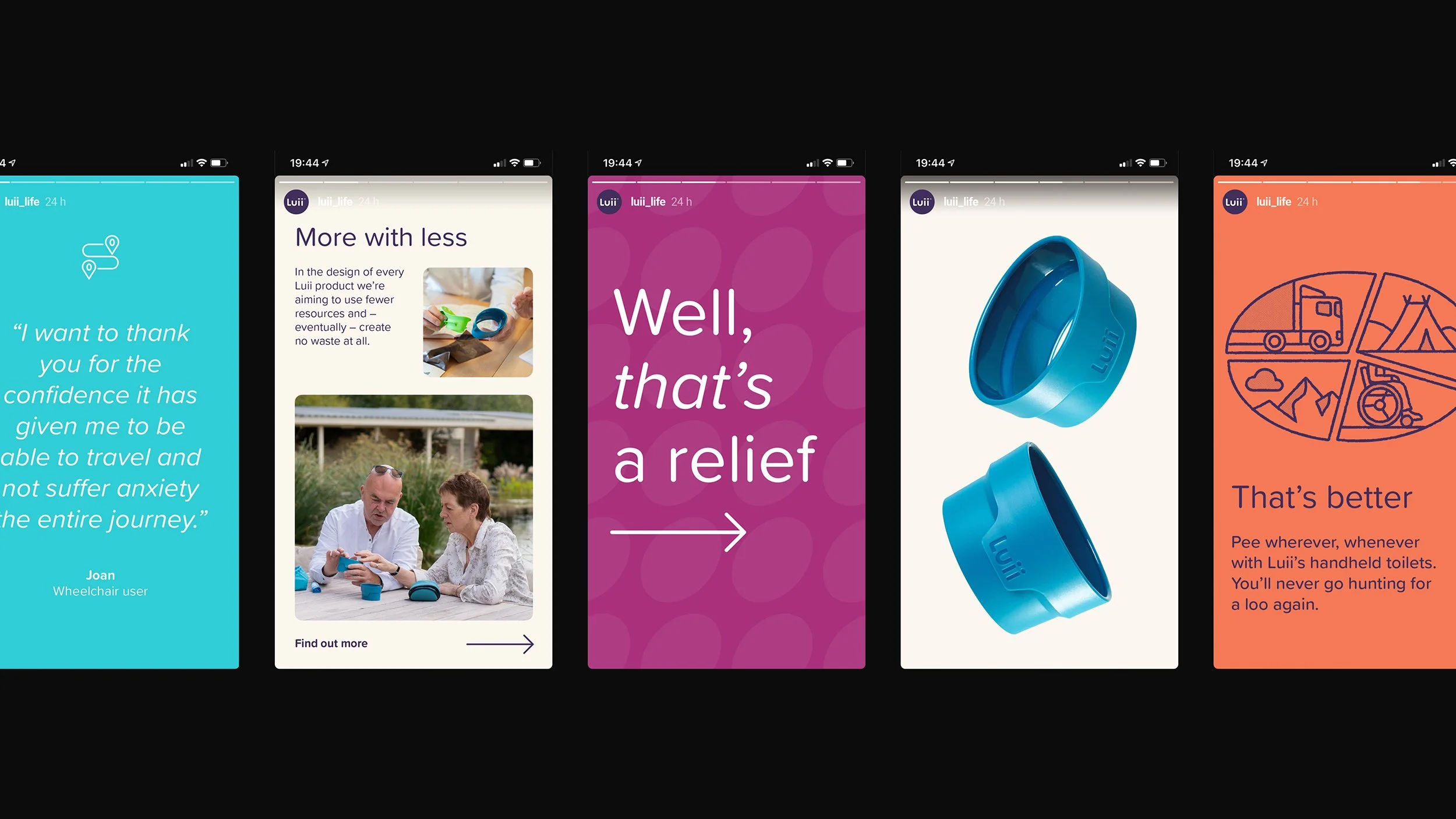
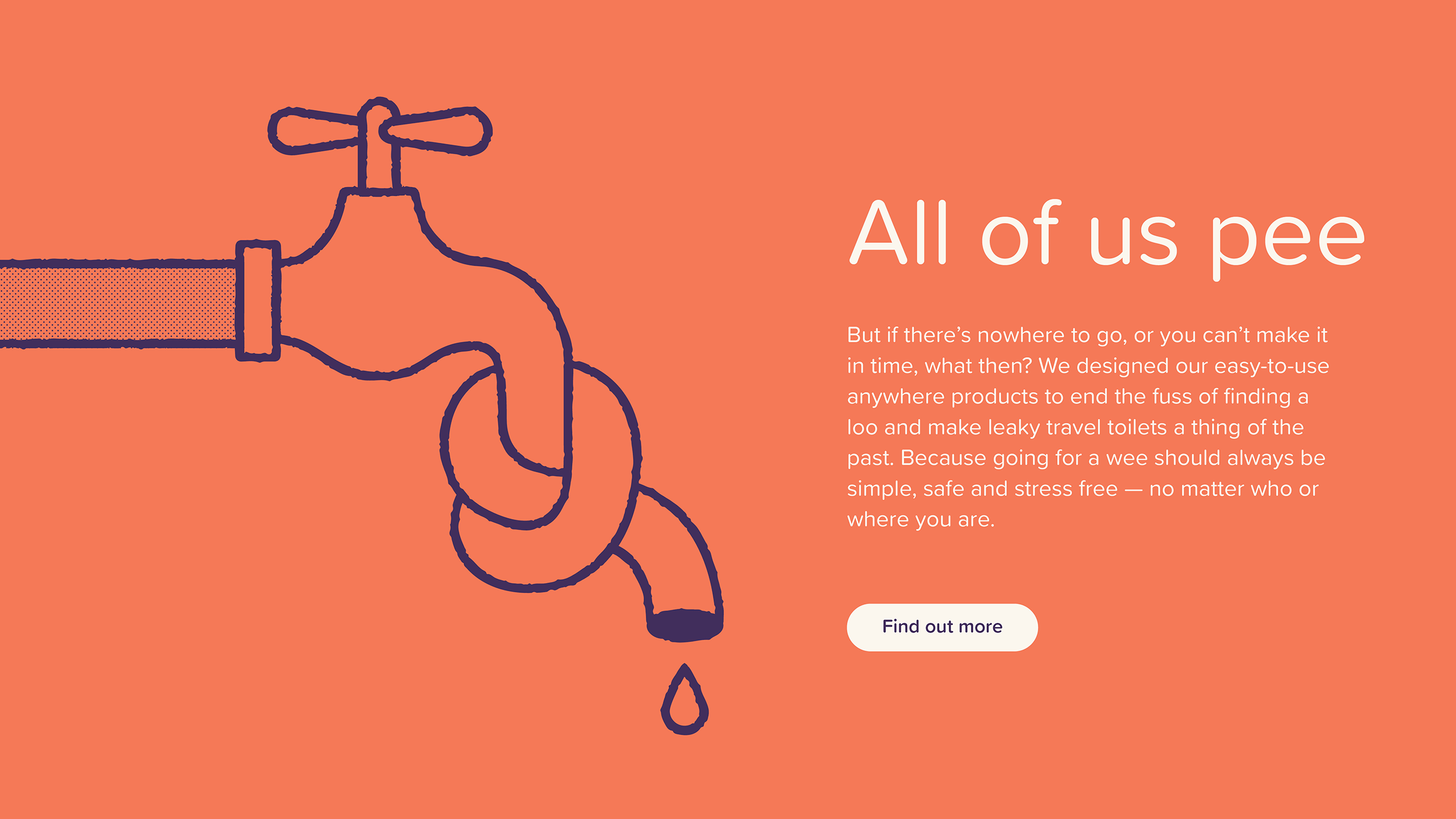
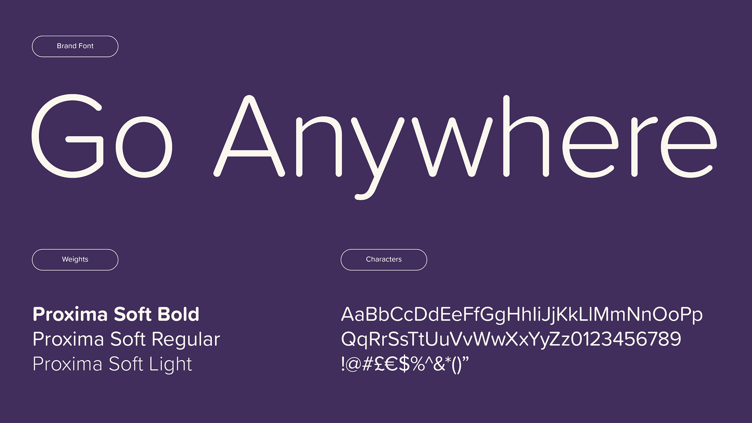
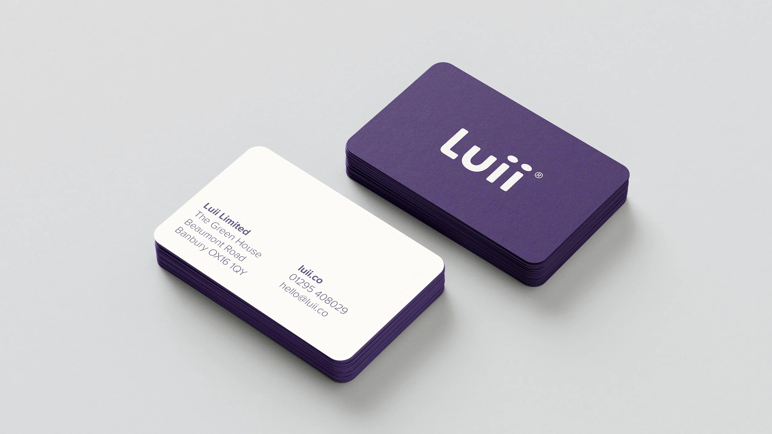
Supporting assets are warm and approachable. We commissioned witty illustrations that disarm the taboos of continence issues, and for typeface chose the rounded Proxima Nova Soft. Custom icons – built around the trademark Luii ellipse – help us talk about the many use cases. While the verbal identity strikes a smart but simple tone, teaming a light, conversational voice with playful touches and matter-of-factness. The brand strapline succinctly says it all: ‘Go anywhere.’
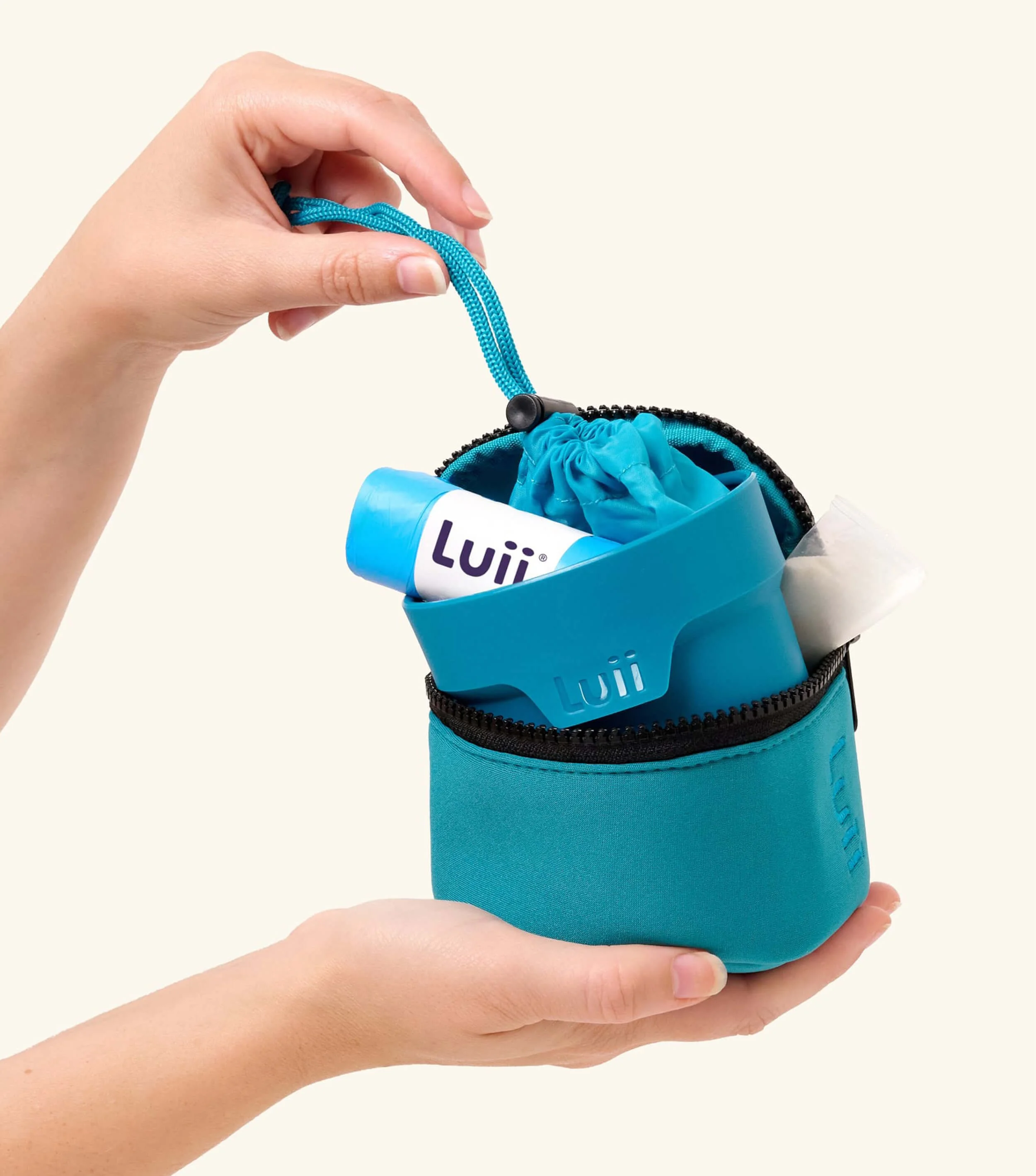
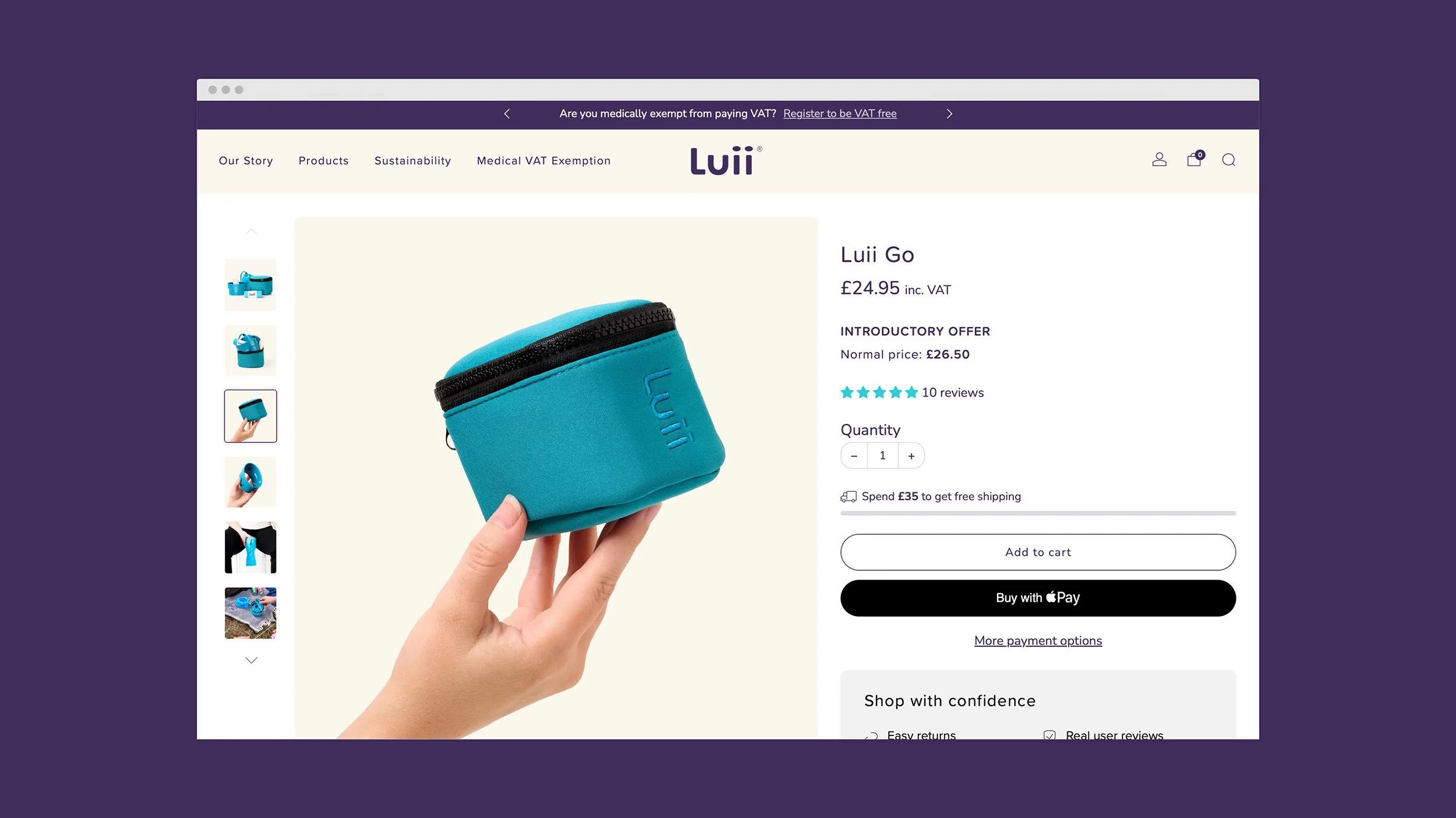
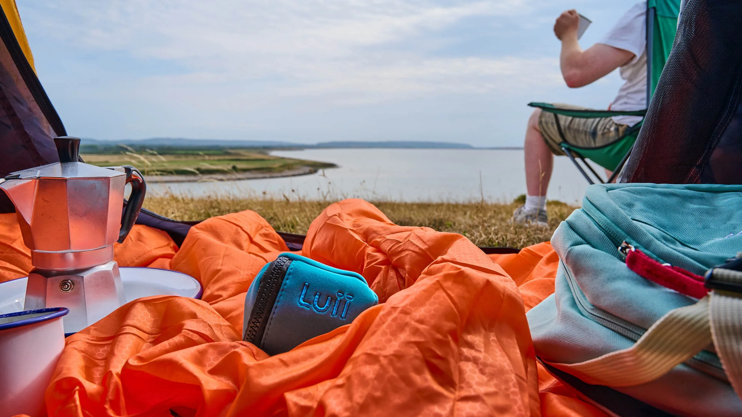
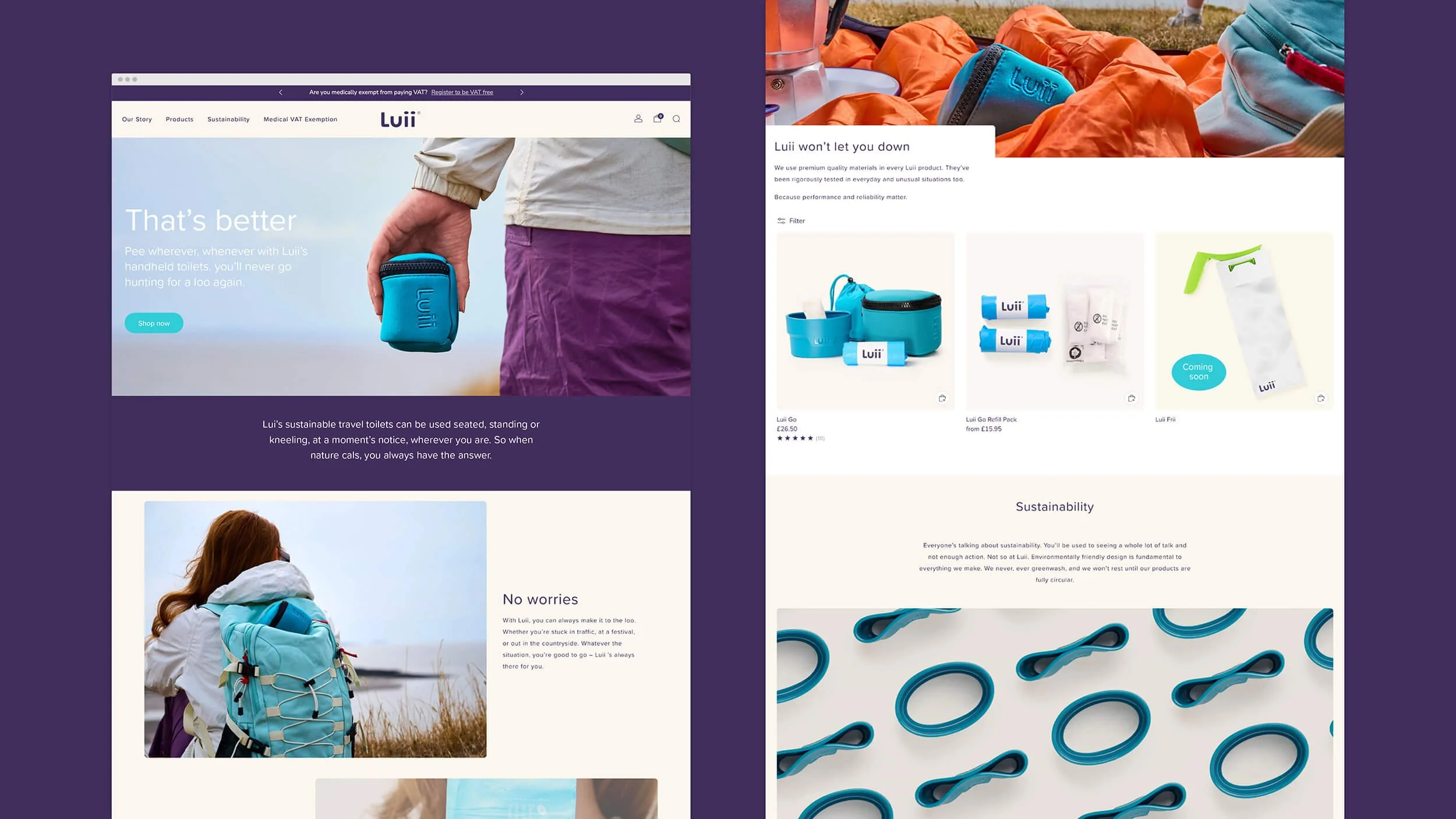
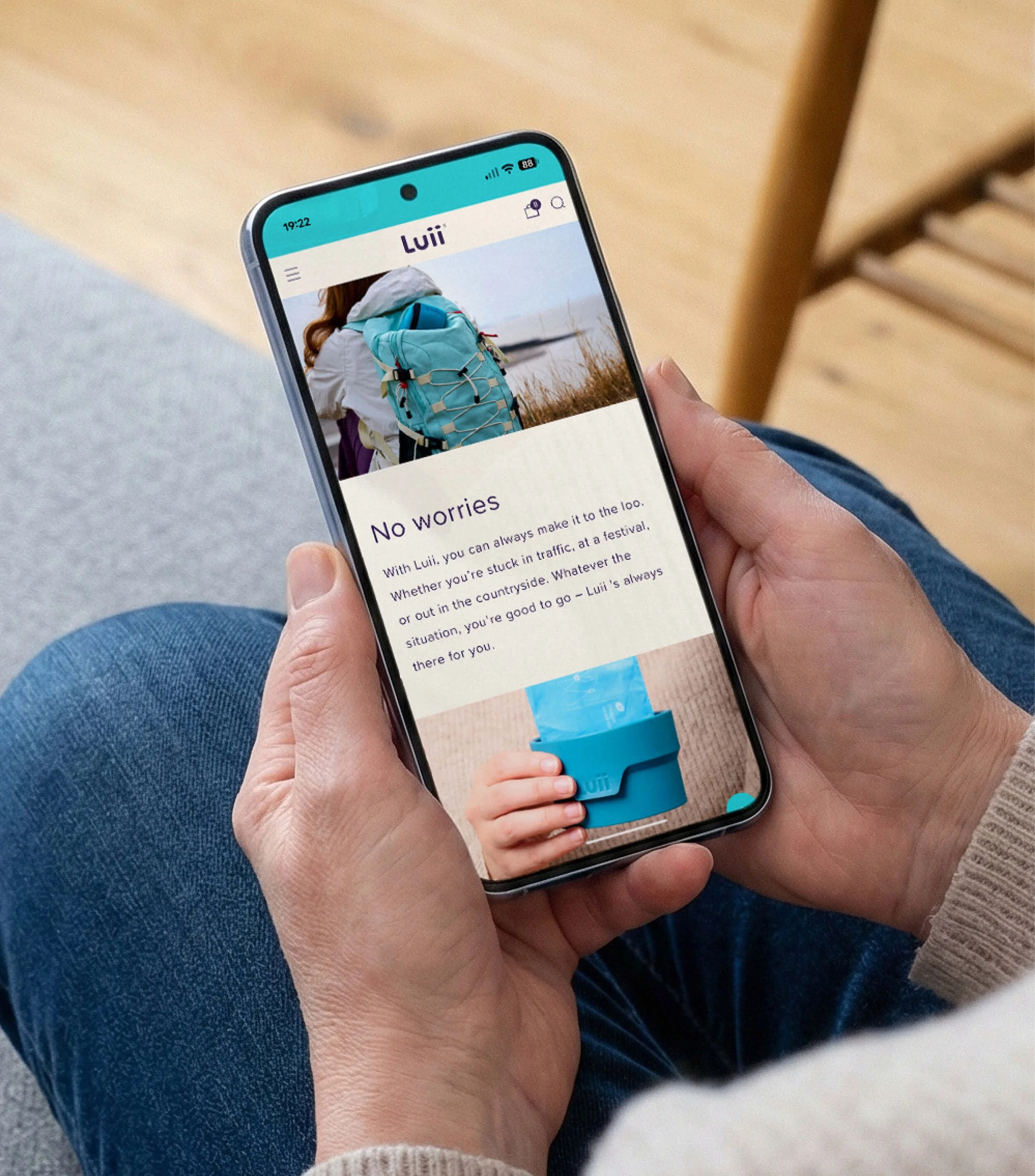
Photography completes the package. Studio shots demonstrate Luii’s design credentials and a thoughtfully briefed outdoor shoot illustrates headline adventures. Altogether, every aspect of this startup brand identity works together to nail the positioning, grab attention, unpack USPs – and put Luii in pockets. Making getting caught short a thing of the past.
Sector
Healthcare
Services
Visual identity
Verbal identity
Ecommerce website design
Art direction
Logo design
David Airey
Collaborators
Copywriting: Yarn
Illustration: Ryan Todd
Photography: Studio Lovely Jubley
Product Design: Tone
Website Development: MB Web
Press
Creative Boom: When the brief is to make a portaloo look cool, you'd better not bottle it
‘From day one Lark were determined to understand our products, markets, desired positioning and, importantly, our motivation, and develop a brand ID to suit.’
Keith Binding
Managing Director, Luii Limited
Hatching plans?
If you’re launching something new or refreshing an existing brand, we’d love to hear about it.
Similar projects