
Rapid IT — Brand Identity
A turbo-charged identity for a new IT solutions brand

Challenge
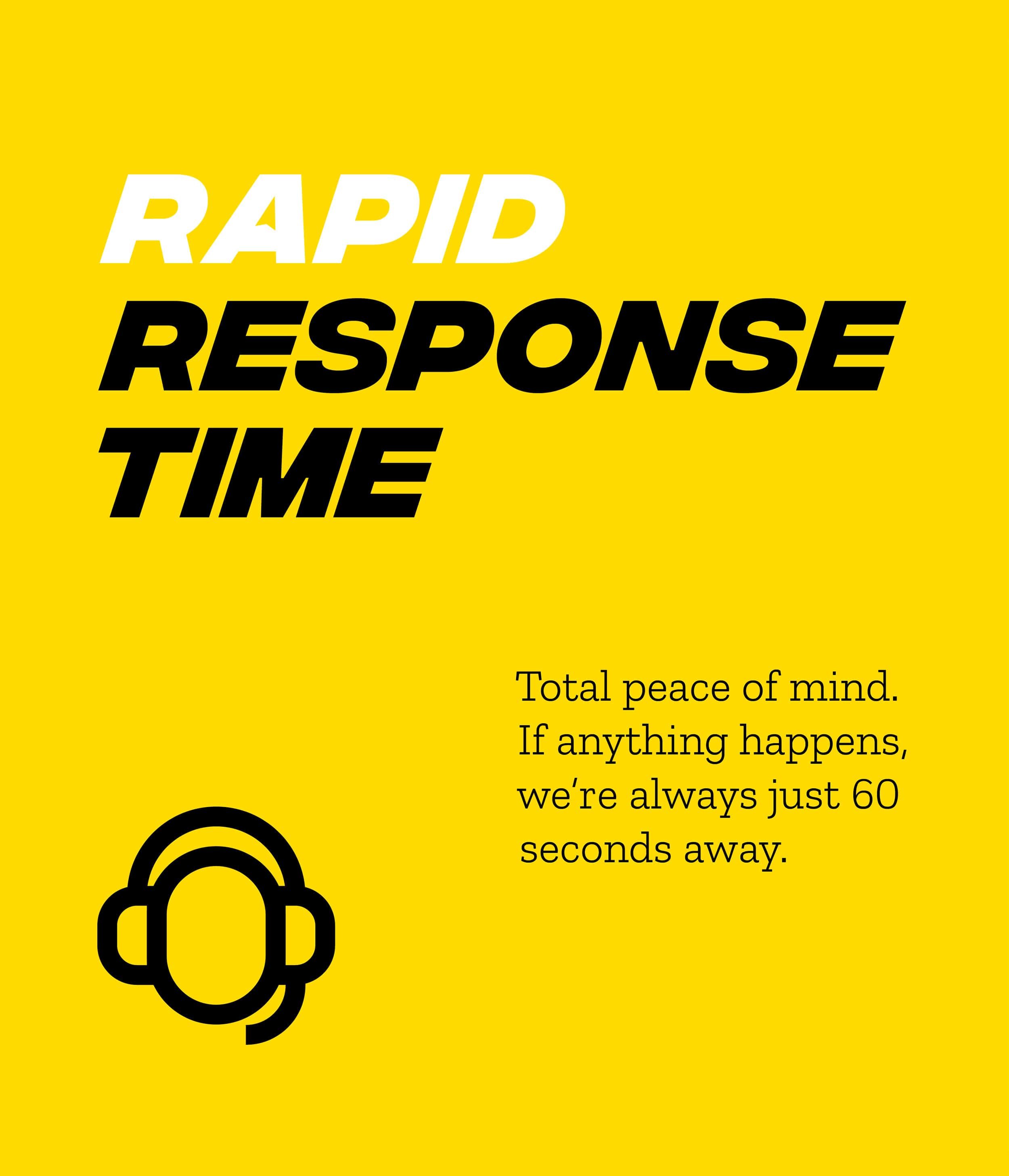
In the world of small business IT, slow is fatal. Rapid IT launched with a bold promise: live human support in 60 seconds, onsite help in under an hour. But to stand out in a sea of blue logos and buzzwords, they needed a brand that matched their name, and their speed.
Idea
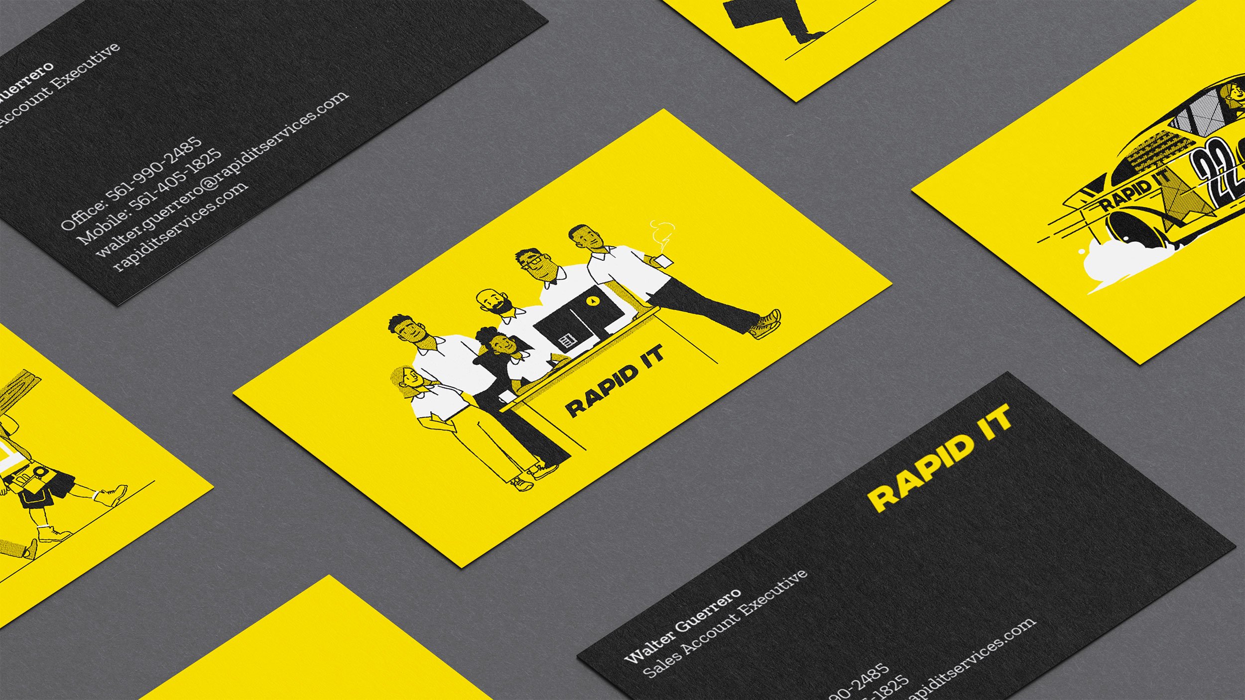
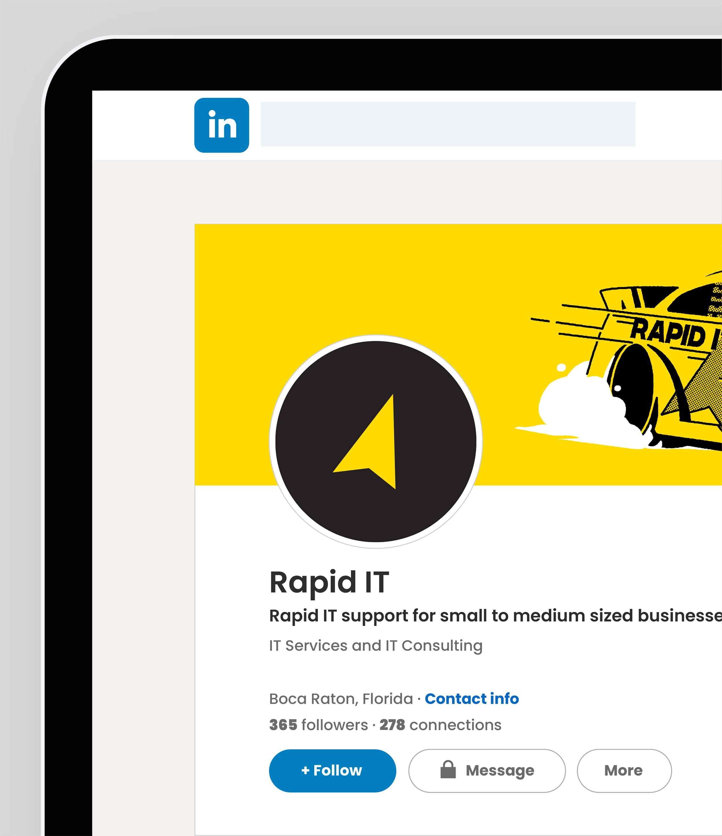
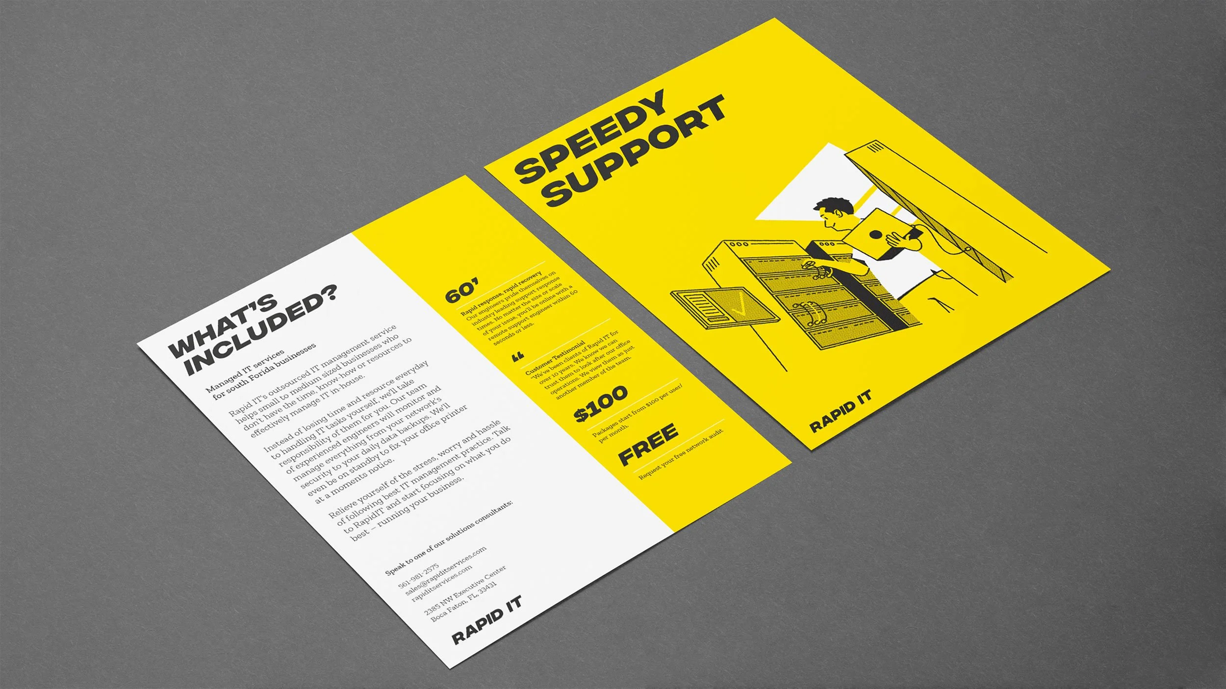
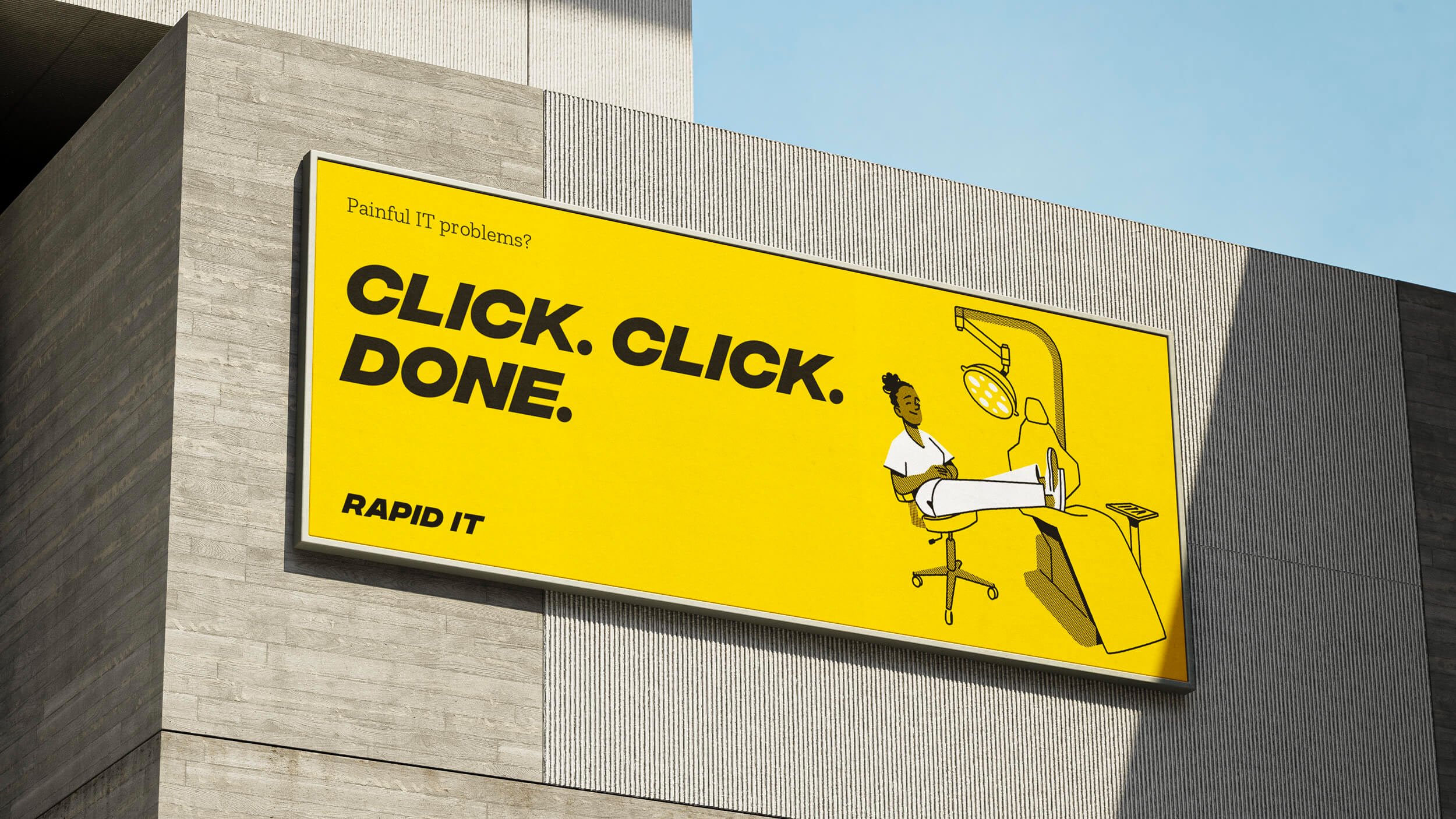
We built a brand that moves as fast as they do. The logotype leans forward, the cursor is built in, and the colour palette screams for attention – bright yellow where the competition leans safe. Typographic cues nod to Nascar. Icons are quick to scan. And the tone of voice? Snappy, straight-talking, and confident: Click, click, done.
To balance the urgency with some humanity, we introduced custom illustrations that show calm, capable teams fixing problems before they start. It’s fast, but it’s friendly.
Outcome
The result is a high-speed identity with stopping power. It’s bold, sharp, and full of personality. Built for a business that moves fast, solves problems, and makes IT support feel refreshingly simple.
Sector
IT Support / B2B Services
Services
Brand Identity
Tone of Voice
Illustration
Collaborators
Illustration: Joshua Callaghan
Copywriting: Mark Lawrence


“We are absolutely delighted with the both the experience and results of working with Lark. From initial brief to final delivery, they were the most professional, dynamic and fun design agency we have worked with. Communication throughout the entire process was flawless and they demonstrated a genuine commitment to getting underneath the skin of our brand and vision. From concept designs to idea development, deadlines were consistently met which helped us keep our re-brand project on track for a Summer launch. We couldn't be more pleased with the results and won't hesitate to recommend or use them again in the future.”
Harry Burton
Rapid IT
Hatching plans?
If you’re launching something new or refreshing an existing brand, we’d love to hear about it.
Similar projects

