
Ordnance Survey — Campaign Identity
A warm-hearted new direction for an iconic British brand

Challenge
Ordnance Survey’s Learning and Development team was launching a new internal programme – but the existing brand materials, while polished, felt distant. Designed with external audiences in mind, they lacked warmth and didn’t reflect the human values of the department. The team needed an identity that felt more like an invitation and less like an instruction.
Idea
We built a softer, more personable layer onto the existing OS brand. The creative solution introduced hand-drawn illustrations, bespoke icons, and subtle patterns to give the materials a friendlier, more engaging tone, without losing the professionalism of the core brand. It was a visual shift from ‘corporate directive’ to ‘trusted guide’.
Outcome
The result was a warm-hearted, people-first identity that employees actually noticed and engaged with. Visually distinct but still unmistakably OS, the new materials helped the L&D team communicate their purpose more clearly and foster a stronger connection with their colleagues. Familiar, but refreshed.
Secor
Government / Internal Comms
Services
Internal Branding
Illustration
Visual Identity
Collaborators
Illustration: Nicola Robson
Animation: James Robertson

We worked with all the core components of the brand, including the colour palette and typography. OS Gill has been used on Ordnance Survey maps for almost 100 years — so it obviously wasn’t going anywhere. For Learning and Development, we used two weights: Regular and Light.


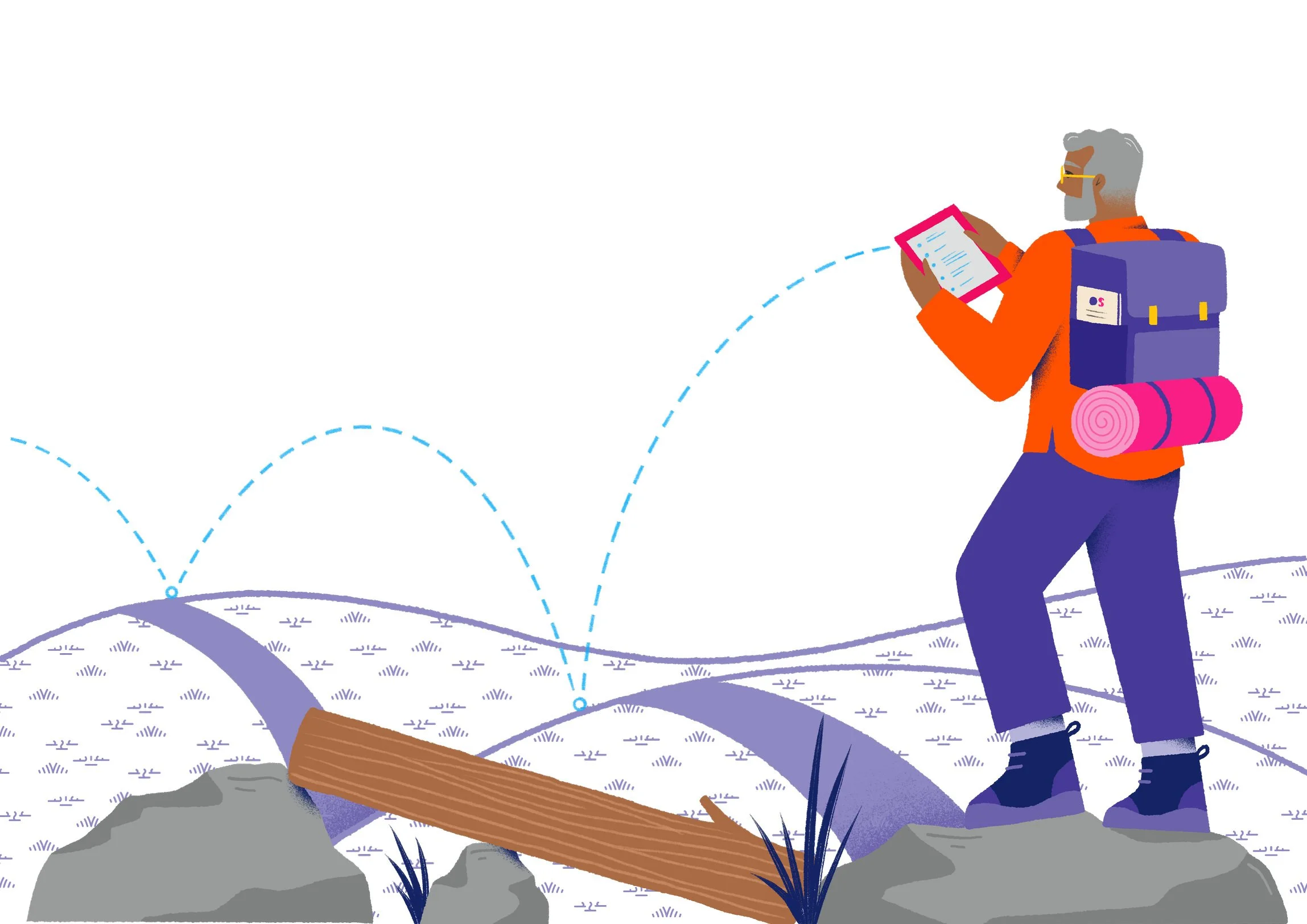
To give the department something they could own, we created bespoke patterns inspired by OS map keys. Contour lines, forests, marsh lands, and loose rocks became distinctive new assets that can be used at multiple scales and in a range of bright, poppy colours.


These new patterns add interest to a whole range of applications. Where previously the department might have used a plain sweep of colour, we can now introduce subtle branding — everywhere from mugs and tote bags to web banners and backgrounds.

The patterns show up in our bespoke illustrations, too. We commissioned illustrator Nicola Robson to create a series all about people, and worked closely with the Learning and Development team to decide how best to represent their services. Some illustrations use apt outdoorsy metaphors to reflect the development journey, showing people climbing, searching, and exploring. Others show them working, talking, and learning. And they’re all full of heart and character.


We rounded out the department’s ownable assets with a new set of icons. These fit neatly into the existing icon suite of the wider OS brand, but reflect specific Learning and Development concepts that will help the team to better communicate their services.
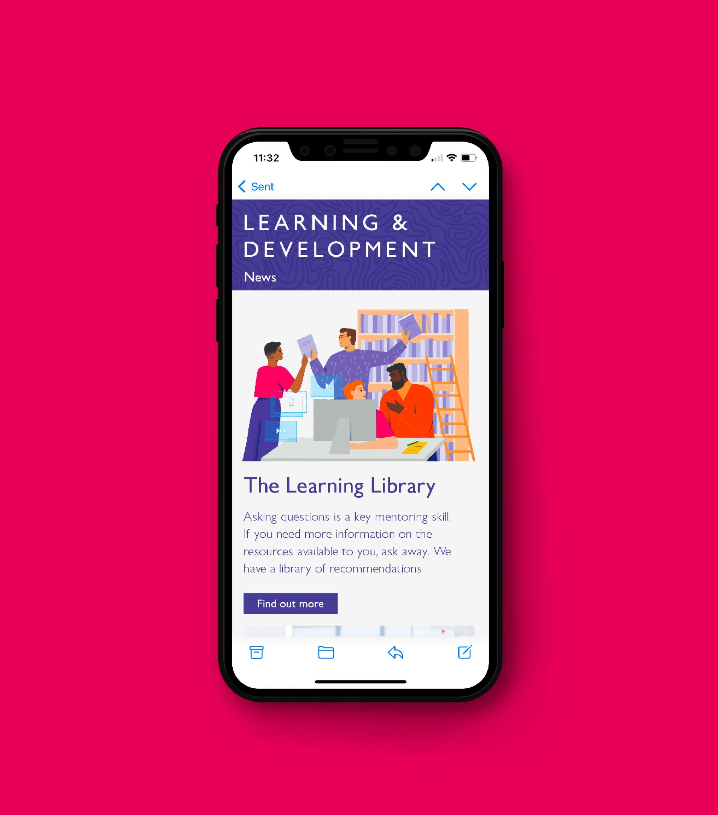


To point the team in the right direction, we compiled a set of guidelines and designed mentoring guides, documents, presentations and templates. And the brand extension has already been a hit. So much so that the HR department asked us for illustrations promoting their sustainability initiatives, too.


“We initially reached out to Lark for support with an internal Learning & Development brand identity. What they have achieved is above and beyond our initial brief. They incorporated our company brand guidelines and delivered eye catching illustrations, simple icons, easy to read tools and recourses as well as considered what people know OS for – maps and the outdoors – and with this, taken map icons to create bespoke patterns we can use for banners or backgrounds on documents. We love what has been delivered and wouldn’t hesitate to work with Lark again in future!”
Emma Hopkins
Learning Specialist, Ordnance Survey
Hatching plans?
If you’re launching something new or refreshing an existing brand, we’d love to hear about it.
Similar projects

