Remore Steading — Brand Identity
A visual identity rooted in the Highlands

Challenge
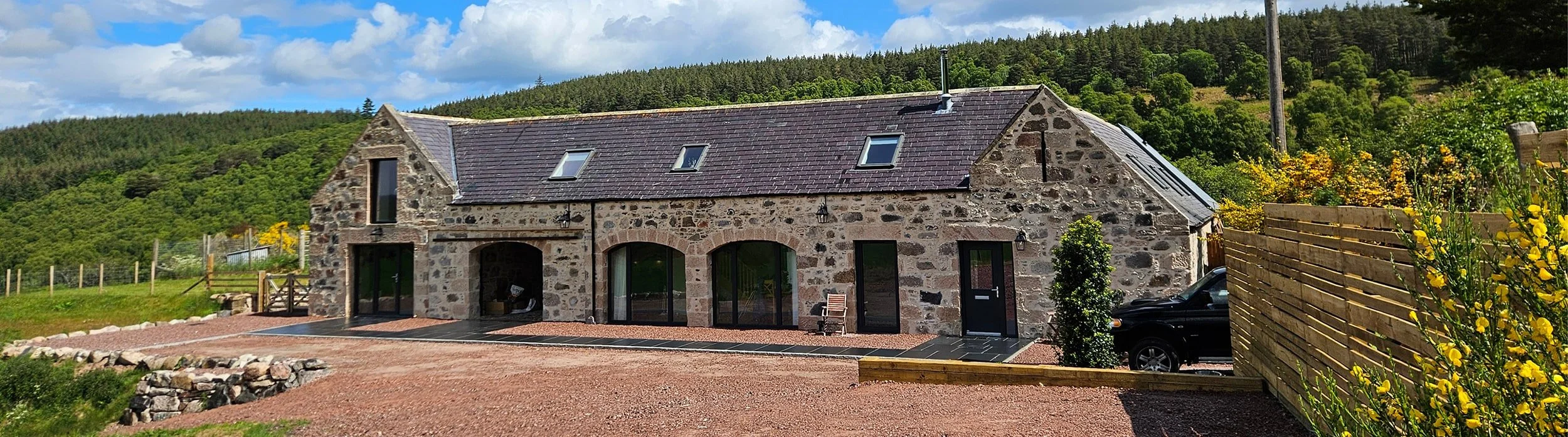
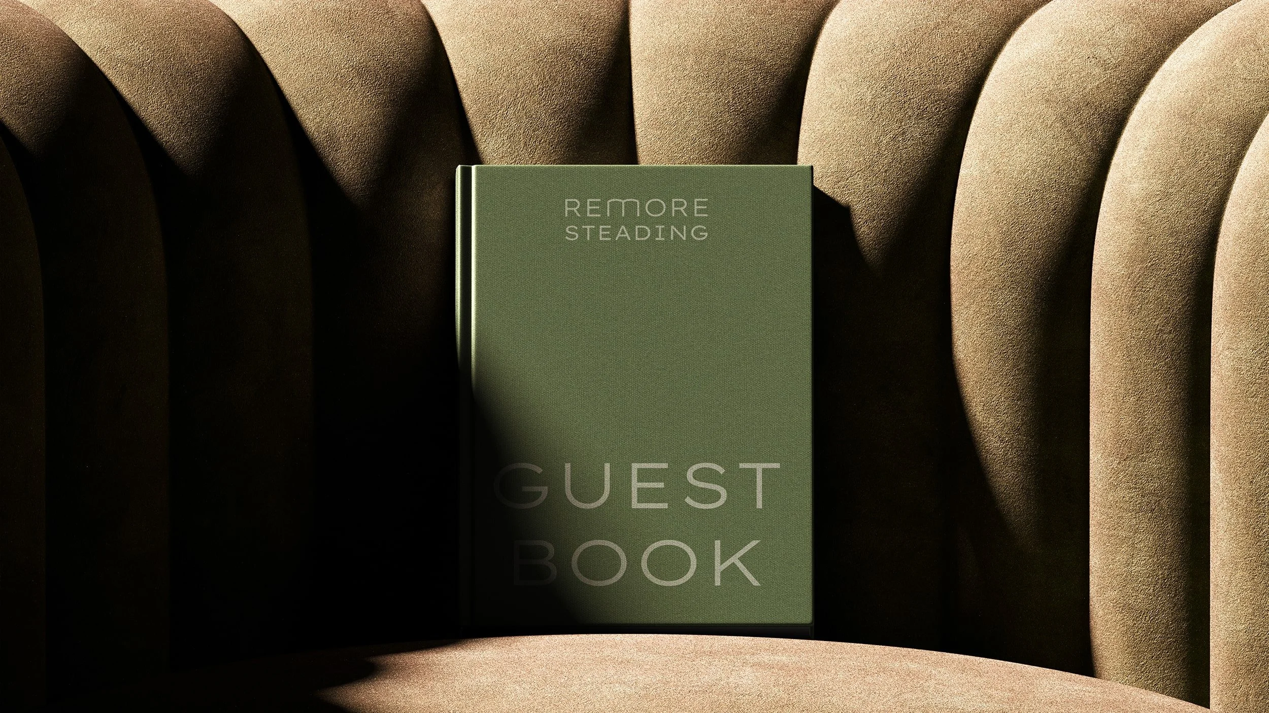
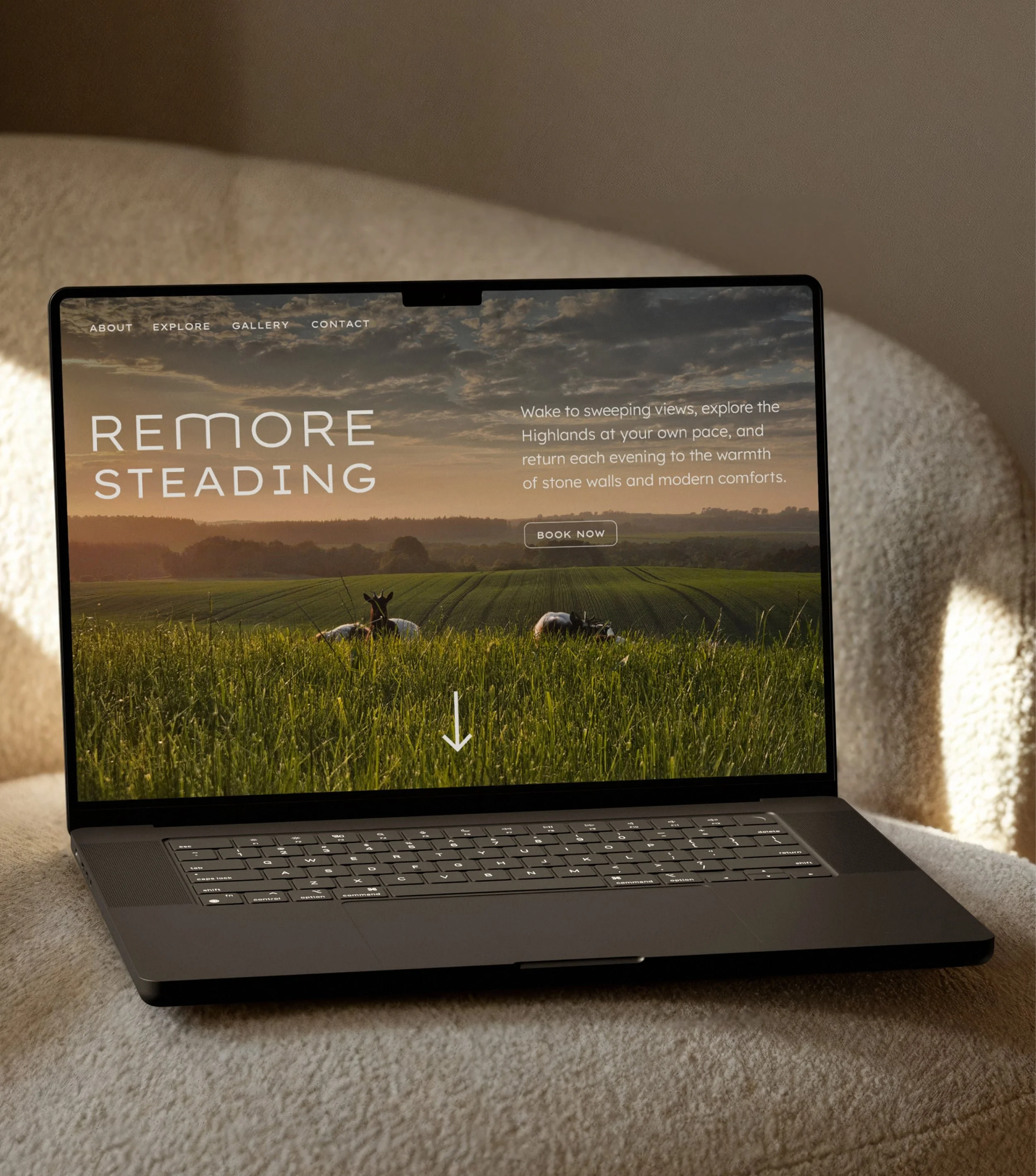
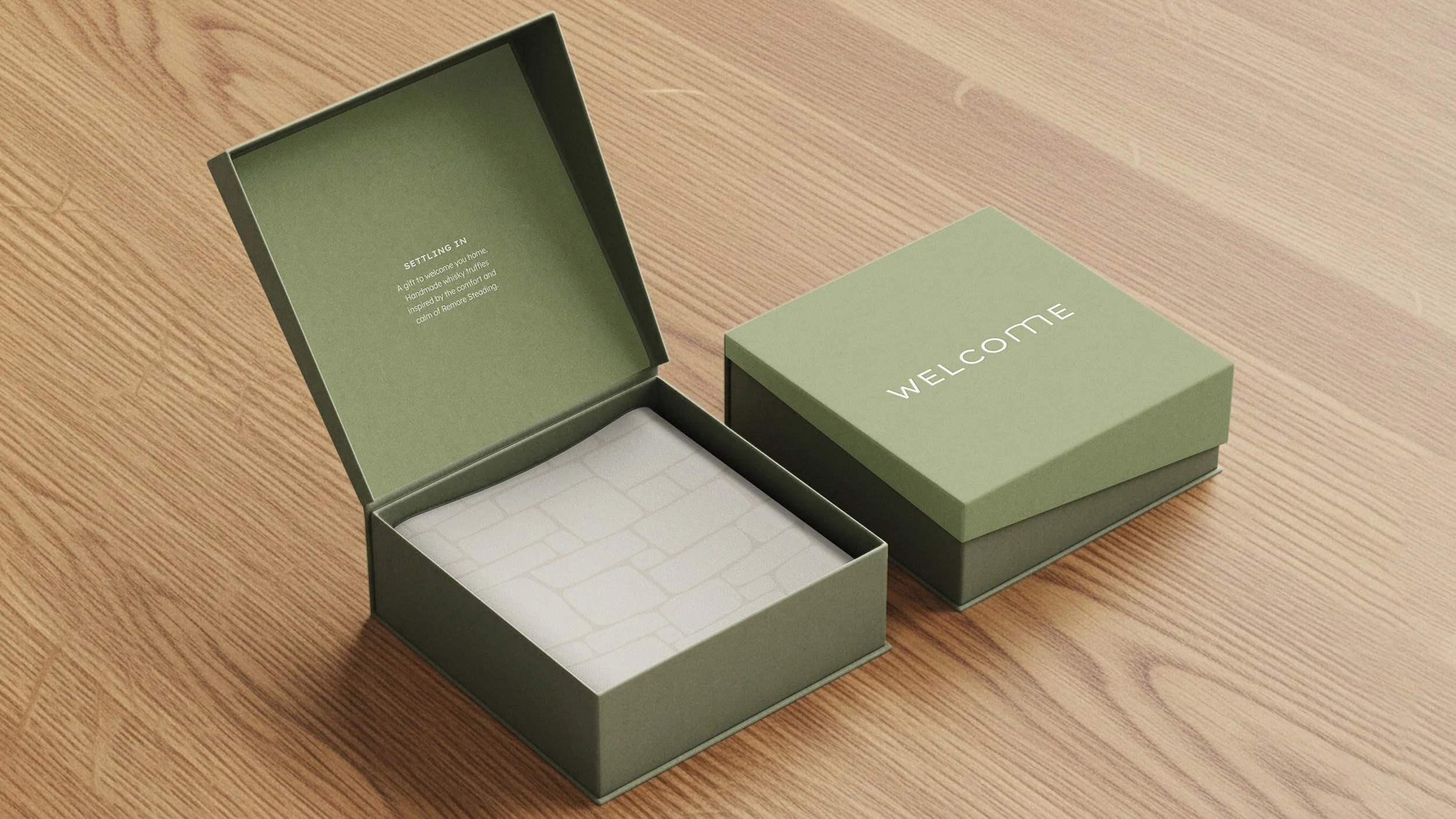
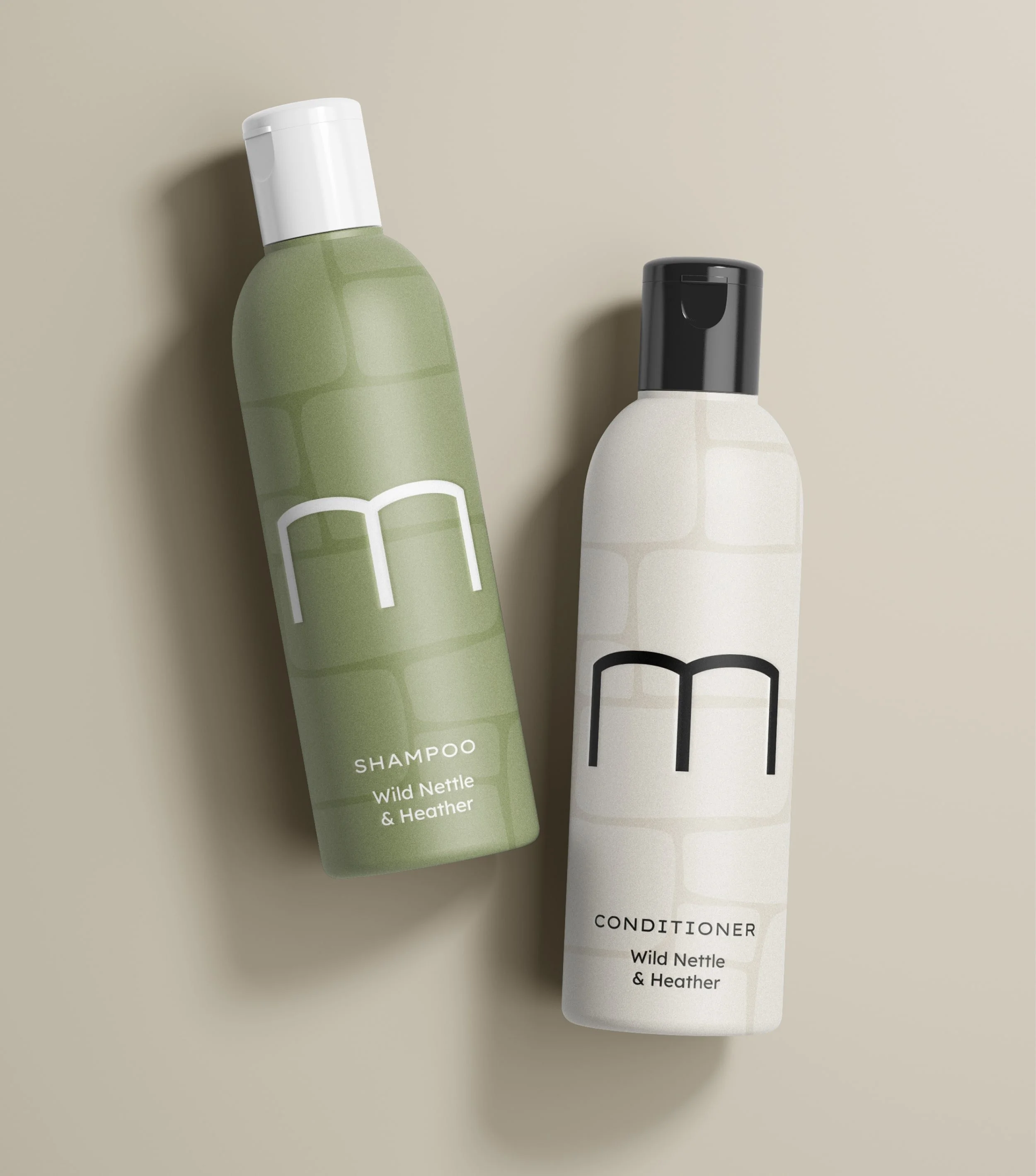
Remore Steading has stood in the Scottish Highlands since the mid-1800s, a solid stone building surrounded by green hills and open sky. When Helen and James bought the property in 2021, they began a careful renovation, turning the former steading into a warm and welcoming home. They wanted an identity that felt just like the building itself: understated, enduring and confident.
Idea
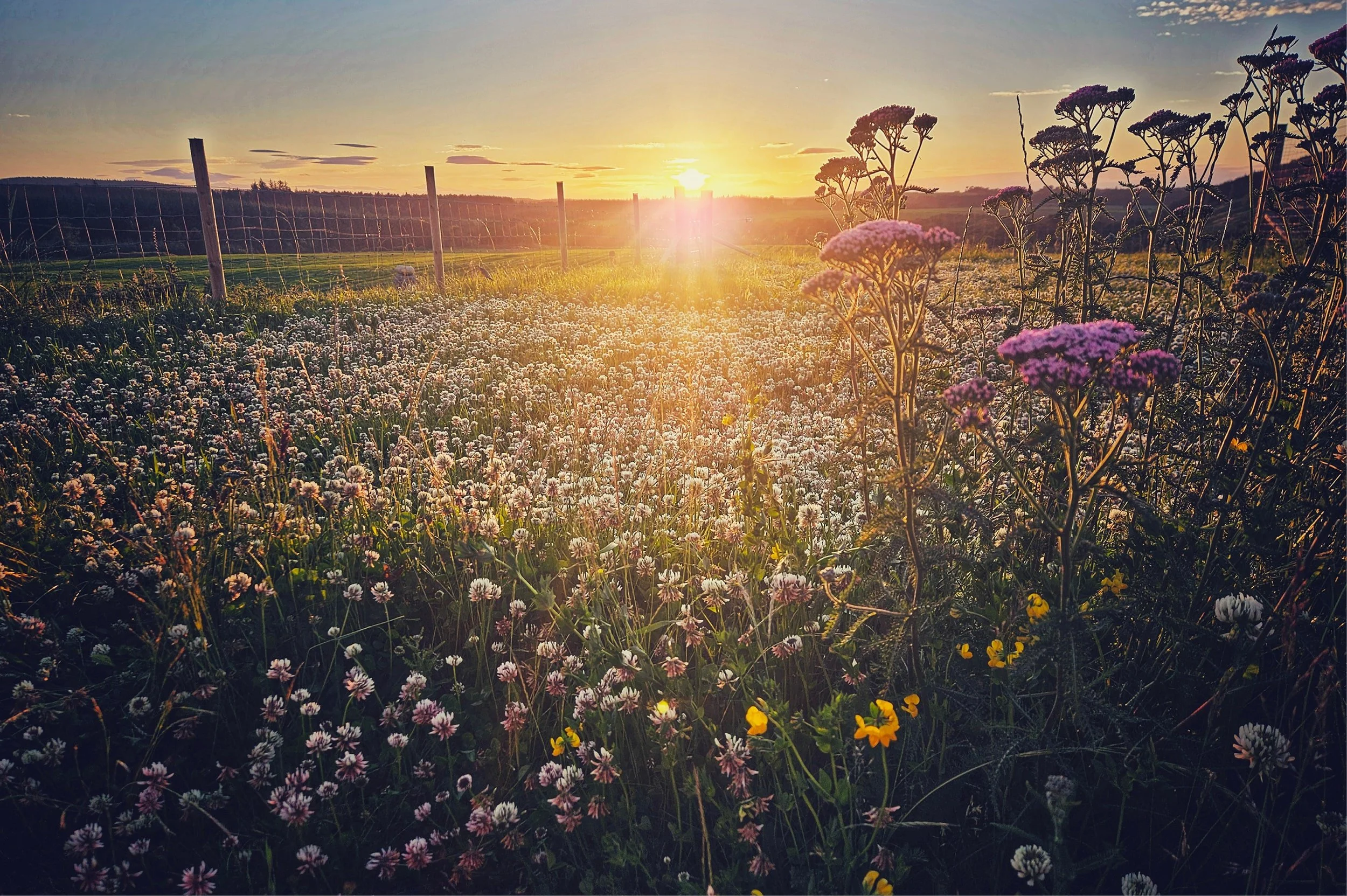
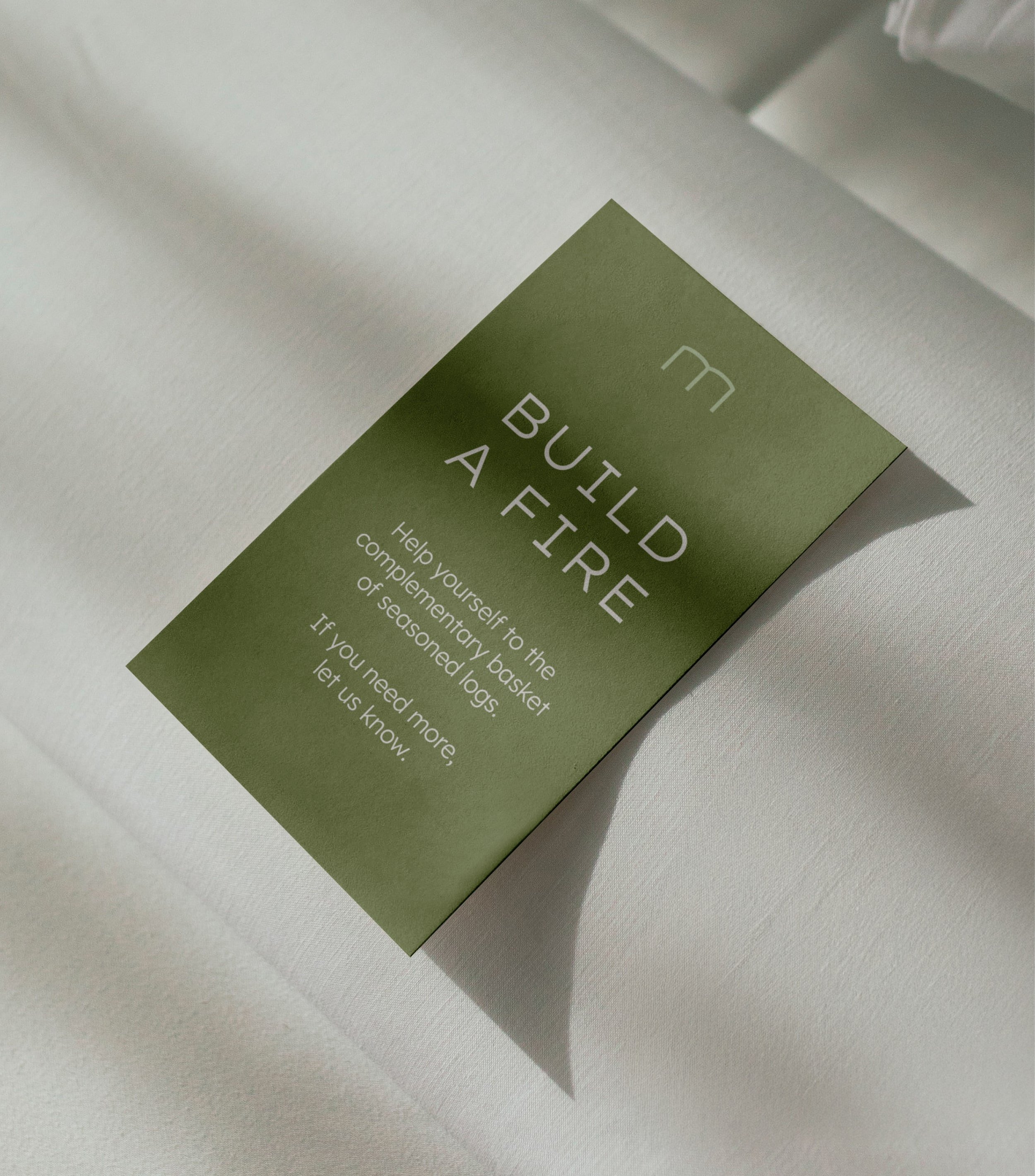
The design takes inspiration from the steading’s distinctive arched windows, making them the foundation for the logo. The palette draws directly from the place itself. Muted tones of stone, timber, slate and Highland greenery. Every element was designed to feel grounded and timeless, reflecting the care and craftsmanship that went into the renovation.
Outcome
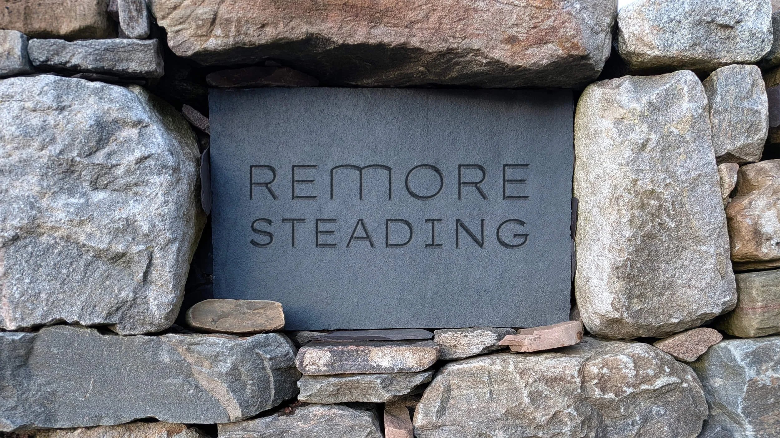
A simple, characterful identity that feels completely at home in its setting. Caturing both the heritage of the building and the calm, modern comfort of its new life. A visual identity as enduring as the stone walls of Remore itself.
Sector
Property and Interiors
Services
Brand identity


“We had a fantastic experience working with Lark. Communication was clear and timely throughout, and they genuinely listened to the story and feeling we wanted the identity to reflect. They responded to feedback brilliantly and delivered a beautiful final design that we really love. Would highly recommend for future projects.”
Helen Amos
Remore Steading
Hatching plans?
If you’re launching something new or refreshing an existing brand, we’d love to hear about it.
Similar projects