England Lacrosse National Schools Championships — Campaign Identity
A new visual identity 82 years in the making
Challenge
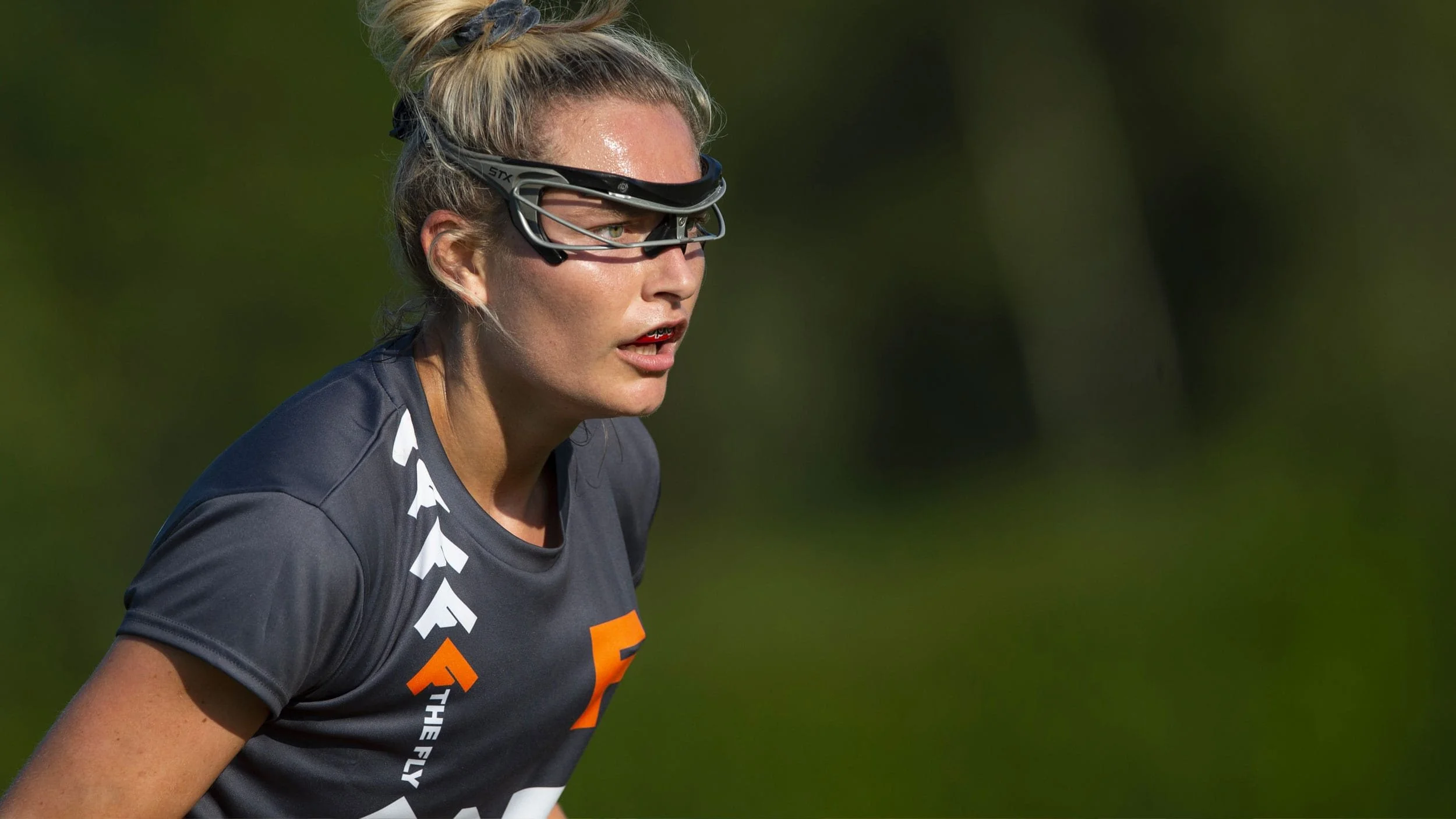
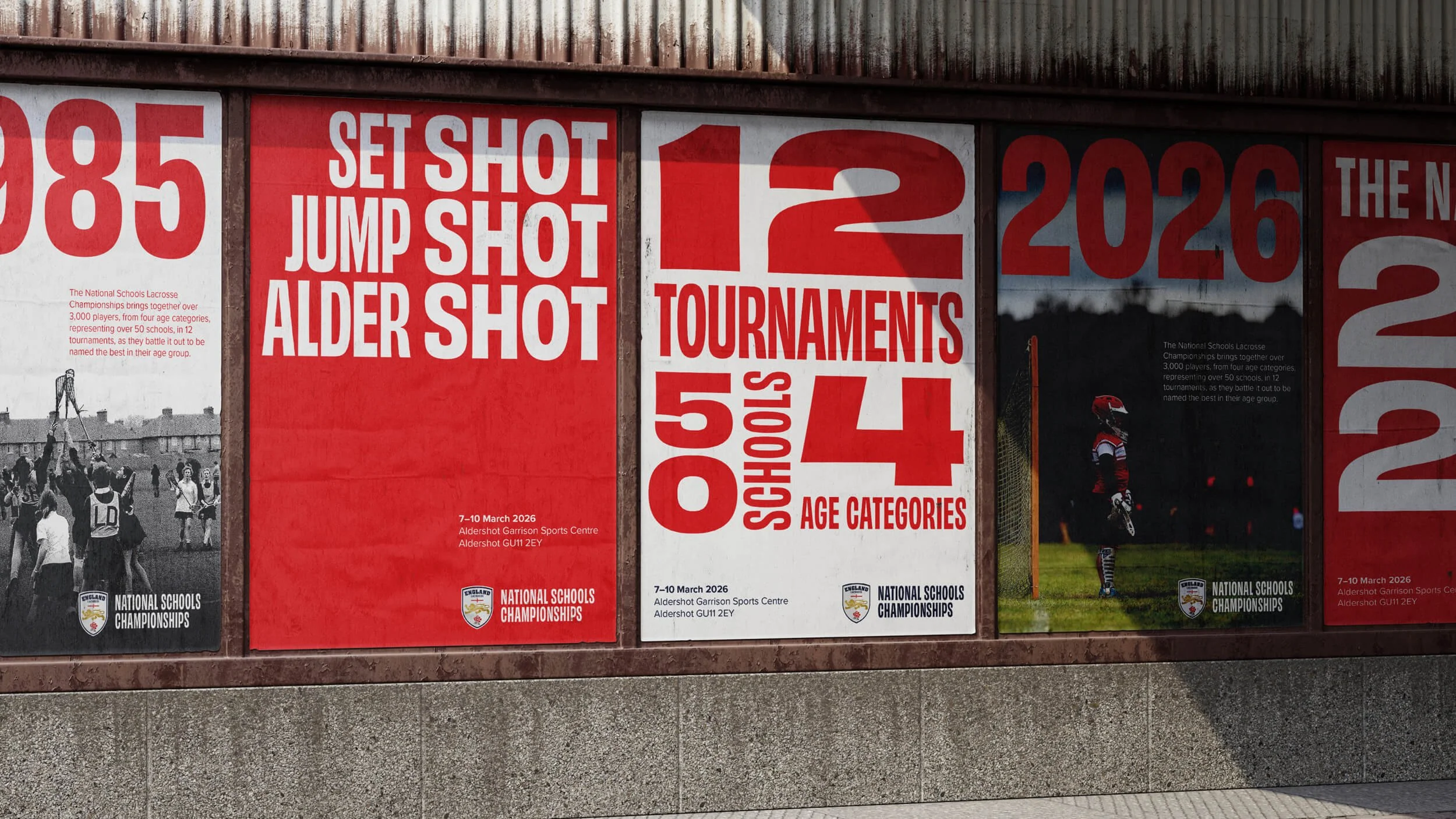
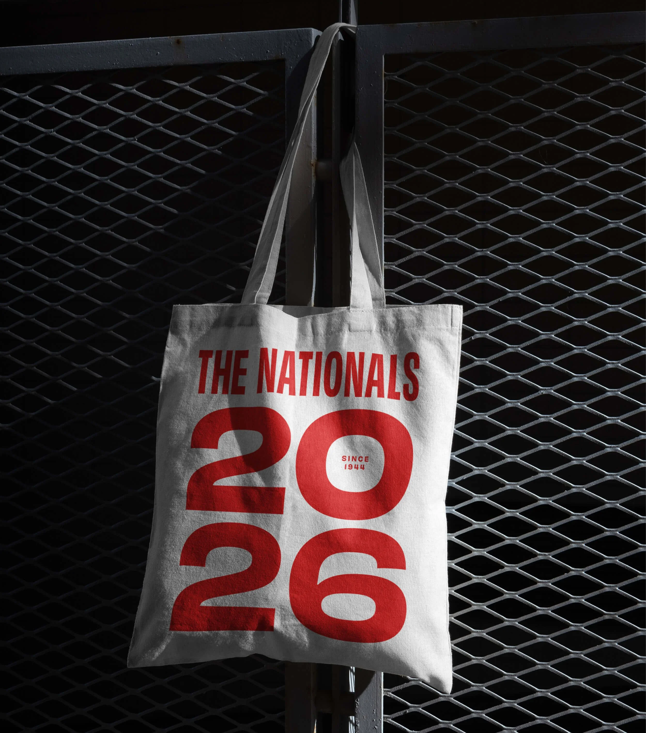
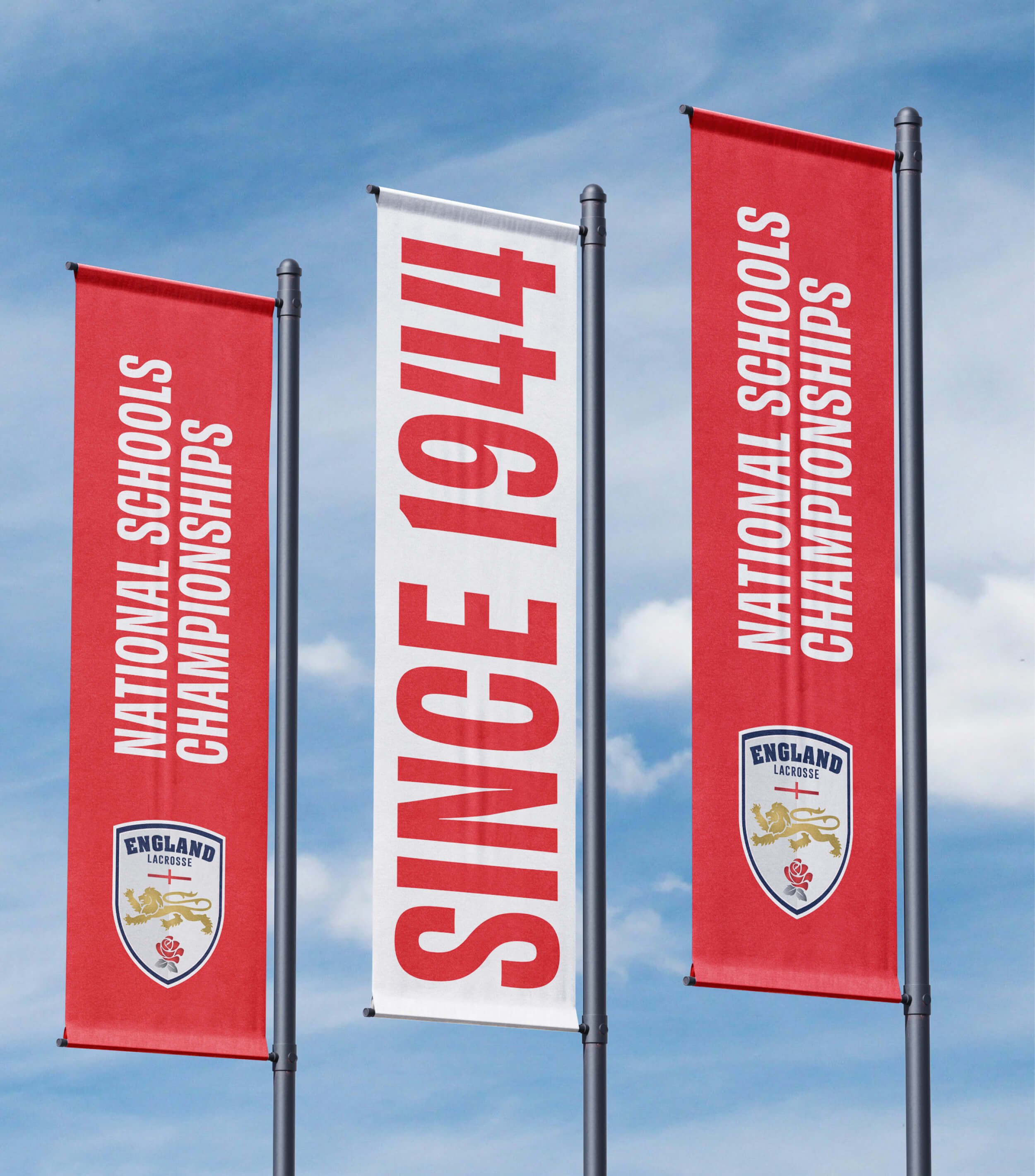
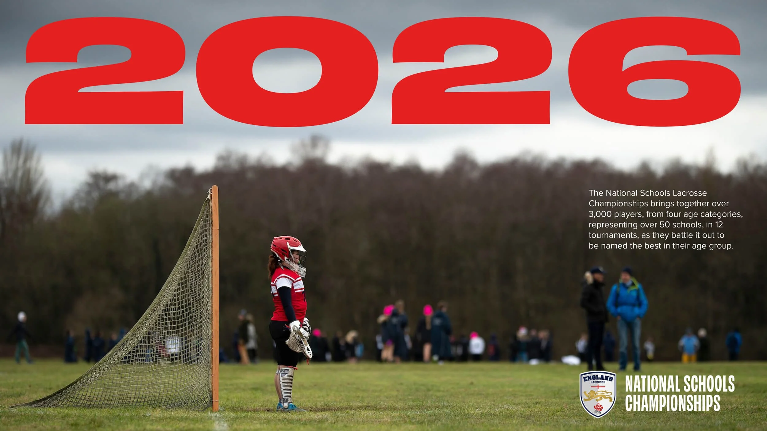
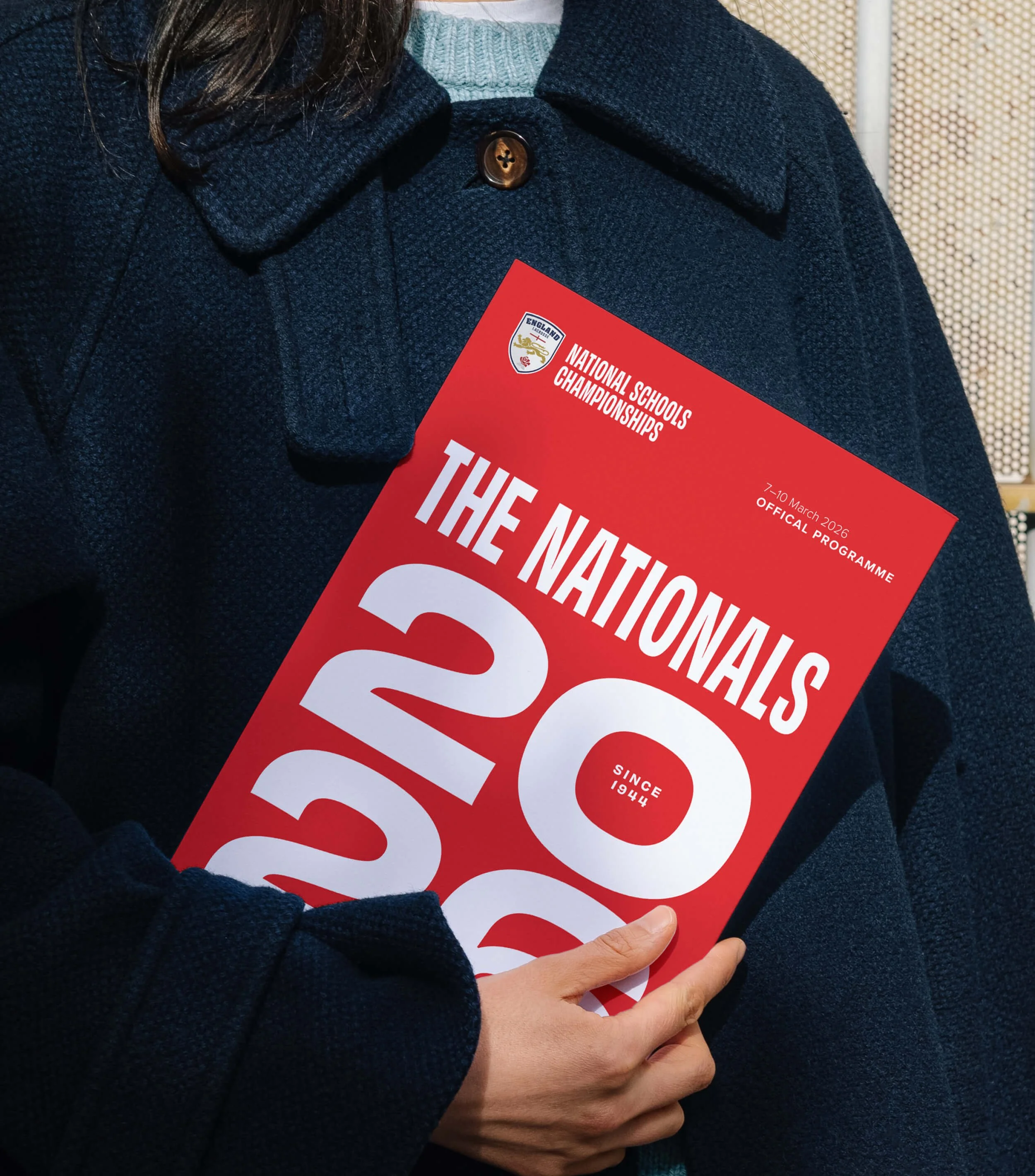
Lacrosse players don’t talk about The National Schools Lacrosse Championships. To them, it’s just The Nationals. The massive annual event brings together more than 50 schools and 2,500 players to battle their way to the top of their age group. But despite 82 years of unmissable tournaments, England Lacrosse had never given the championships a proper, punchy identity to match the name. Until now.
Idea
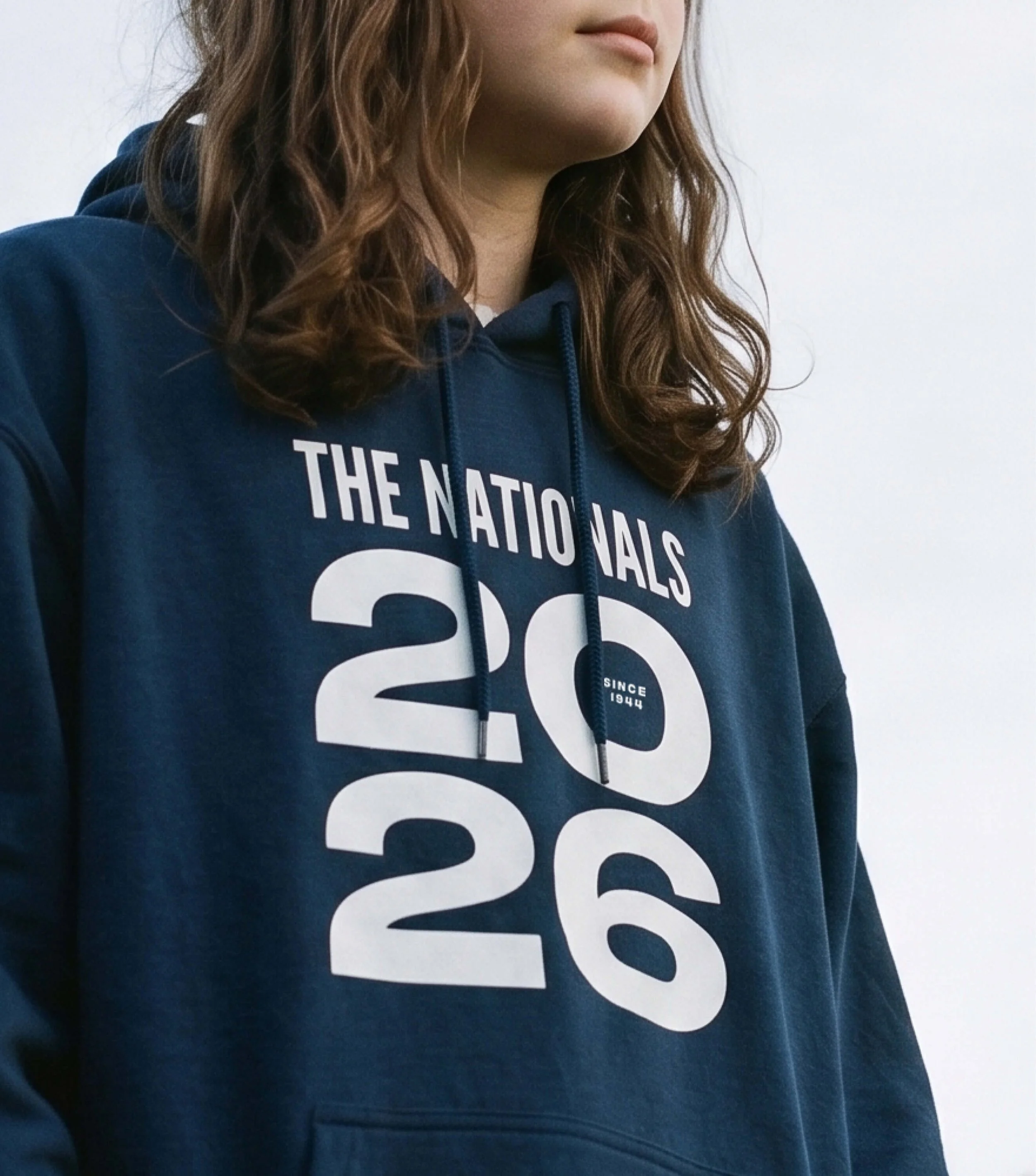
The new look and feel had to align with and extend our work for Aspire. That meant bold, fresh and exciting. Something rooted in the competition’s heritage that captured the speed and energy of lacrosse and – crucially – appealed to the under-19 players. Because this identity wouldn’t just live online. It would roll out across all the official merchandise. And we wanted every player to wear their time at The Nationals with pride.
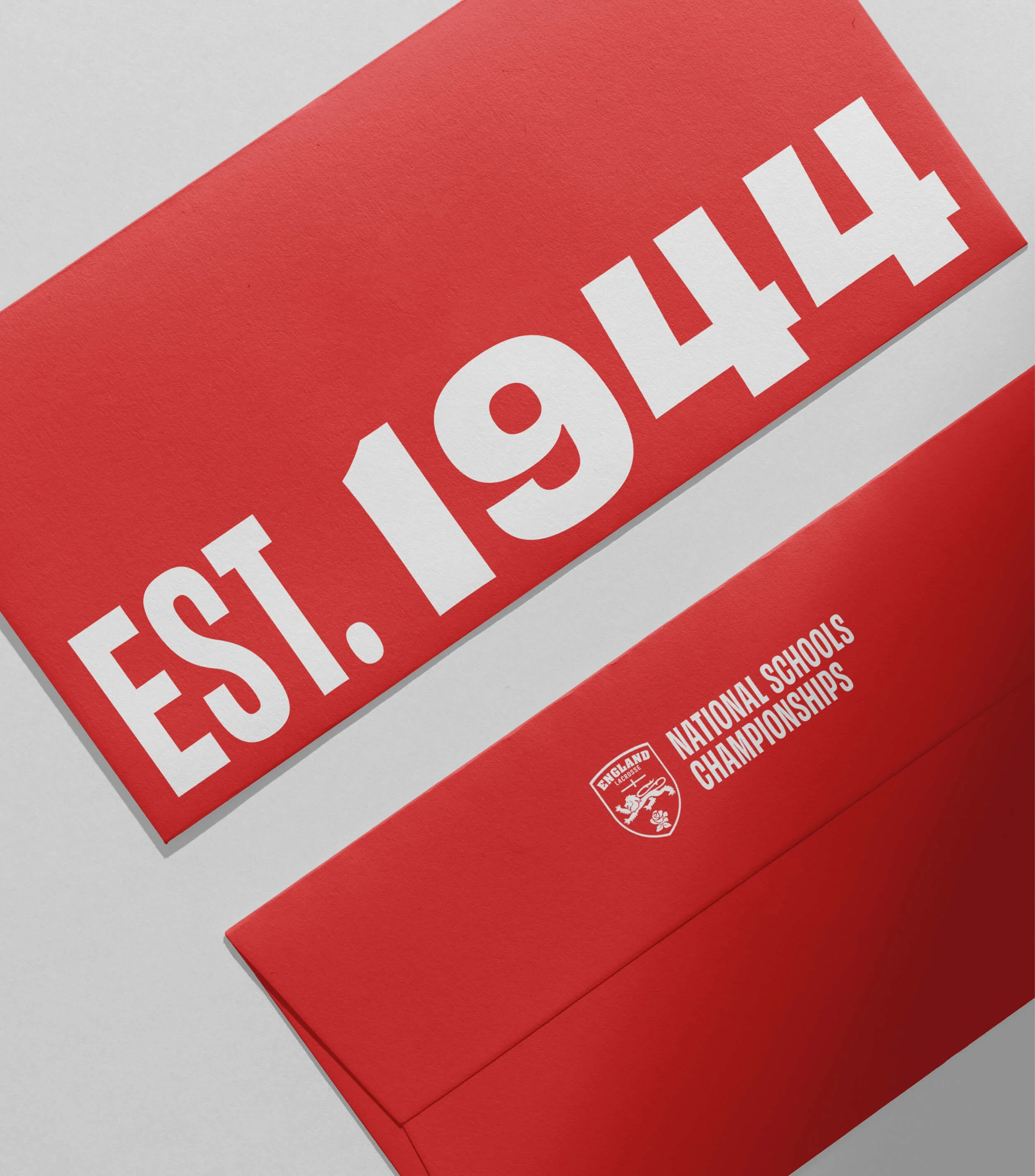
Outcome
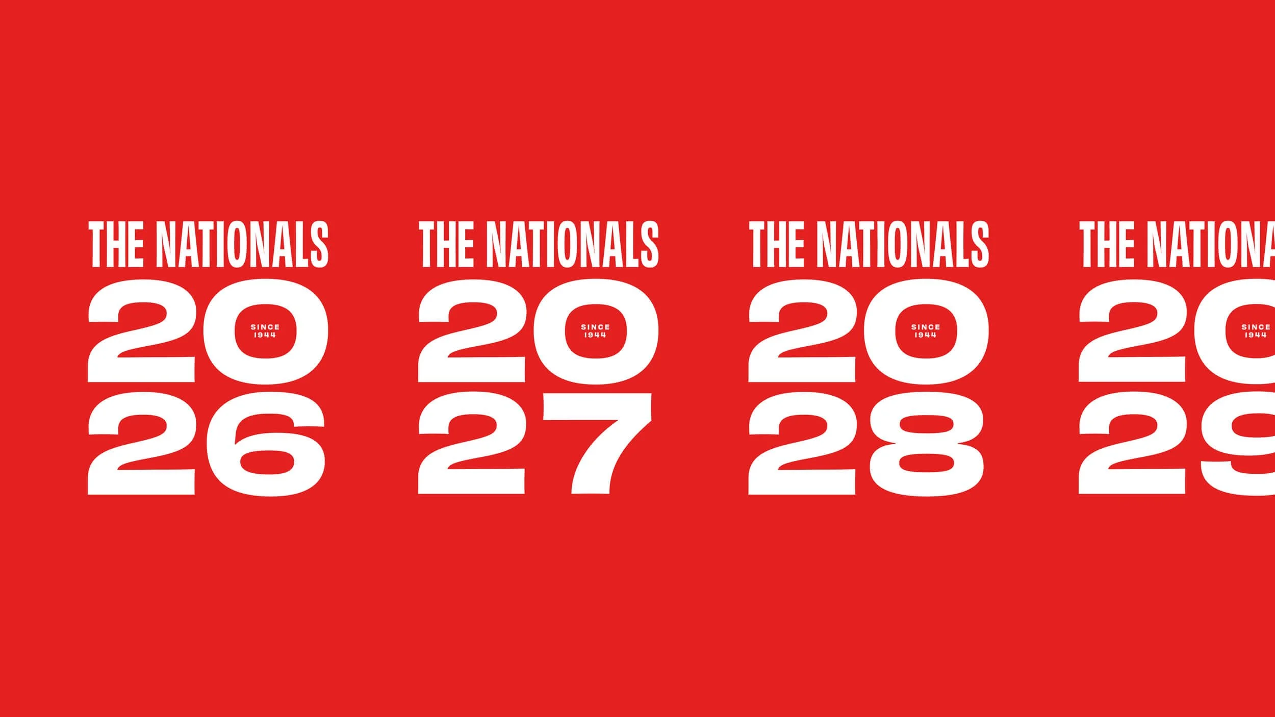
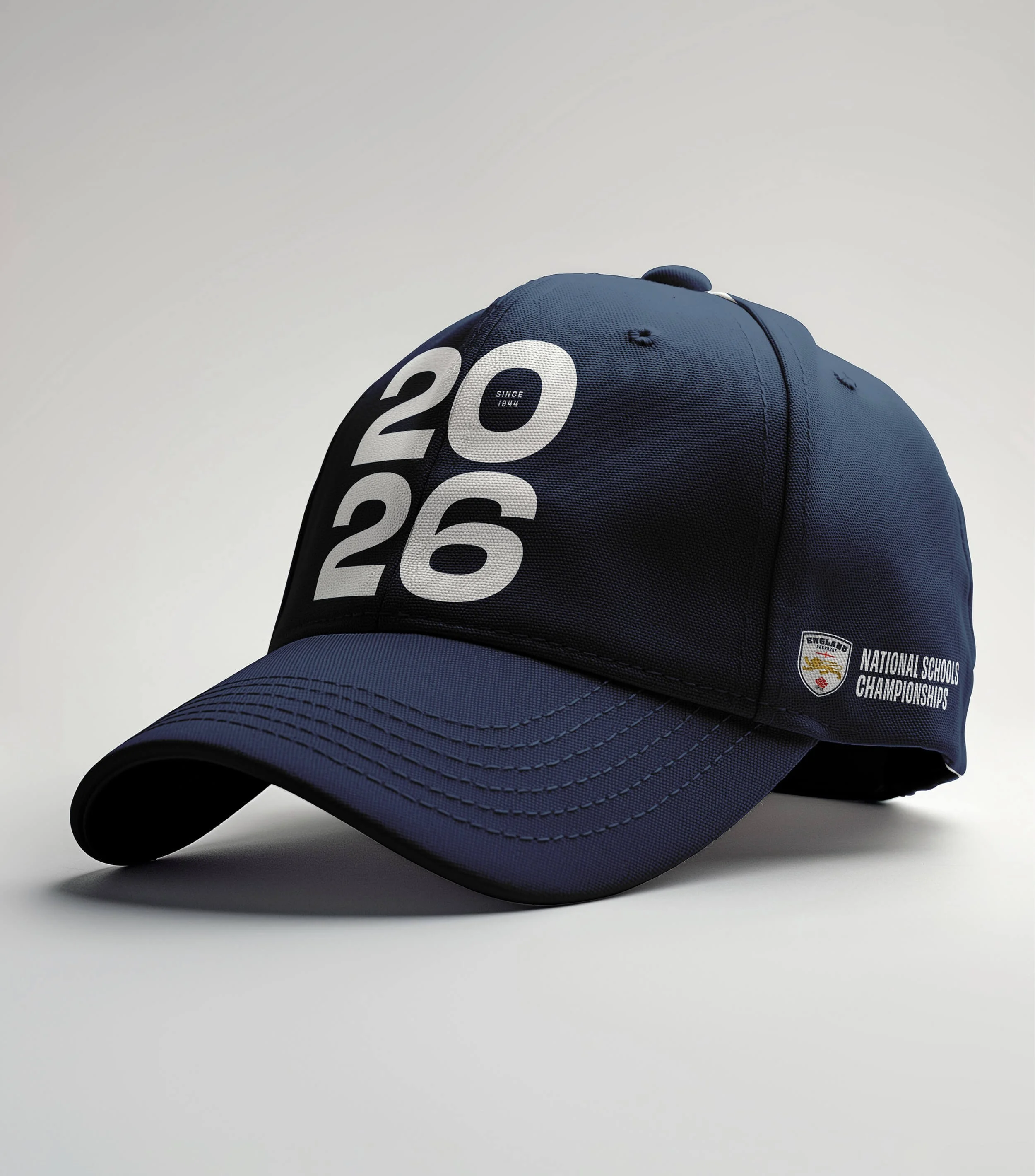
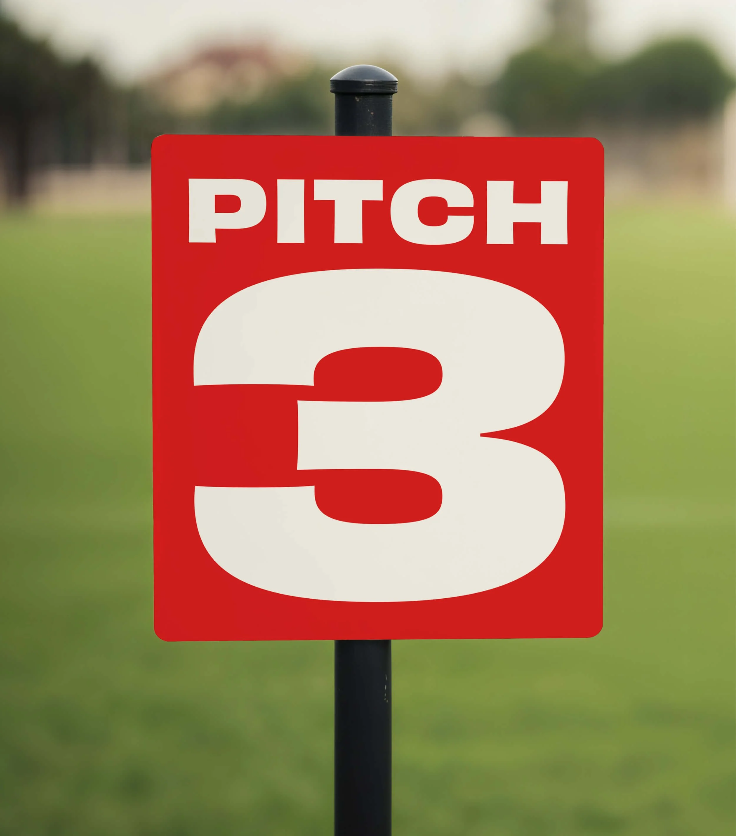
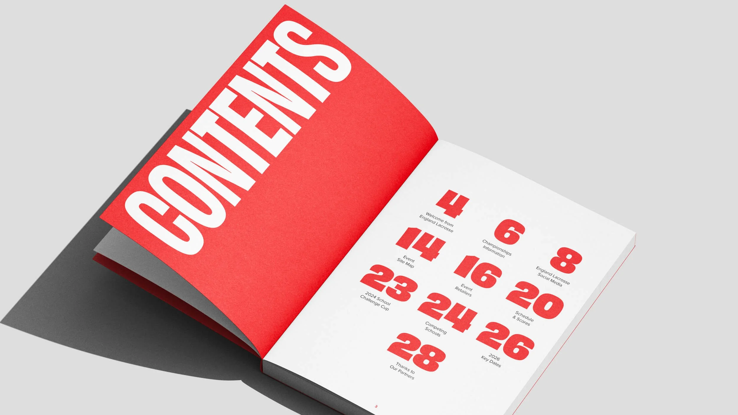
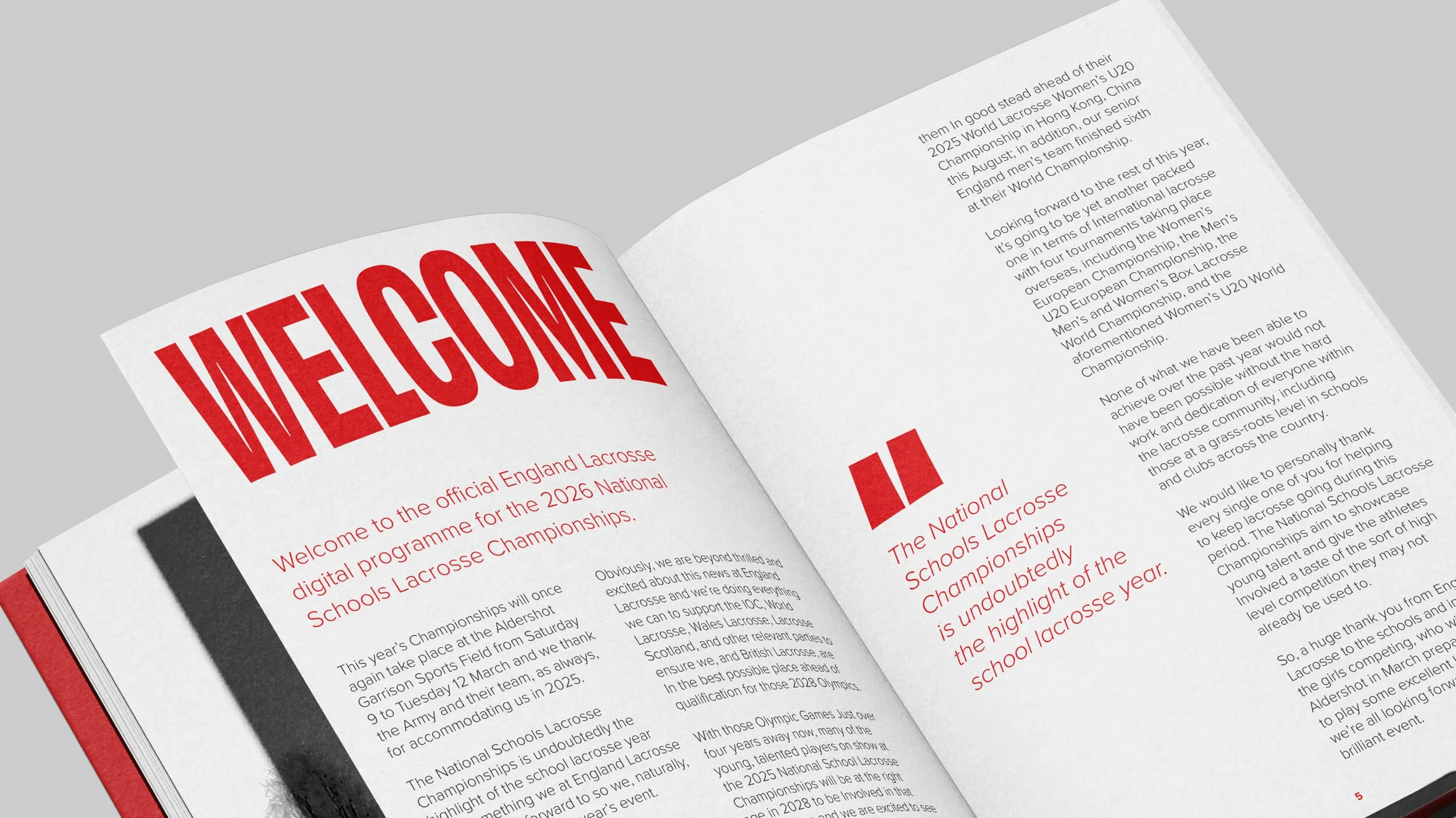
The new typography-led identity is poppy and energetic. Picked out in punchy English red and white, words and stats converge on page and screen just like schools on the field. We took special care over the design of the yearmark, making it easy for the in-house design team to update while sticking to the direction. And we teamed the striking typography with incredible England Lacrosse photography and archival imagery, creating a contemporary identity that celebrates and elevates The Nationals – present and past.
And the merch? The customisable t-shirts, hoodies, sweats and more are now must-have teamwear players will love to show off. Leavers’ hoodies, eat your heart out. Anyone can finish school. But this girl played in The Nationals.
Sector
Sport / Youth Development
Services
Branding
Print Design


Hatching plans?
If you’re launching something new or refreshing an existing brand, we’d love to hear about it.
Similar projects