Wottz — Brand Identity
A powerful visual identity plugged into the details
Challenge
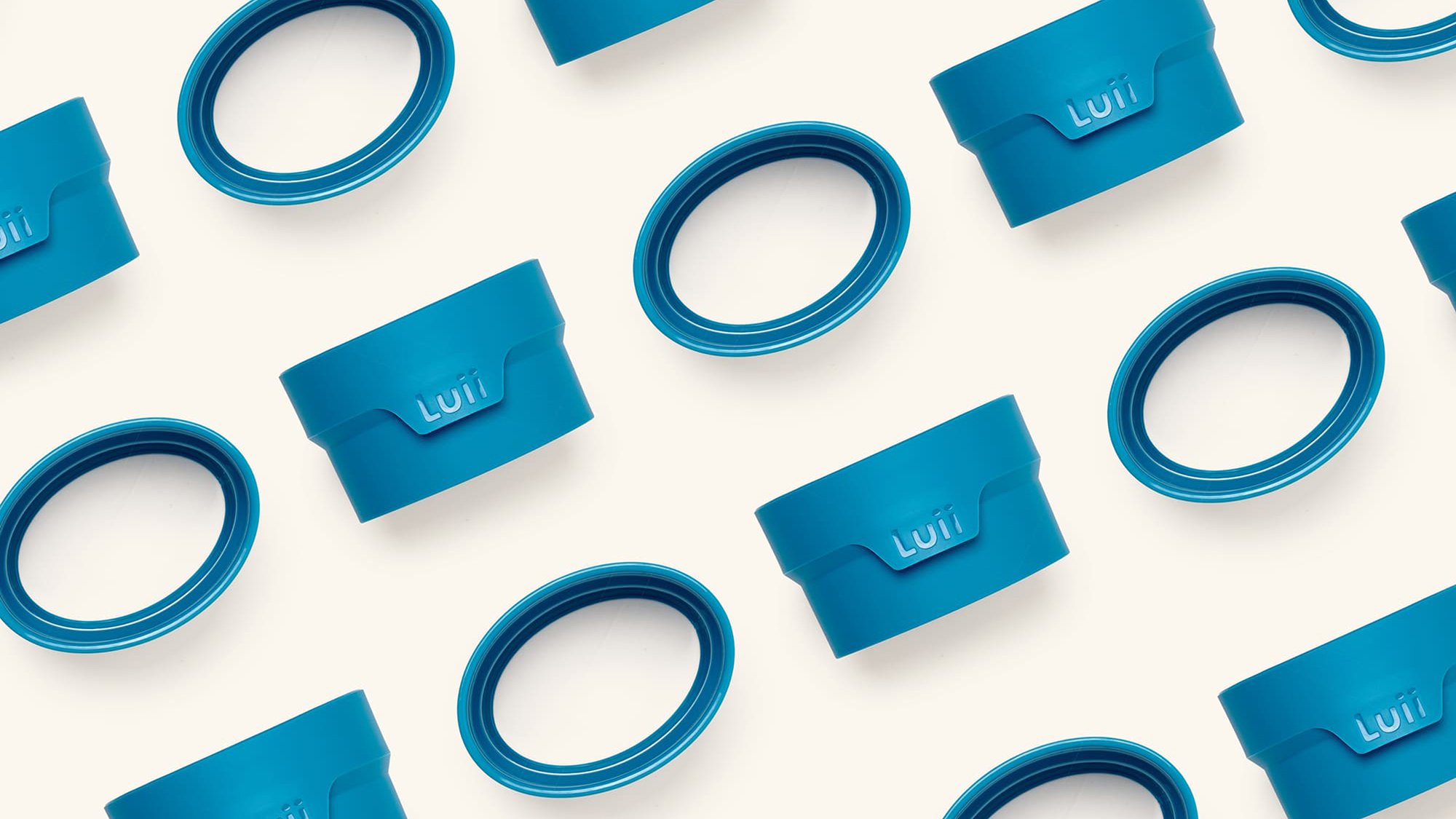
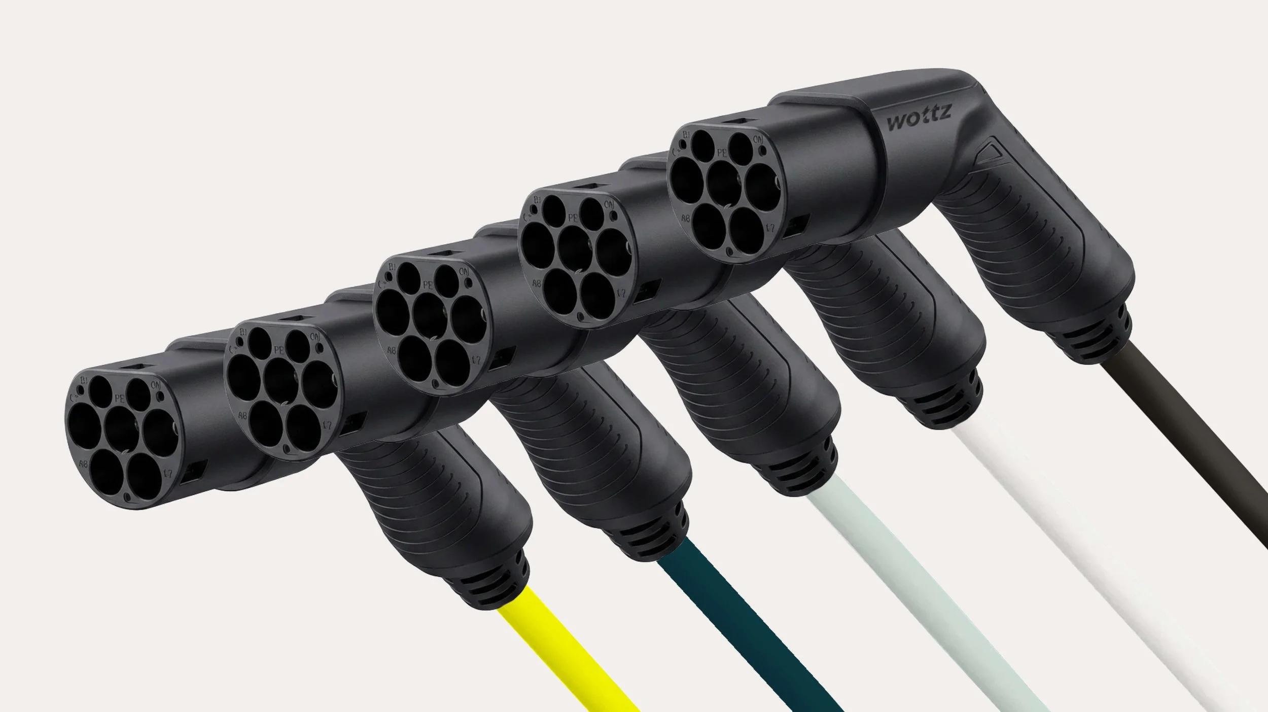
Wottz makes cables. Really, really good ones. They manufacture a range of fully customisable, properly tested AC EV cables and chargers – all built to order for each customer’s exact setup. They’re obsessed with what they do and dedicated to their customers, who range from everyday drivers to big commercial fleets. It’s a premium proposition stacked with deeply technical expertise. It was our job to make it feel that way.
Idea
The smart, contemporary and recognisably ‘EV energy’ of the brand name was a great foundation. We wanted our visual brand to be equally clever – and equally simple. It had to feel fresh, but like a trusted British brand. Techy, but not like a clinical startup. And led by their ‘Built with Obsession’ strapline, we needed to bring through their single-mindedness, drive to iterate, and their meticulous design and manufacturing process.
Outcome
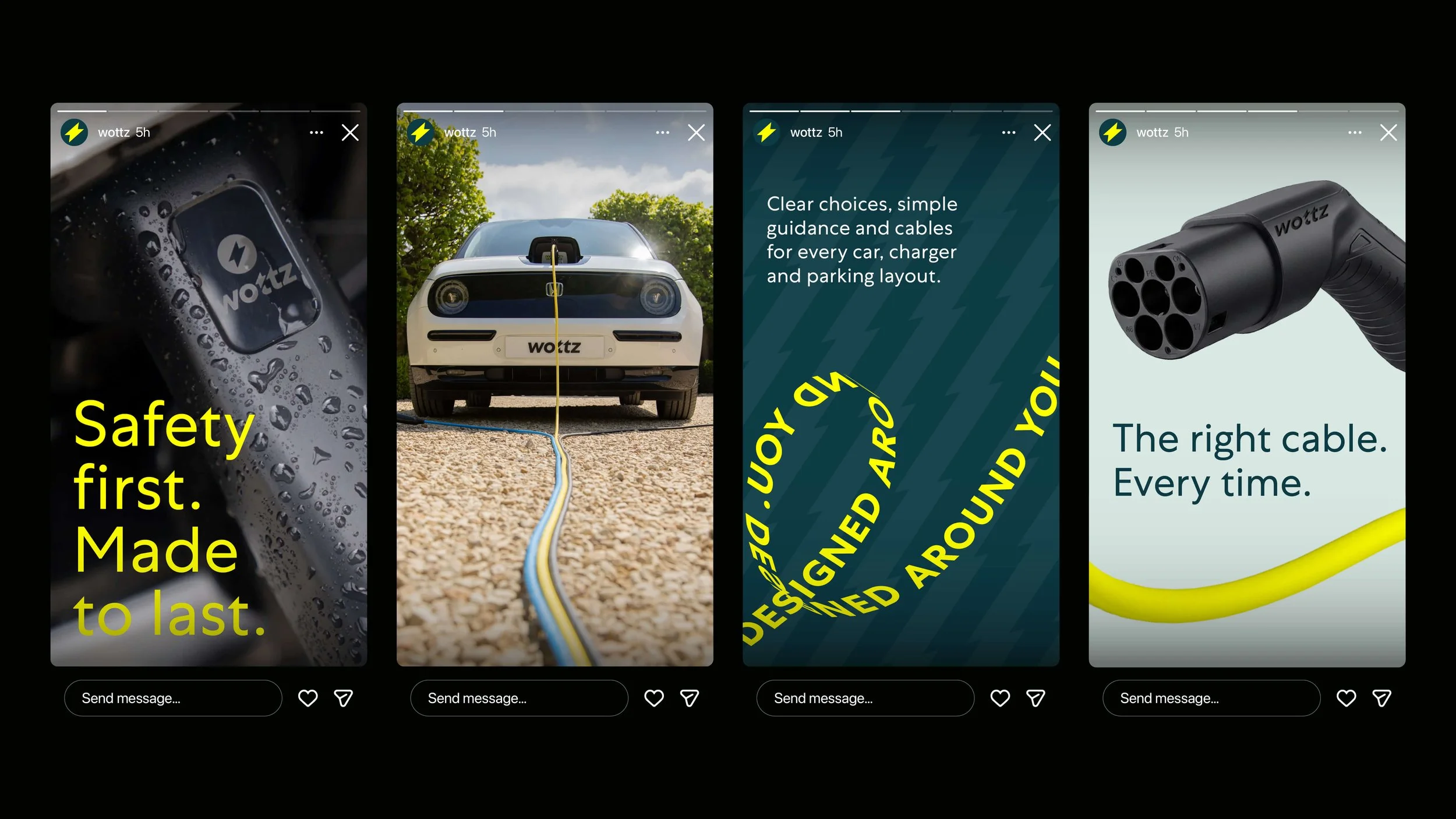
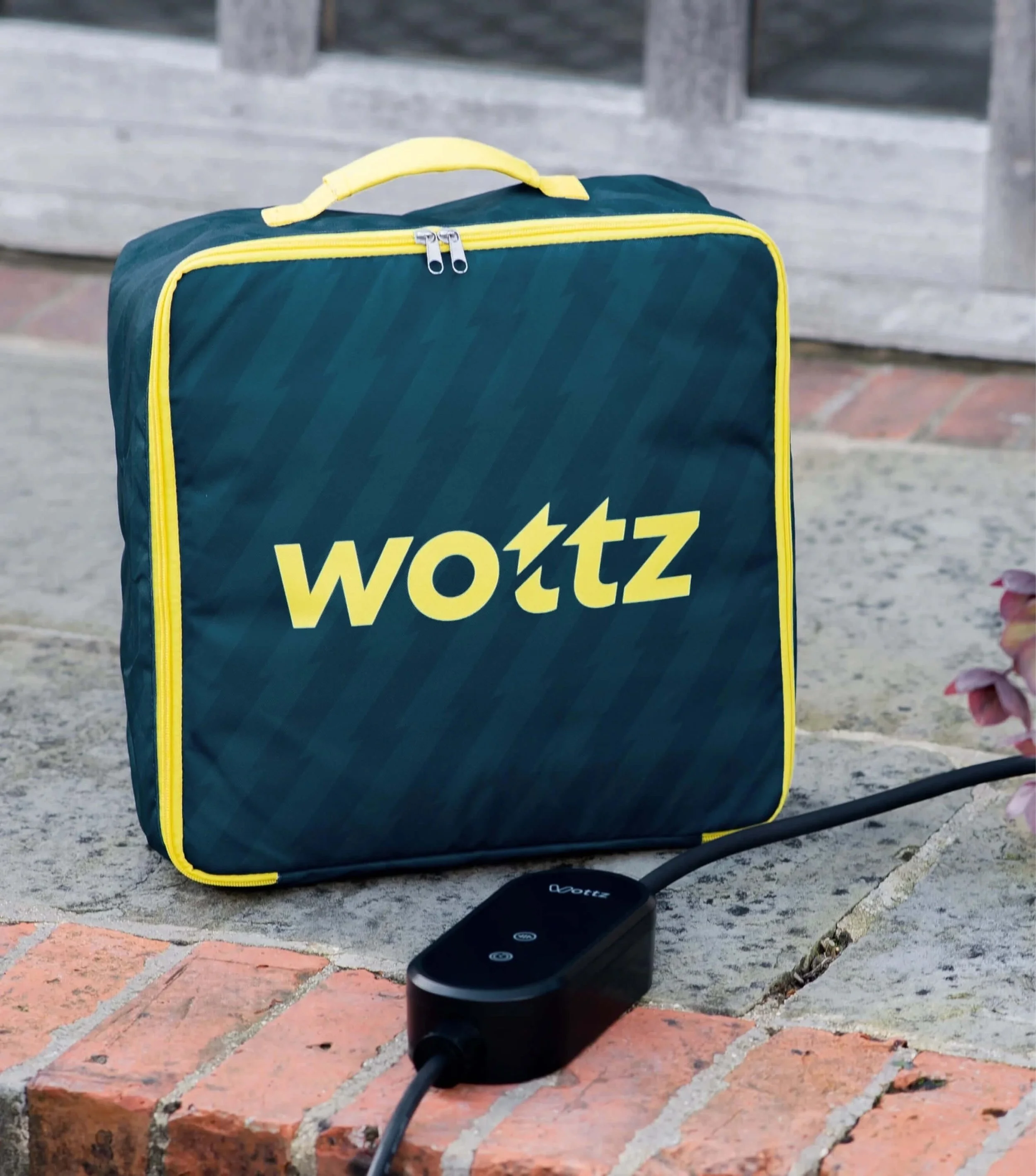
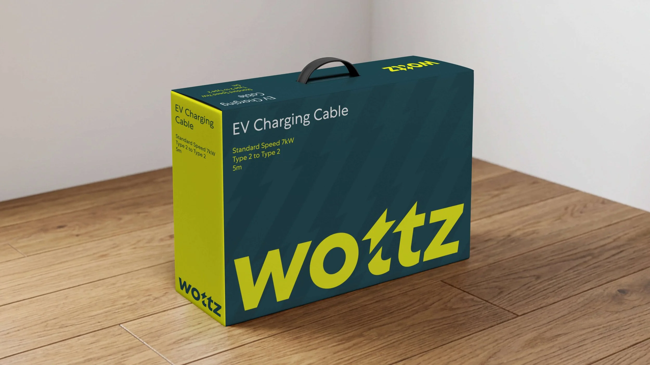
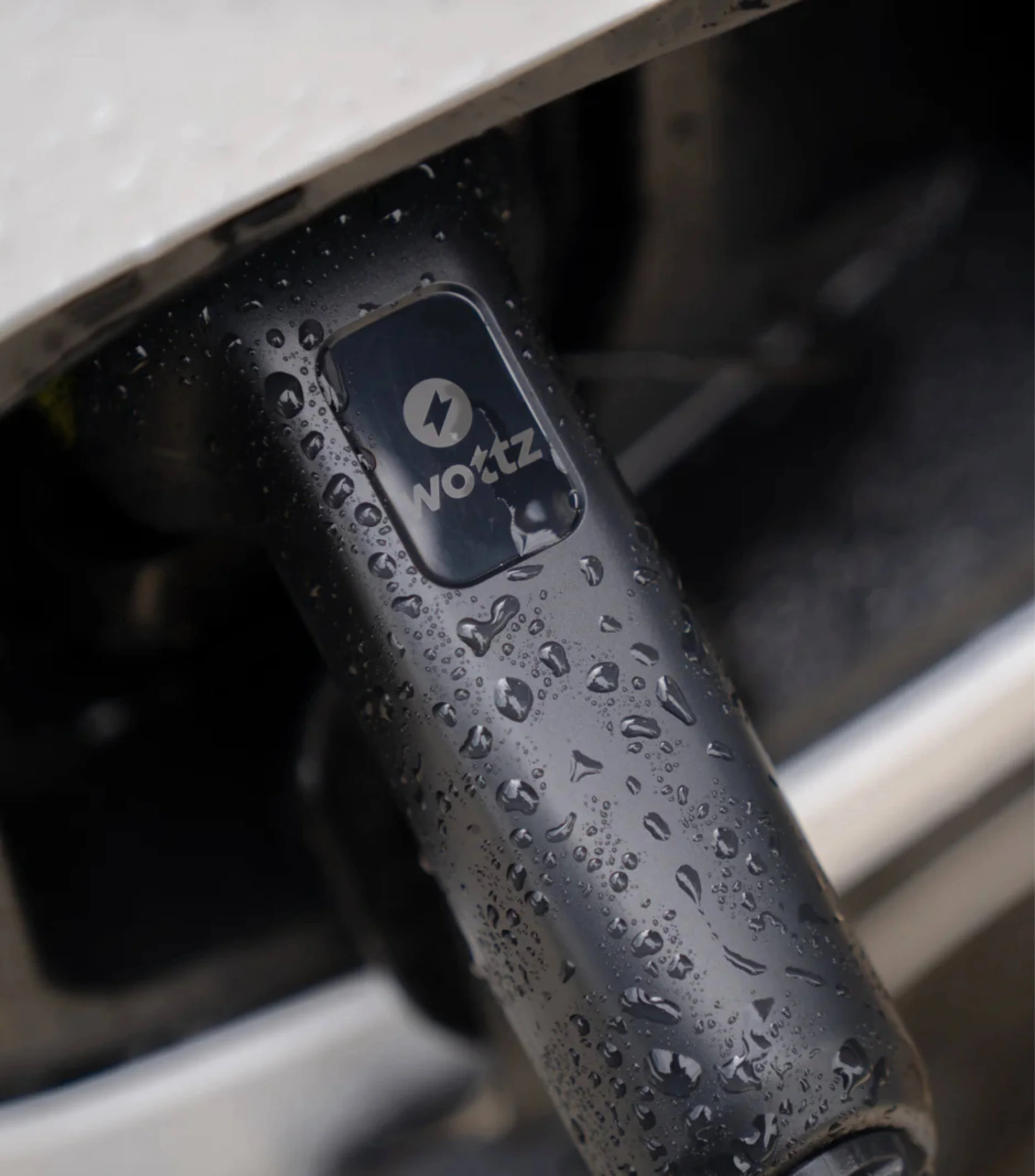
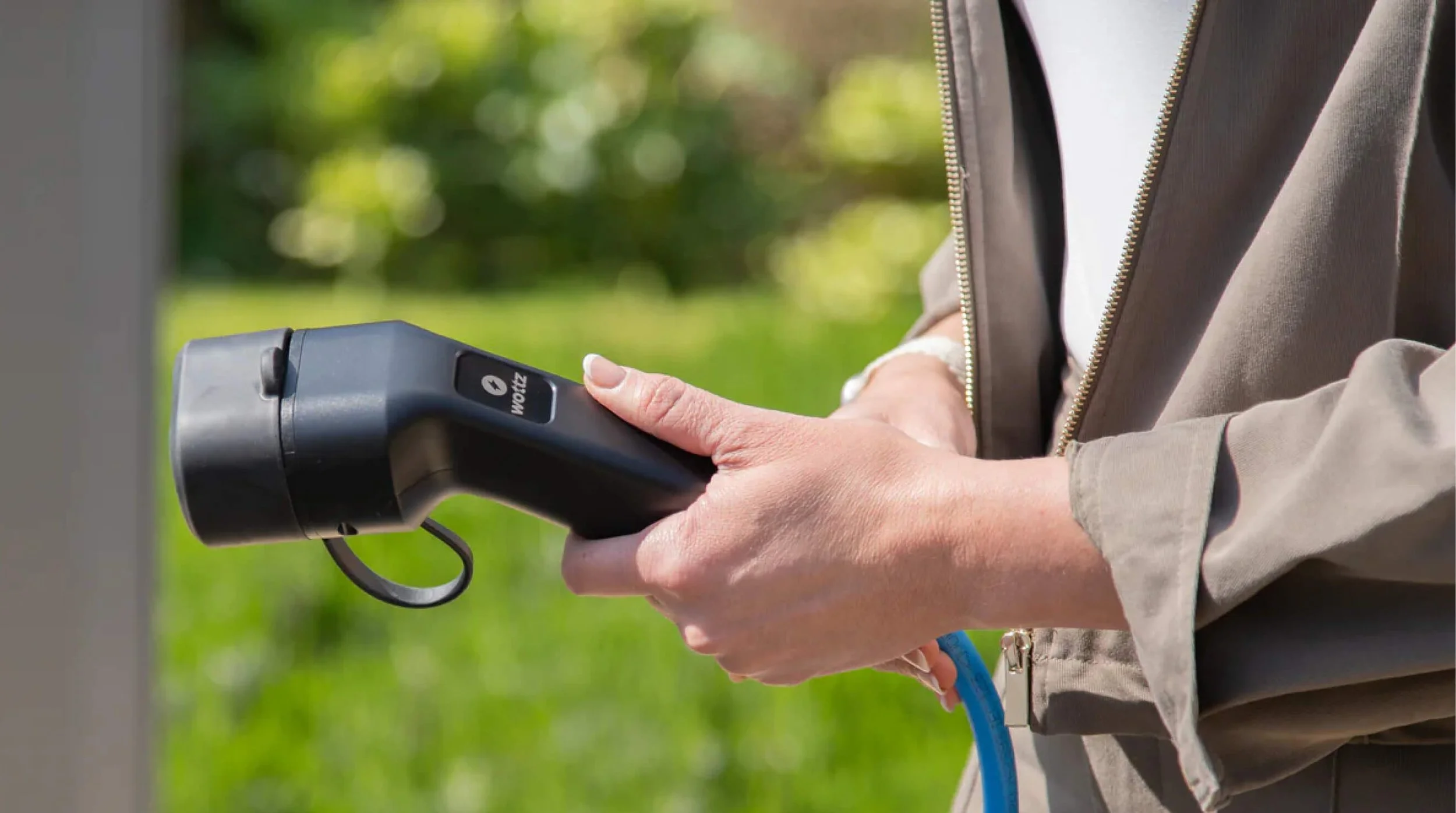
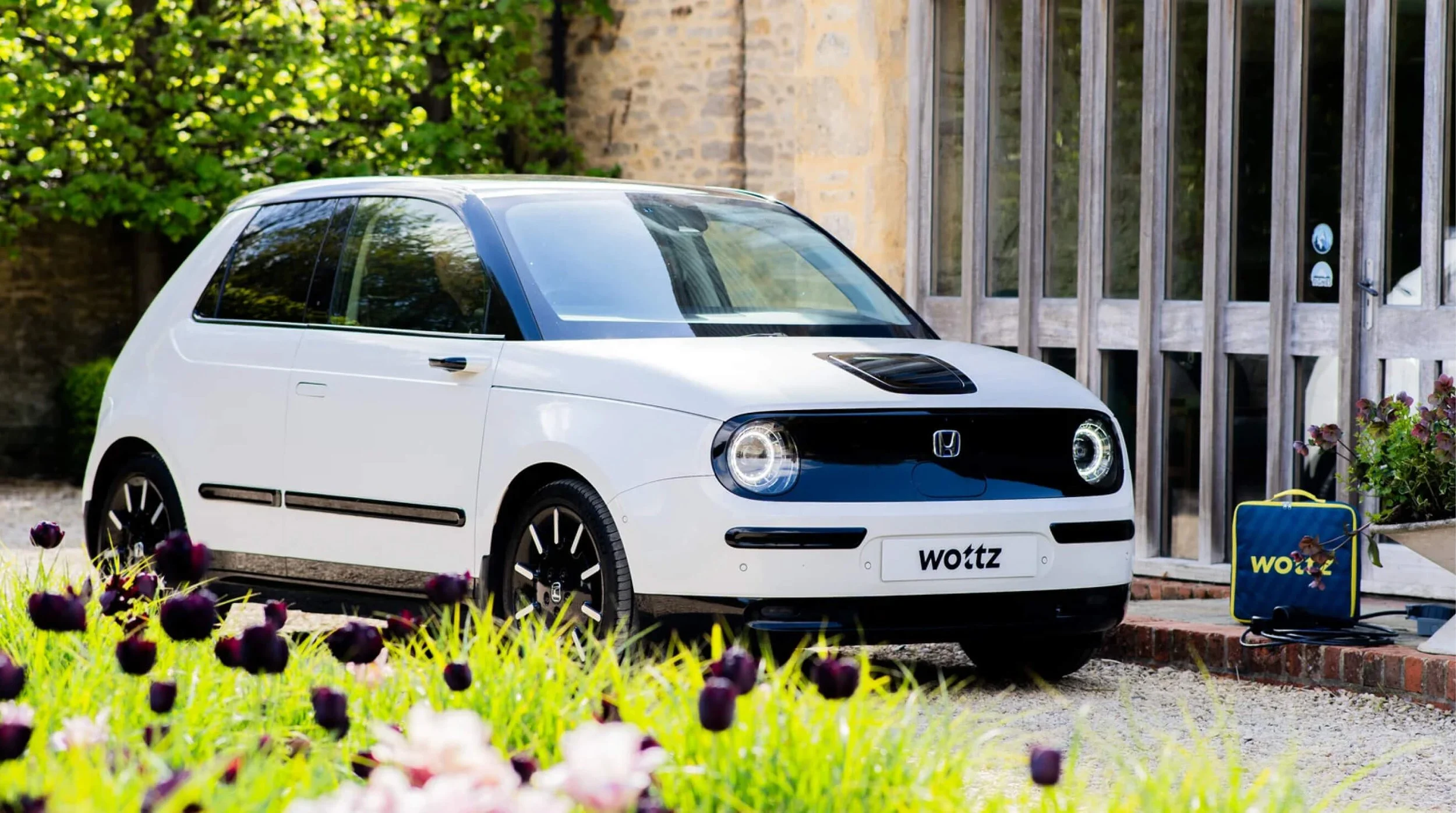
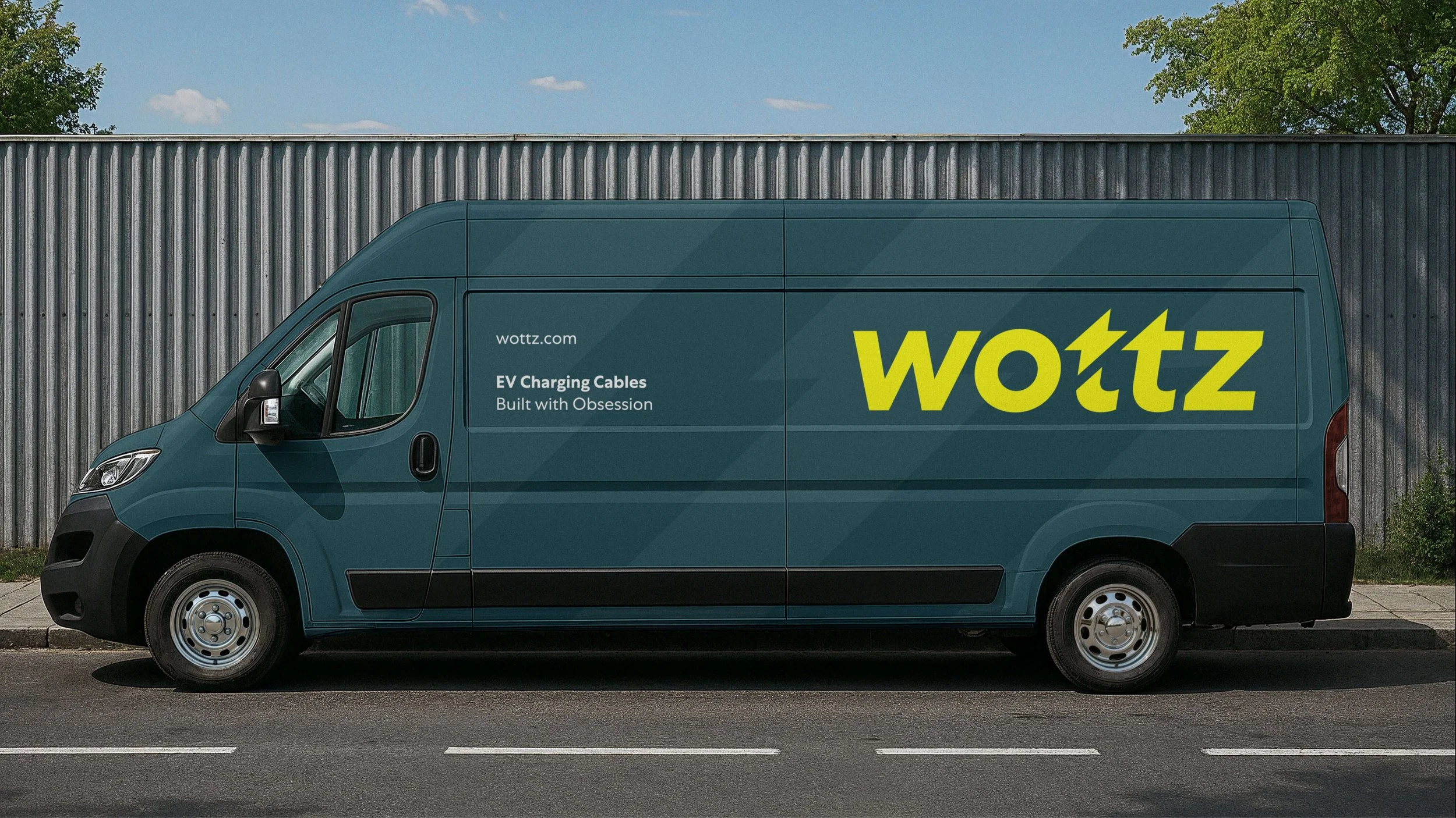
Building with ‘obsession’ means sweating the small stuff and paying razor-sharp attention to the details. Designing with AI is not that. And while Wottz had pulled together an AI logo a while back to save time and costs, they knew the next phase of their brand needed something more professional and original. The new logo is sleek and unmissable with a flash (not sorry) of signature blink-and-you’ll-miss-it Lark wit. It’s as recognisably EV as the name and as considered as their product.
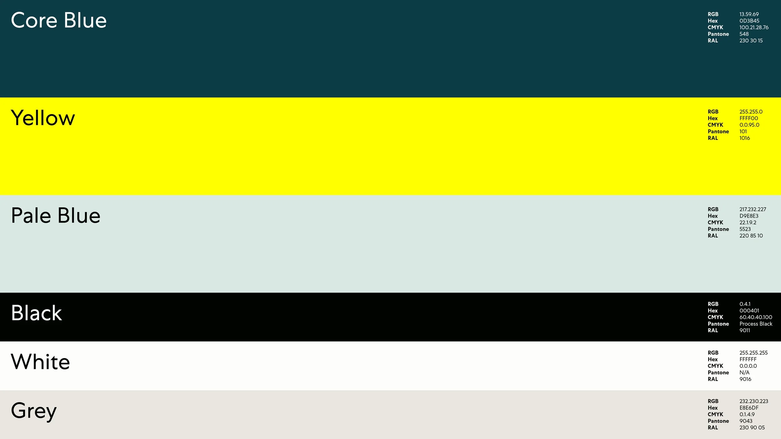
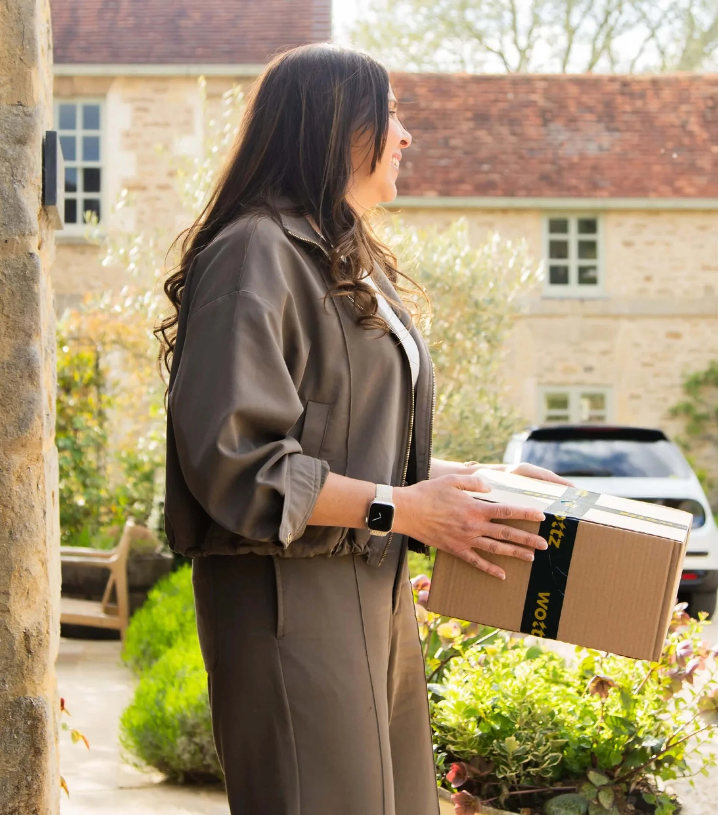
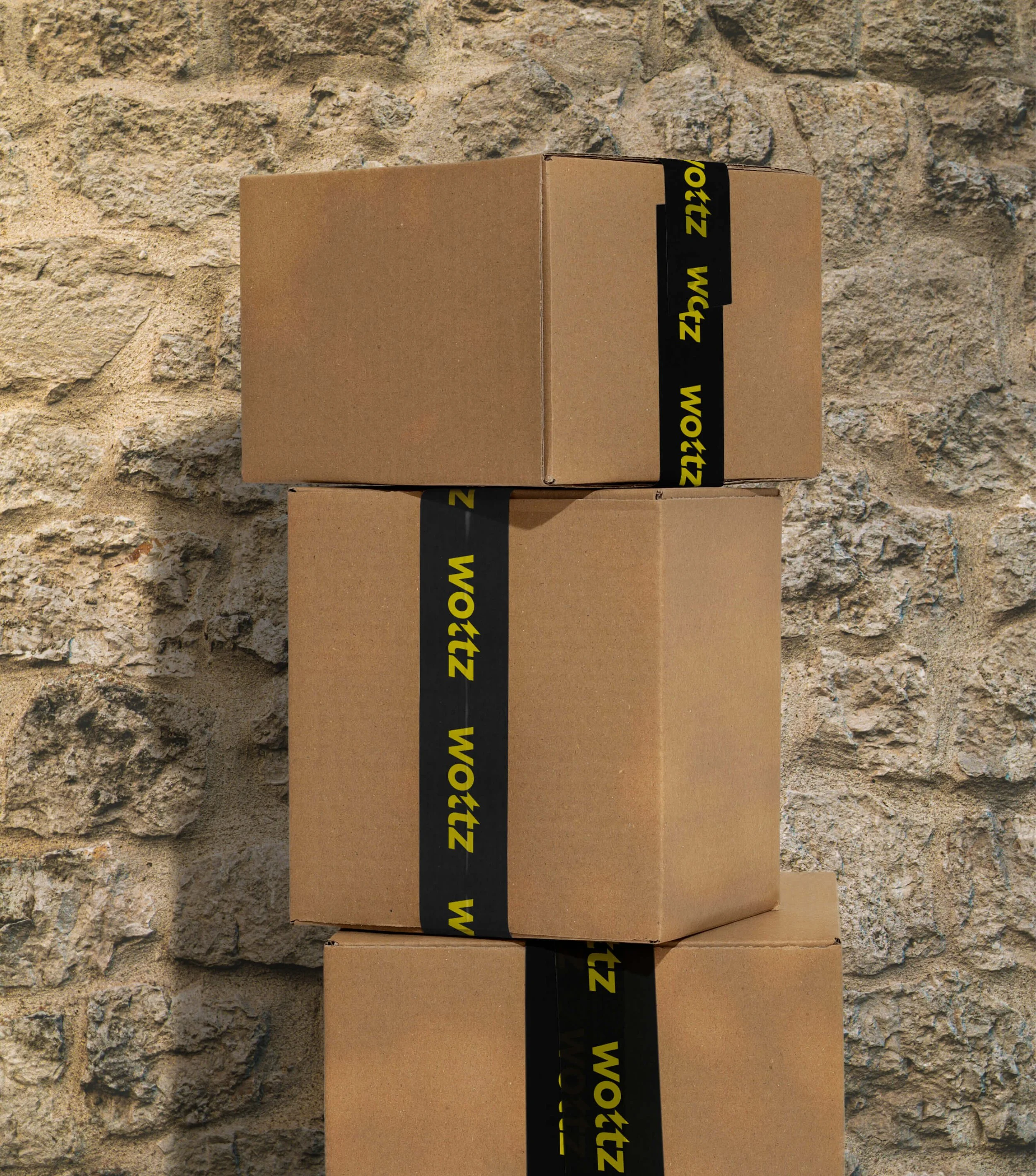
We complemented their core blue with an arresting neon yellow, ownable in their space, while for the typeface we chose Centra No.1: a fresh take on cornerstone British fonts like Gill Sans and Johnston’s New Rail Alphabet. Teamed with minimalistic icons, cable-inspired typography, subtle patterns and editorial-style imagery, the attention-grabbing resulting brand is unmissable for both their audiences. It’s slick. It’s contemporary British. And it’s exactly the zap of personality the brand, and industry, needed. Since launch, conversion rates on their main Google Ads Search campaign are up 10%.
Sector
EV/Automotive
Services
Branding
Digital Design
Collaborators
Strategy: Harry Burton
Photography: RAW Pictures
Press
Creative Boom: This clever rebrand finds its entire personality in one tiny flourish


‘Having built an EV charging cable manufacturer from the ground up we needed a brand to reflect all that hard work and passion. Lark took time to understand the business properly, not just what we did but where we were headed. The result is a brand that works hard across everything from the products to the website. Wottz feels British and engineered, but it has personality too. We wouldn't hesitate to recommend them.’
Graham O’Reilly
Co-Founder, Wottz
Hatching plans?
If you’re launching something new or refreshing an existing brand, we’d love to hear about it.
Similar projects