Property Hive — Brand Identity
A people-first brand for a leading property plugin
Challenge
Property Hive was thriving. As architects of the #1 WordPress property plugin, Steve and Laura’s tools were already must-haves in the kit of developers and estate agents across the UK and beyond. But they’d reached a ceiling. With expansion in their sights, plus a radically accessible CRM to share, it was time to reposition and evolve their brand.
Idea
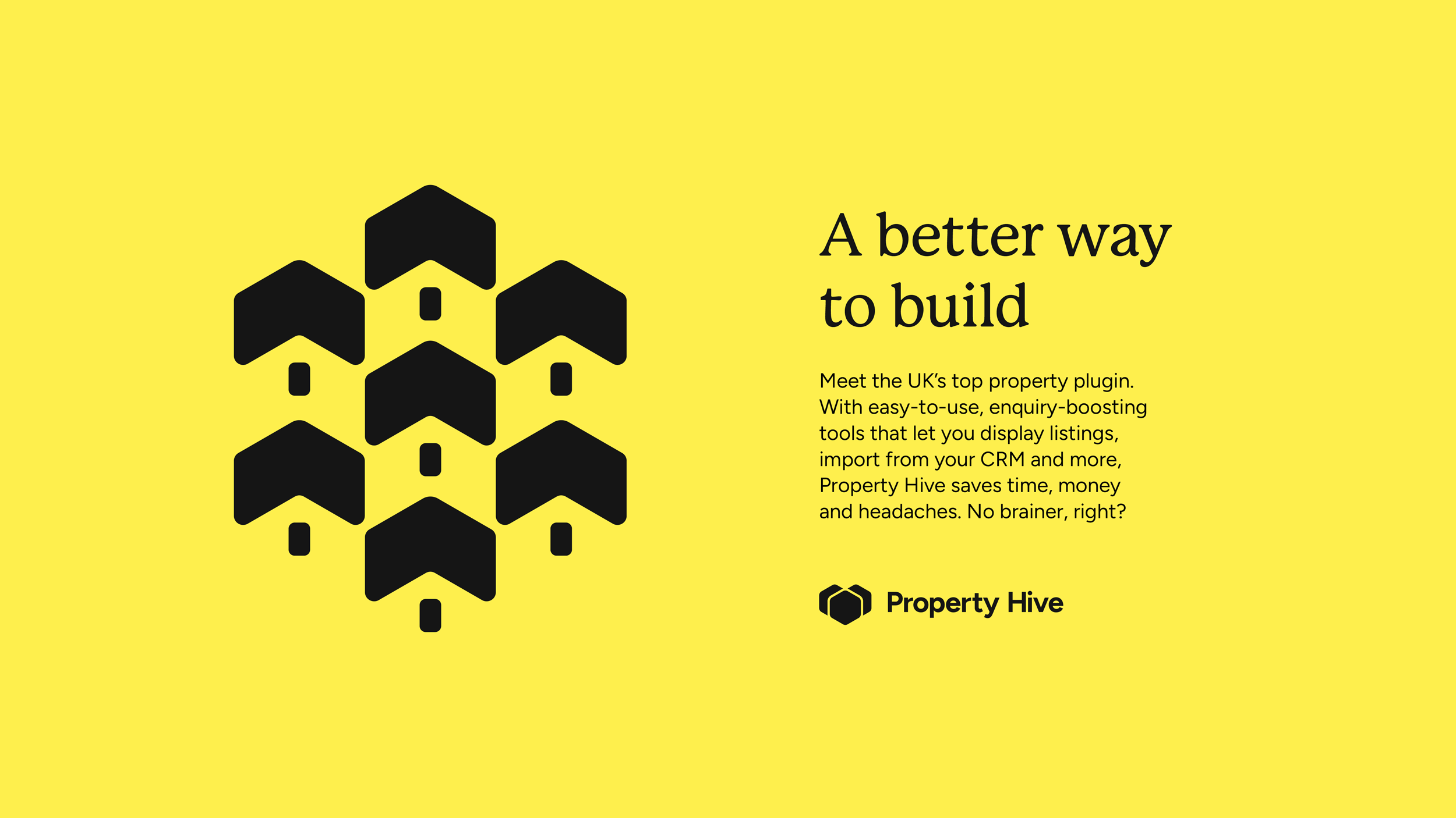
Clichés? We’re better than that. Instead, we explored ways to embrace the ‘hive’ in their name without leaning heavily on bees. We took inspiration too from the team’s amazing client relationships and notoriously brilliant customer service, investing the brand with loads of warmth and heart. And to help them build awareness of their broader offering, we delved beyond the functional to create a core, organising idea: ‘A better way to build’.
Outcome
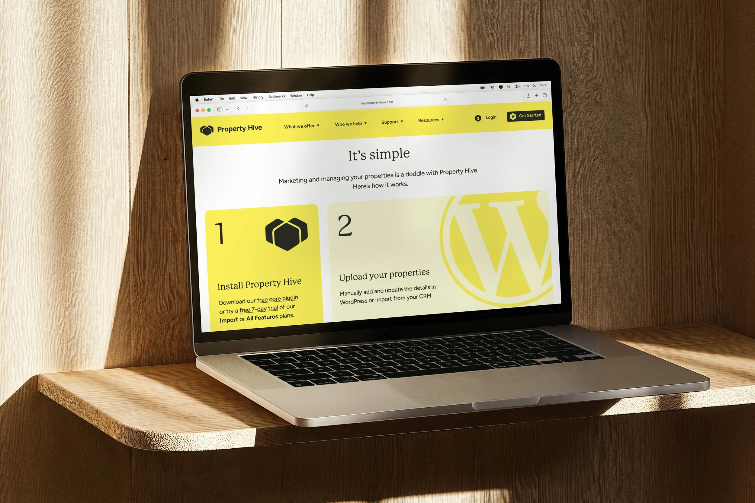
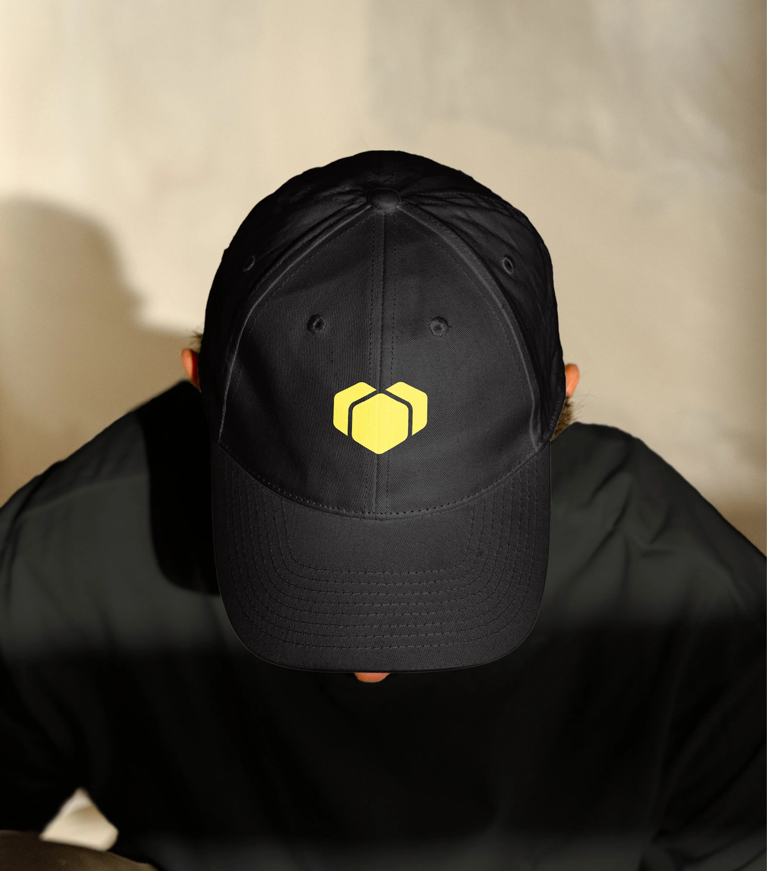
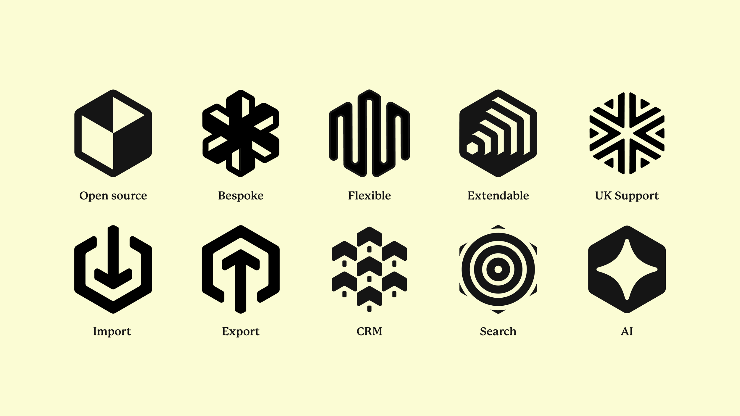
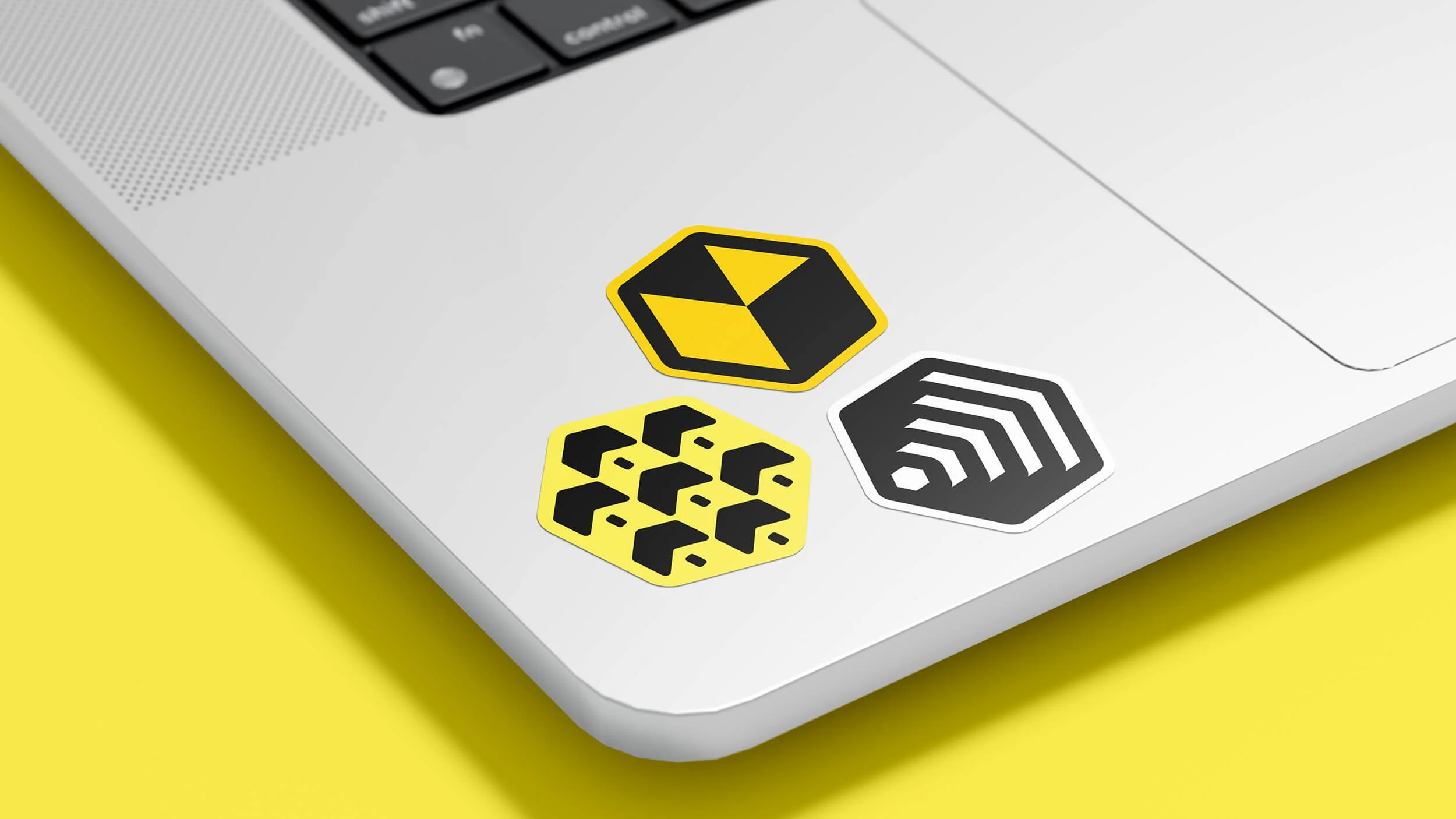
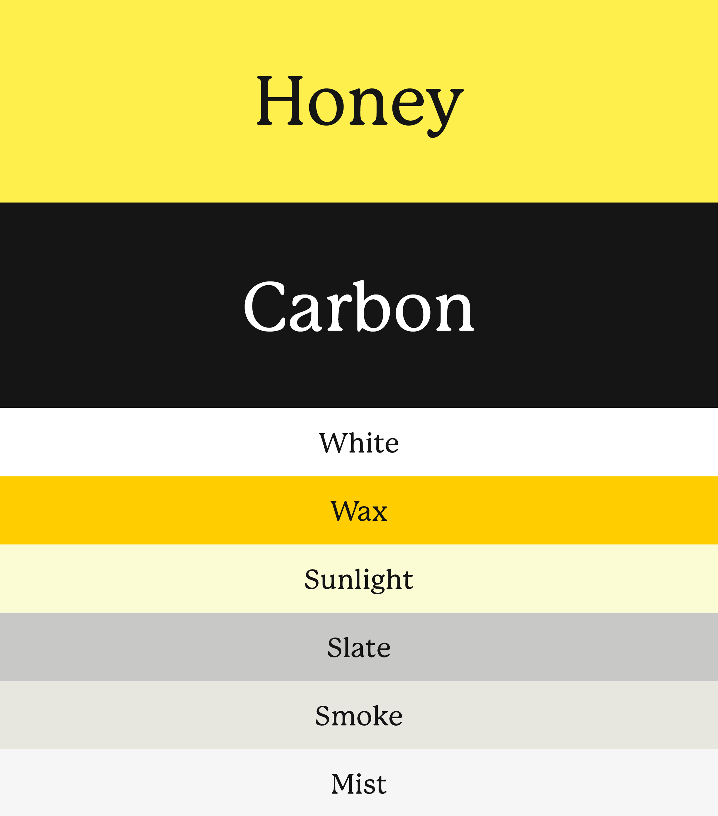
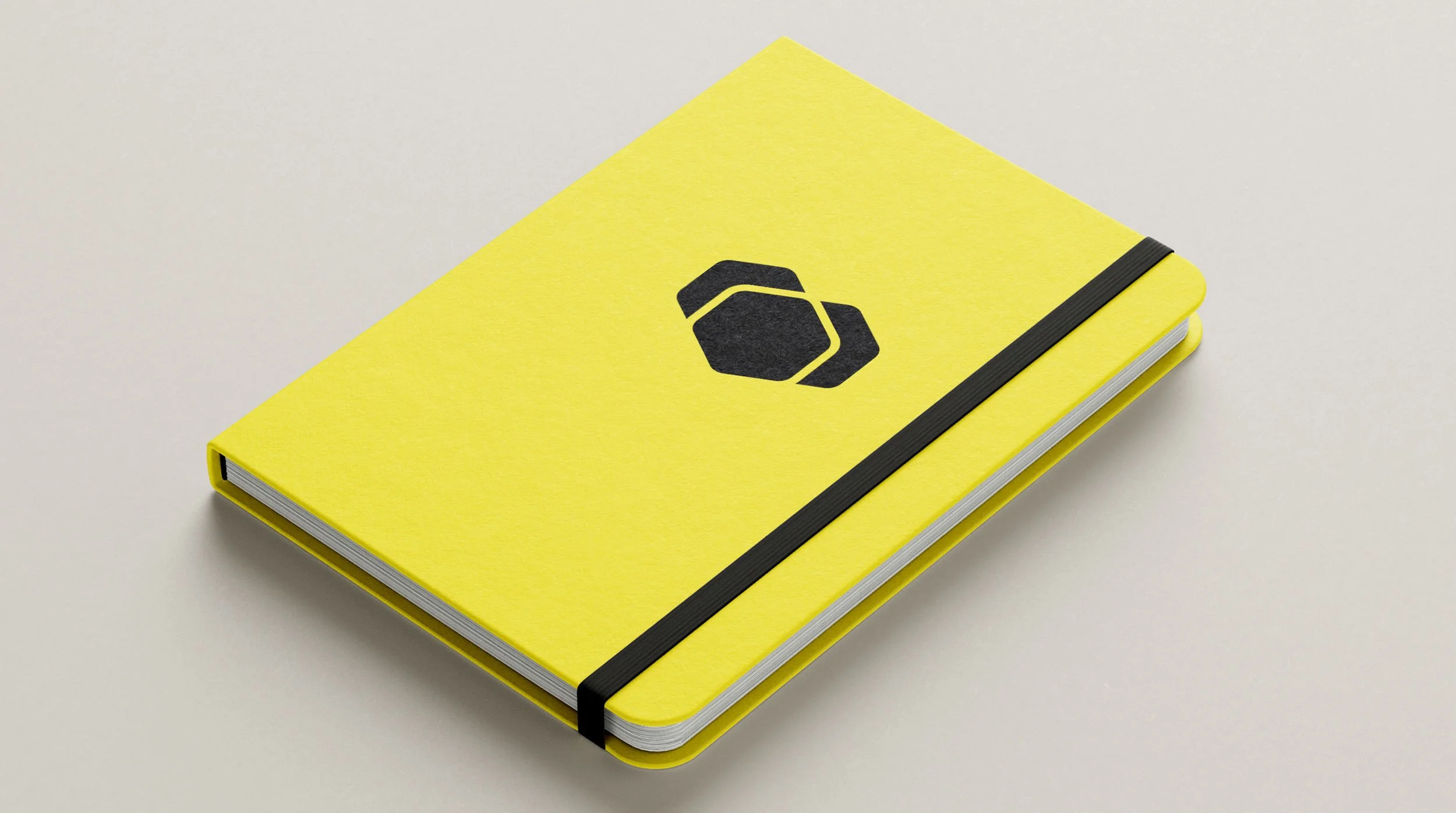
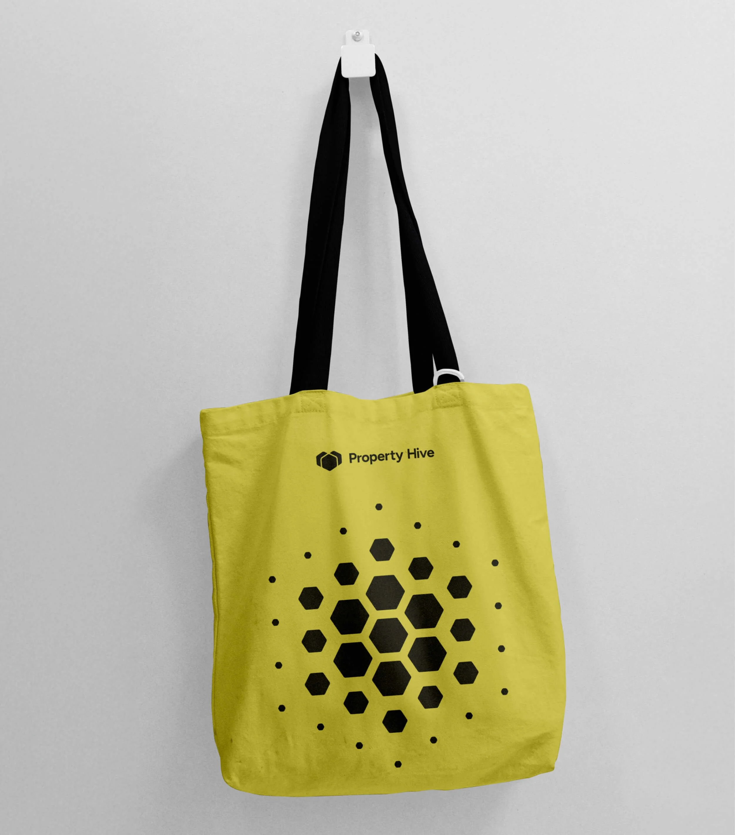
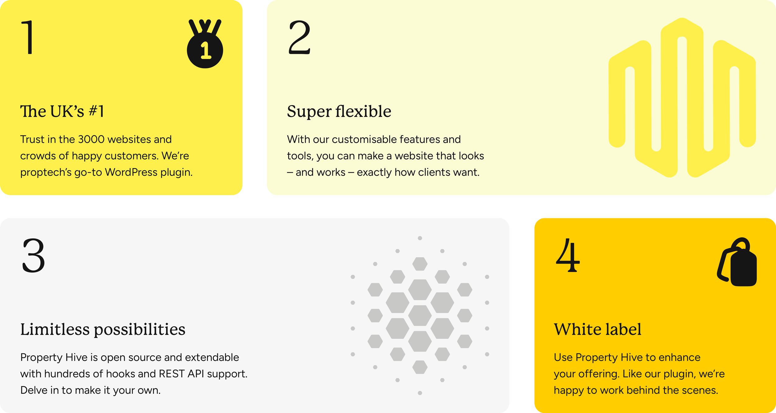
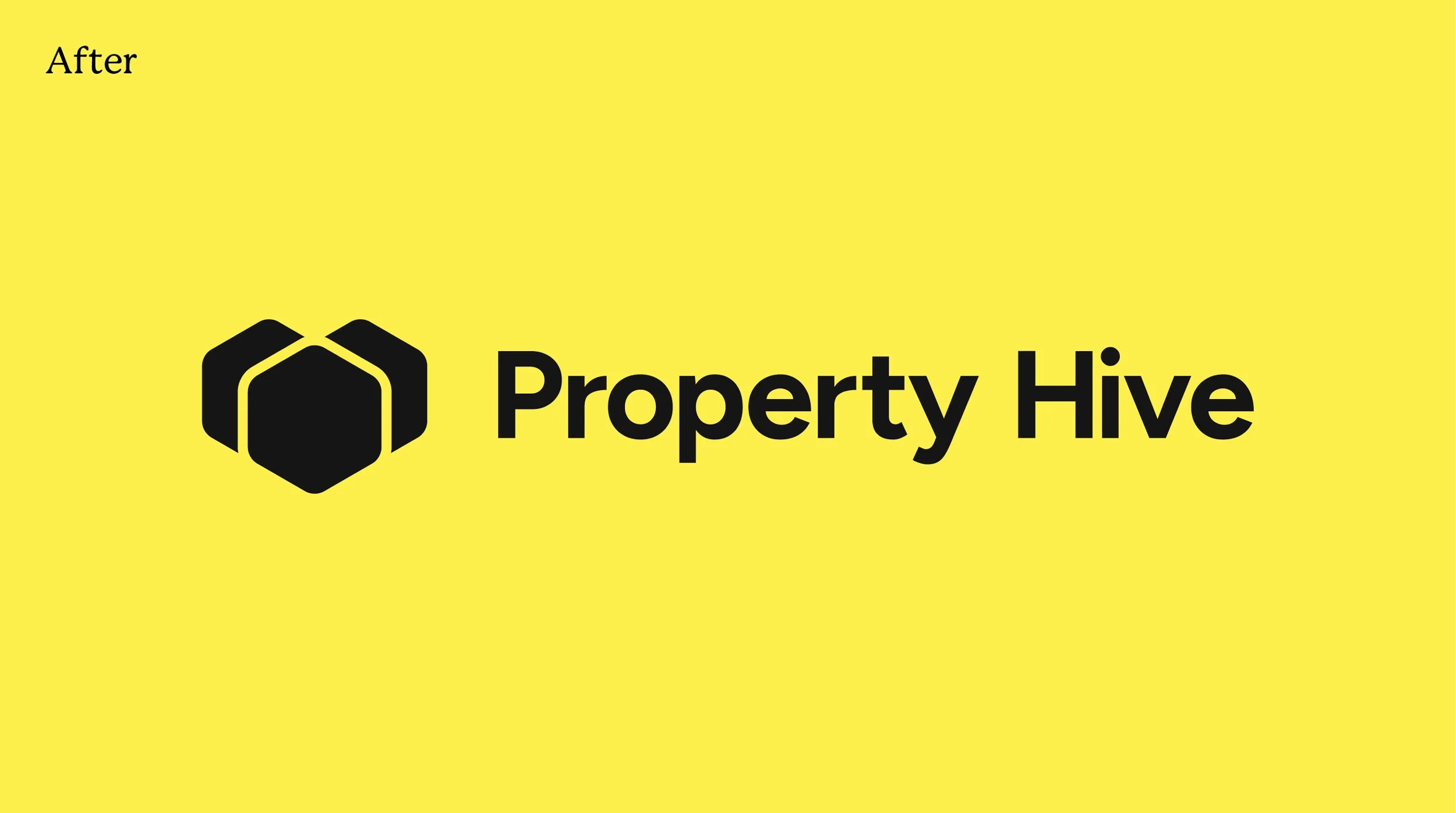
For the high-contrast colour palette, we chose a rich and joyful primary yellow that captures the infectious warmth of the team – steering clear of anything too bright or acidic. Staying in bee territory, we designed a distinctive hexagon asset that became the building blocks of the logo and bespoke illustrations. It runs across all their services and themes as a visual signature for the brand.
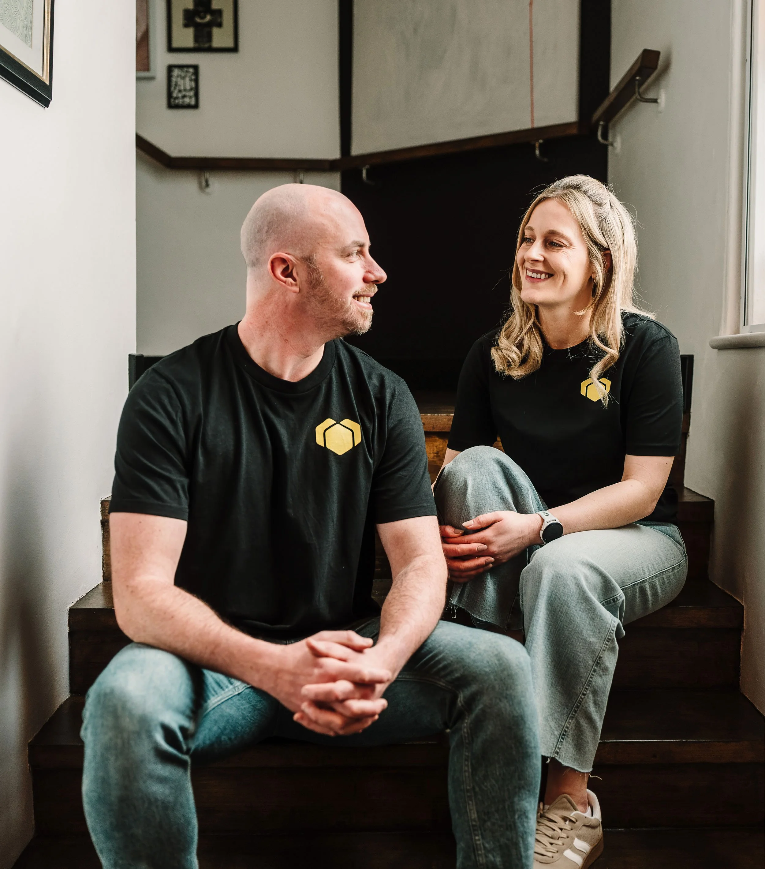
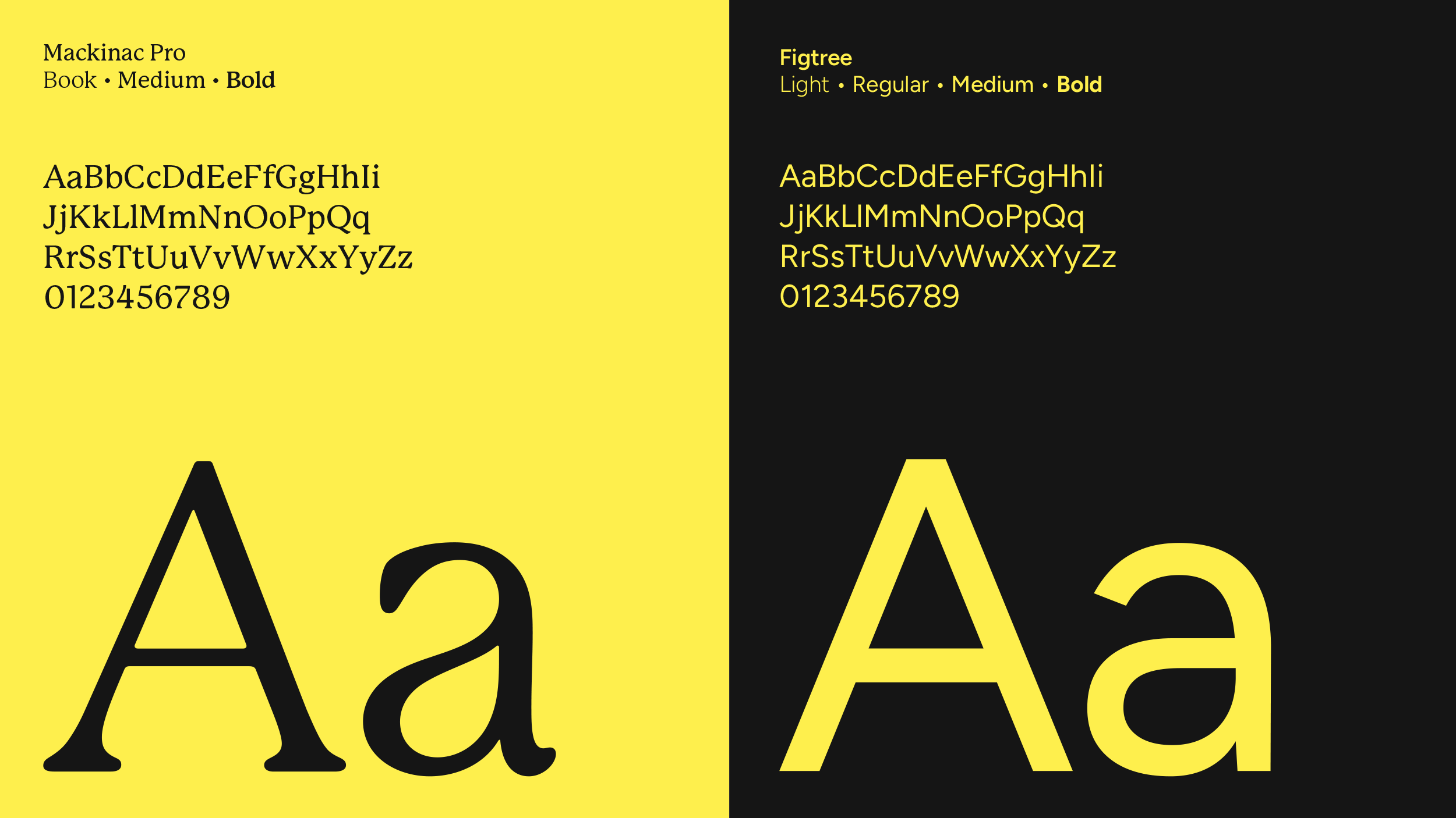
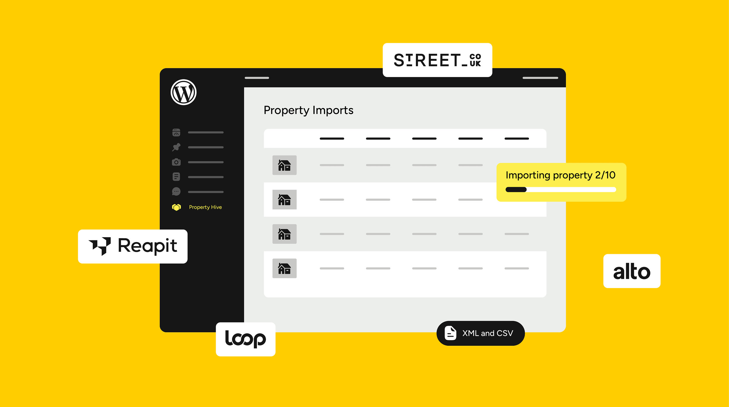
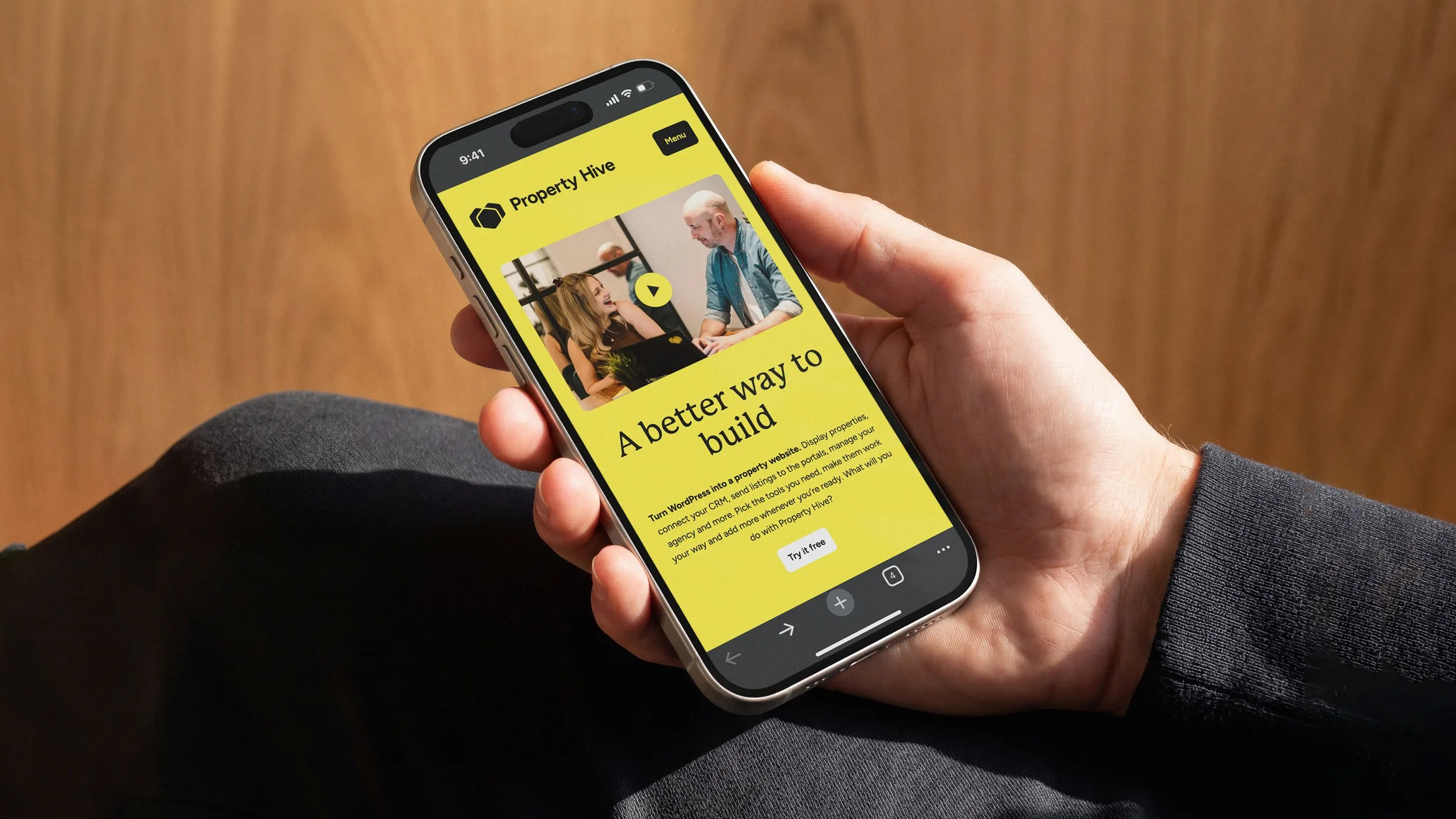
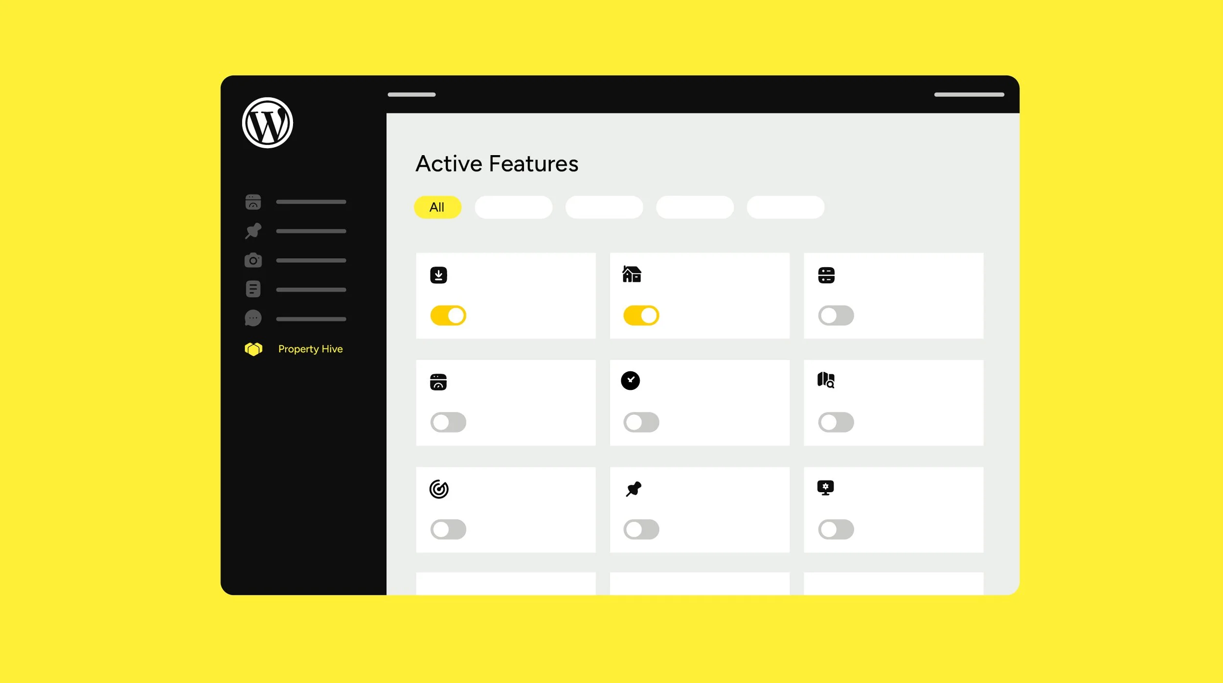
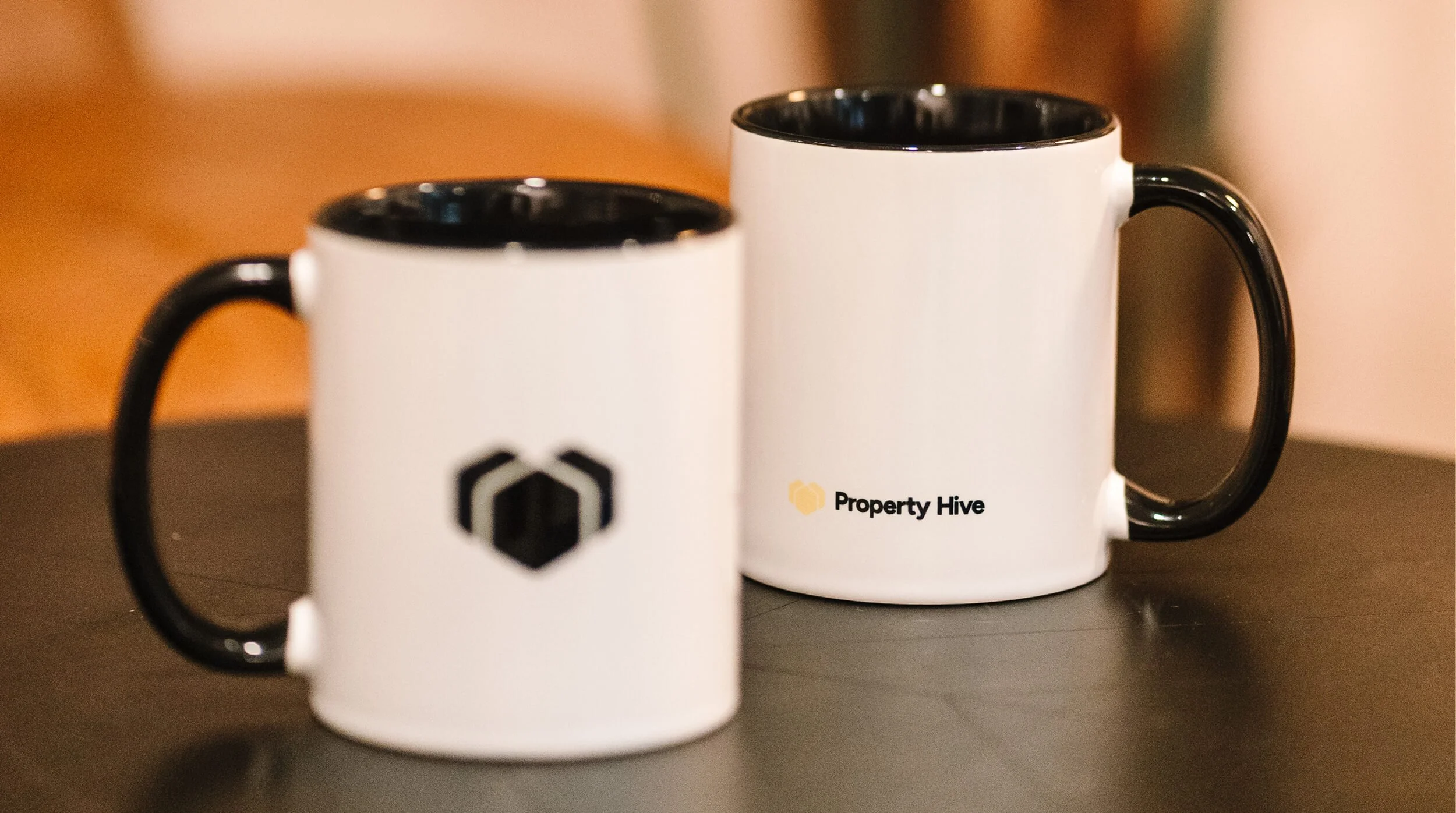
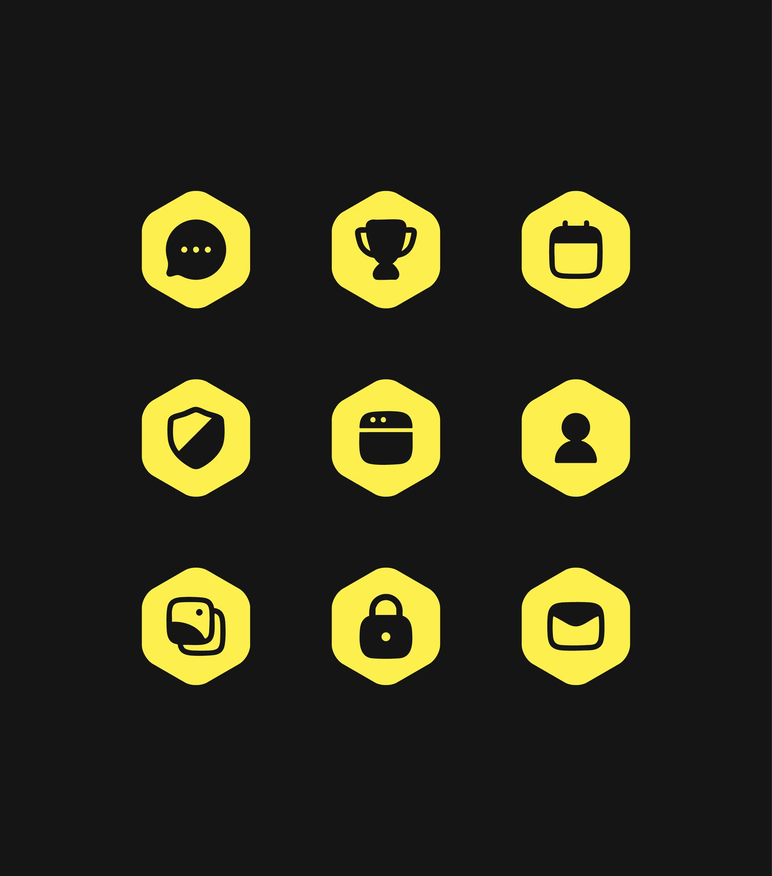
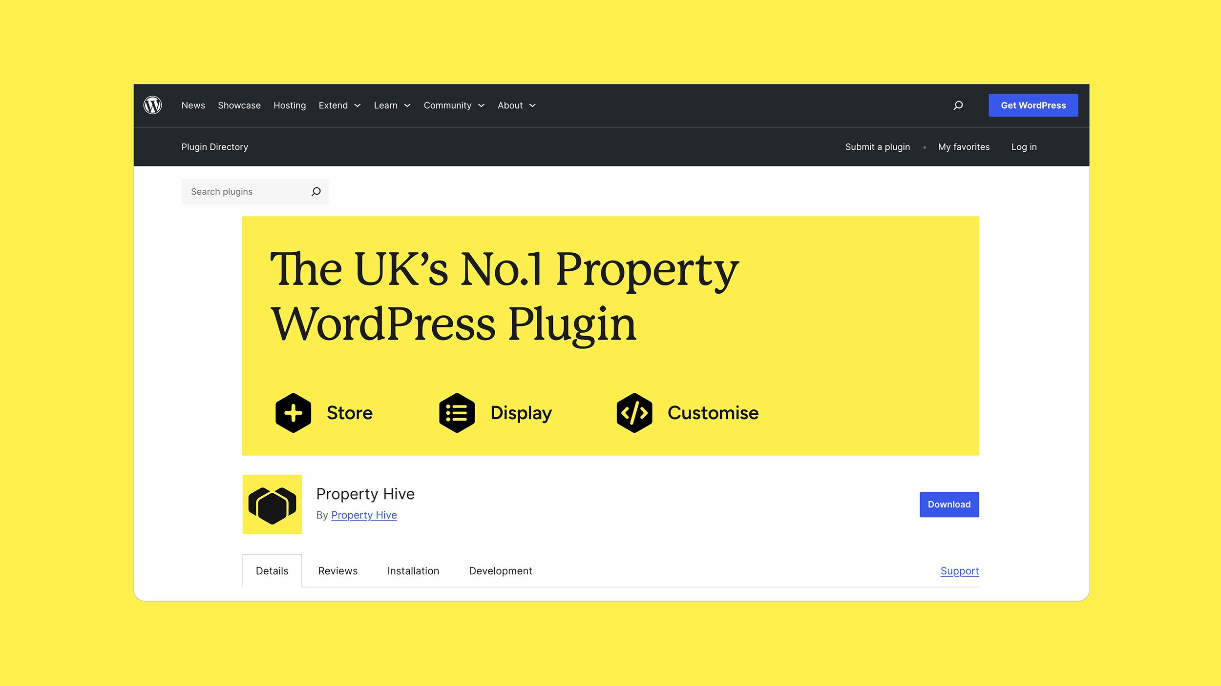
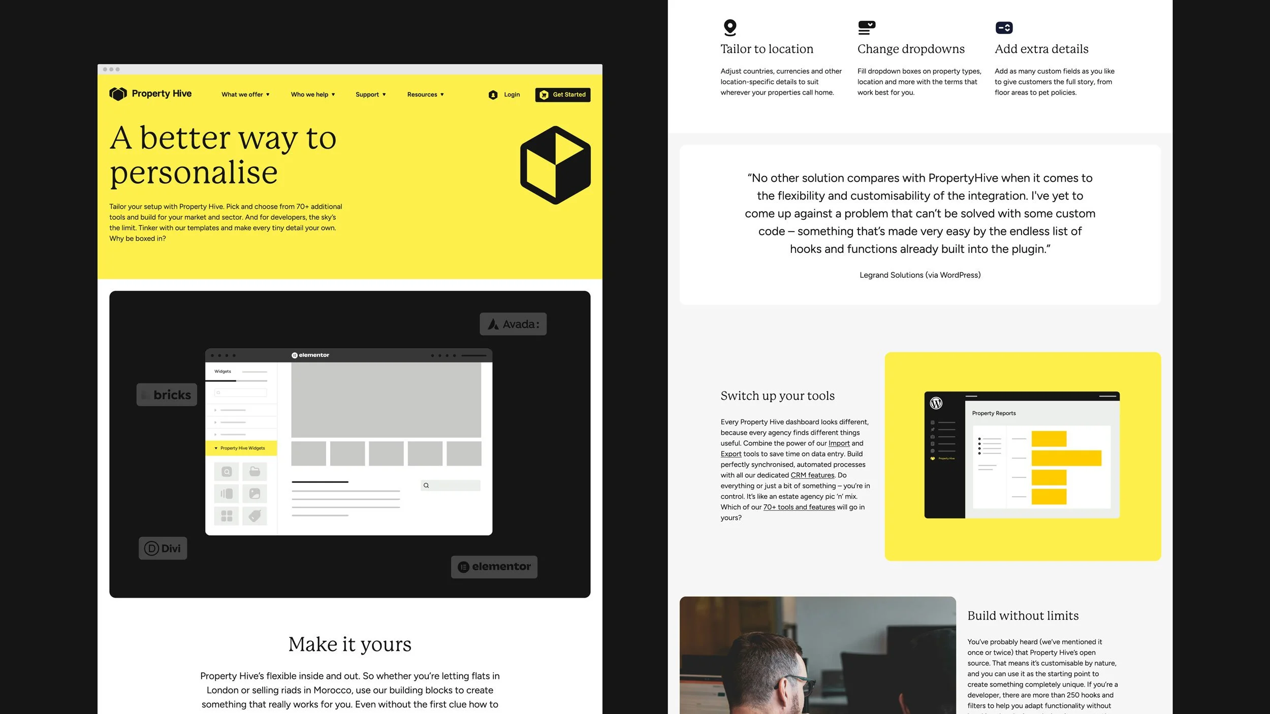
The team’s warmth lives in the finer details too: an open and approachable voice, a softened set of icons and a friendly-feeling header serif complimented by a more functional body sans-serif. We also looked at how to express the product in a visually engaging way, rather than showing the WordPress interface. And we recommended photography that put Steve and Laura front and centre: showing the real, personable people behind the brand. Lastly, we rolled out the identity to a brand new website and merchandise for the brand’s greatest champions: developers.
Sector
Information Technology
PropTech
Services
Branding
Digital Design
Collaborators
Copywriting: Yarn


‘The visual identity you created has given us the building blocks to bring everything to life.’
Laura Marks
Head of Product & Growth, Property Hive
Hatching plans?
If you’re launching something new or refreshing an existing brand, we’d love to hear about it.
Similar projects